Home/Blog/Design & Brand
Design & Brand · 11 min read

Commerce UI patterns that consistently convert

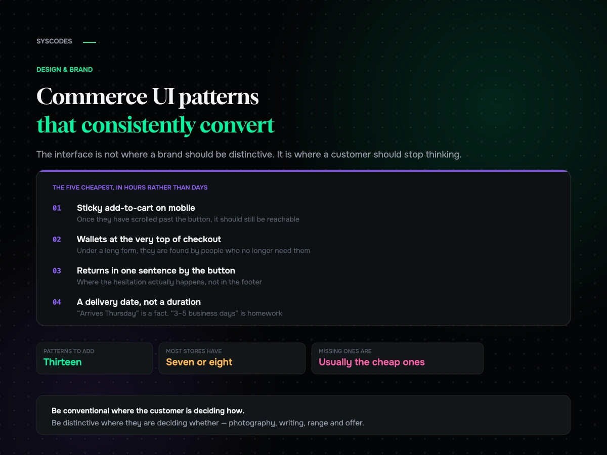
Somebody says the store looks like every other store, and the room agrees that this is a problem. It usually is not. The interface is not where distinctiveness should live.

Commerce UI patterns that consistently convert
S
Sayan SahaUpdated August 2026 · 11 min read

There is a particular kind of design review where somebody says a store looks like every other store, and the room agrees that this is a problem.

It usually is not. In commerce, the interface is not where distinctiveness should live — that is the job of the product, the photography, the writing and the offer. The interface’s job is to be immediately legible to somebody who has used a hundred other stores and has no interest in learning yours.

Which is why patterns win. A pattern is a solution that has been tested across an enormous number of sites and has become what people expect. Departing from one costs you comprehension, and comprehension is what you are spending when you are original in the wrong place.

These are the patterns we implement almost every time, the ones that look good and do not work, and how to tell the difference.

Why patterns beat originality here

Three reasons, and they compound.

Familiarity is speed. A customer who does not have to work out how your filters behave is a customer spending their attention on your products instead of your interface.

Patterns carry accumulated testing. The reason a cart drawer became standard is that a very large number of stores discovered that a full page navigation loses people. You inherit that finding for free.

Deviation costs more on mobile. There is less room for explanation, less tolerance for exploration, and a mis-tap is a lost order rather than an annoyance.

None of this means a store should be visually generic. Typography, colour, photography, motion and voice are where a brand lives. Where the “add to cart” button goes is not a branding decision, and treating it as one is expensive.

Discovery: helping people find the thing
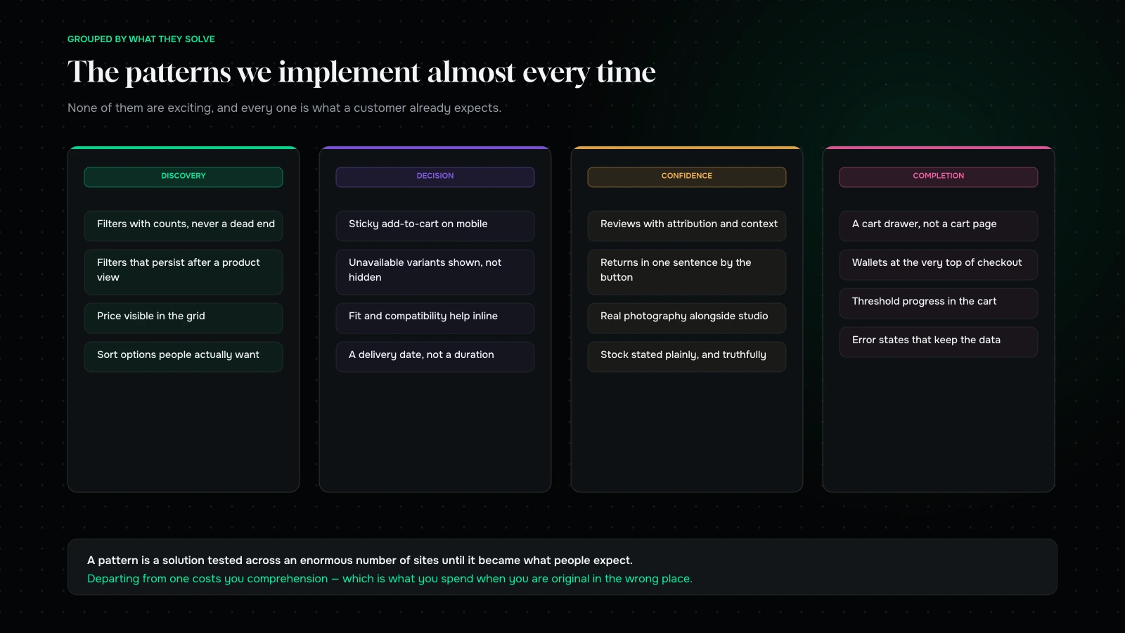
Ten commerce interface patterns grouped by funnel stage — discovery, decision, confidence and completion — with what each one solves
Ten patterns. None of them are exciting, and every one of them is what a customer expects.

Filters that show counts, and never return zero. A filter option that leads to an empty page is a dead end you built on purpose. Show how many products each option contains and grey out the ones that would return nothing.

Filters that persist. If somebody filters, opens a product and comes back, the filters should still be applied. Losing them is one of the most reliably frustrating things a store can do, and it happens constantly on mobile.

Price and key variant visible in the grid. The customer is comparing. Making them open four products to compare prices is asking them to do work a grid could have done.

Sort that includes what people actually want. Price, newest, and — if you have the data — genuine popularity. Relevance as the only option is a black box.

Decision: the product page

A sticky add-to-cart on mobile. Once the customer has scrolled past the buy button, it should still be reachable. This is one of the highest-return single changes available on most stores, and it costs an hour.

Variant selectors that show what is unavailable rather than hiding it. Hiding a sold-out size is confusing; showing it struck through, with a “notify me”, is honest and it captures demand you would otherwise never hear about.

Fit, size and compatibility help inline, not behind a modal. The question “will this work for me” is the most common reason a purchase does not happen, and putting the answer behind a click loses a share of the people who needed it.

A delivery date, not a duration. “Arrives Thursday” is a fact a customer can plan around. “3–5 business days” is homework.

Image galleries that behave normally. Swipe on mobile, thumbnails on desktop, zoom that works, and at least one photograph with a scale reference. Nobody has ever complained that a product gallery was too conventional.

Confidence: the objections nobody voices

Reviews with attribution and context. A name, a date, and whatever the buying anxiety is in your category — skin type, size worn, room size, use case. Four rich reviews beat two hundred anonymous five-star sentences, because the rich ones answer a question.

The returns policy in one plain sentence, next to the button. Not a link in the footer. One sentence, honestly worded, where the hesitation happens.

Real photography alongside studio photography. In context, at scale, imperfect. It is more persuasive than another lit shot on a white background, and customers increasingly know the difference.

Stock and availability stated plainly. Including when it is low, which is only credible if it is true — see below.

Completion: getting out of the way

A cart drawer, not a cart page. Adding to cart should not navigate away from browsing. Open first, populate second, so it feels instant.

Express wallets at the very top of checkout. Above the form, not below it. A wallet button under a long form is discovered by people who no longer need it.

Progress toward a threshold, if you have one. “Add £18 more for free shipping” is the entire mechanic; without it you have a policy rather than a lever.

Error states that keep the data. Mark the field, scroll it into view, say what to change, and never clear the form. This is the single most valuable unglamorous fix in commerce, and we go through the rest of it in the checkout audit.

Patterns for the states nobody designs

Every store has a happy path and it is the only path most design work covers. The states below are where a real customer ends up several times a session, and each one has a conventional solution that most stores have not implemented.

Out of stock. Show the product, show it is unavailable, offer notification, and suggest the nearest alternative. Hiding it entirely is worse: the customer arrived from a search result or an ad and now believes you never had it.

Empty cart. Not a dead end with the word “empty”. A route back to the last thing they looked at, or the category they came from.

No search results. Show what they typed, suggest a correction, and show something. A blank page with “no results” is the single most abandoning screen in commerce.

Empty filter. Prevent it with counts, and if it happens anyway, say which filter caused it and offer to remove that one rather than resetting everything.

Payment declined. Keep the data, say what to try, offer an alternative method. Covered elsewhere, and it belongs on this list too.

A page that is loading. Skeletons rather than spinners, and reserved space so nothing jumps when the content arrives.

A slow connection. Something useful should render before everything has arrived. If your page is blank until the last script lands, a share of your customers see only the blank.

These are unglamorous, they never appear in a portfolio, and collectively they are the difference between a store that feels solid and one that feels fragile. If you are choosing what to spend a fortnight on, this list beats almost anything on the happy path.

Patterns that look good and do not convert
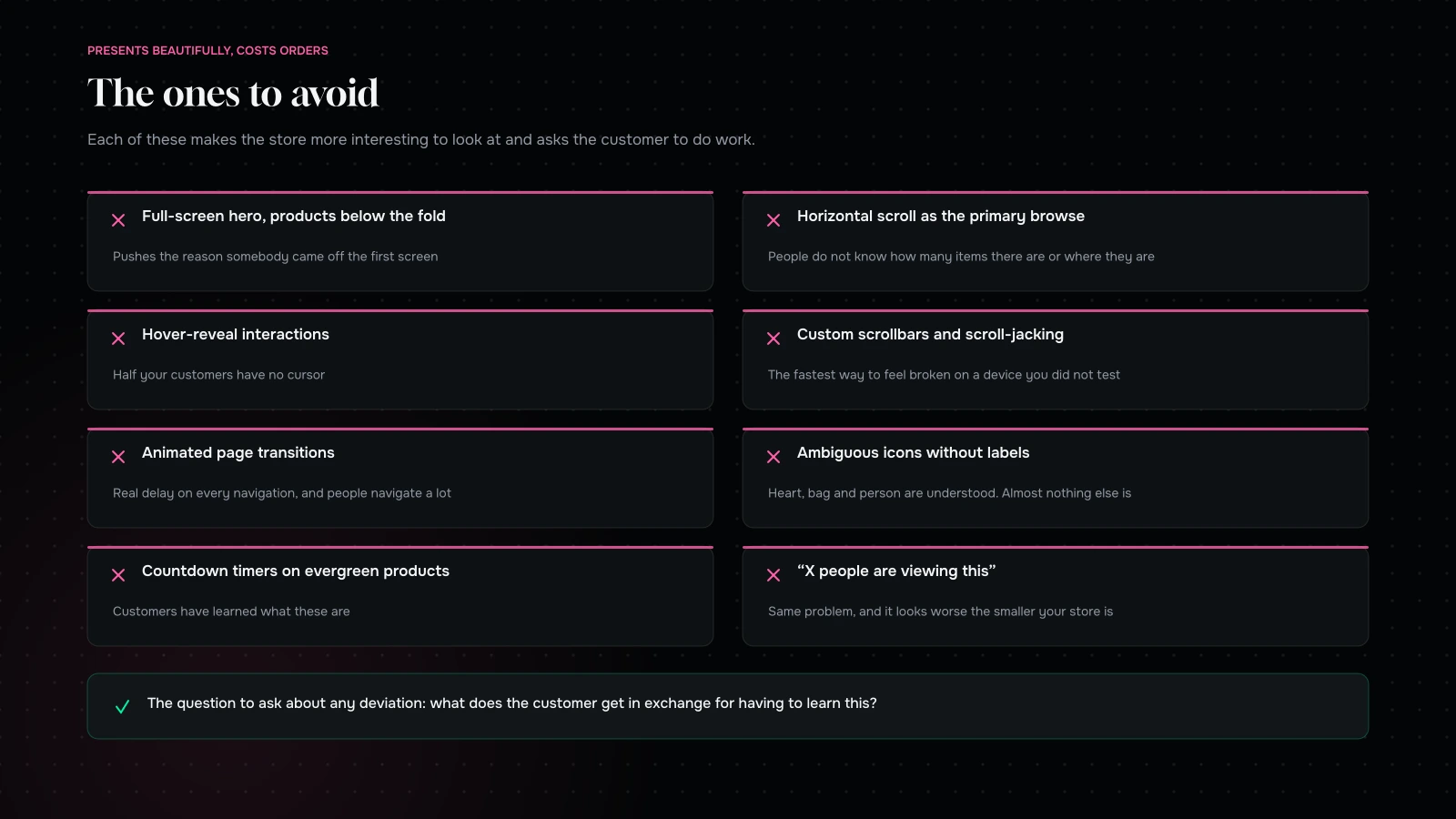
Interface patterns that look sophisticated in a design review and cost conversion in production
Every one of these presents beautifully and asks the customer to do work they did not agree to.

Full-screen hero images with the products below the fold. They present beautifully in a review and they push the reason somebody came off the first screen.

Horizontal scrolling product rows as the primary browse. Fine as a supplement, poor as the main way to see a range. People do not know how many items there are or where they are in the list.

Hover-reveal interactions. Half your customers have no cursor.

Custom scrollbars and scroll-jacking. Taking control of scrolling from the customer is the fastest way to make a site feel broken on a device you did not test.

Animated page transitions. They add real delay to every navigation, and on a store people navigate a lot.

Ambiguous icons without labels. A heart, a bag and a person are broadly understood. Almost nothing else is, and the cost of being wrong is a customer who cannot find their basket.

Countdown timers on evergreen products. Customers have learned what these are. In any category built on trust, they cost more than they earn.

“X people are viewing this.” Same problem, and it looks worse the smaller your store is.

The common thread: each of these makes the store more interesting to look at and asks the customer to do work they did not agree to.

Where distinctiveness actually belongs

Since this article spends a lot of words arguing for convention, it is worth being precise about where the opposite applies — because a store that follows every pattern and has nothing of its own is forgettable, and forgettable is its own kind of expensive.

Photography. The single largest opportunity, and the one most brands under-invest in. Your product on a white background looks like everybody’s product on a white background. Your product in a real context, shot consistently, in a way nobody else in your category is shooting, is a brand asset that works in every channel.

Writing. Product descriptions are where almost every store sounds identical, which means it is where being specific and human is cheapest to do and most noticeable. The interface should be conventional; the words in it should not be.

The range and the offer. A bundle nobody else offers, a size nobody else stocks, a guarantee nobody else gives. This is product strategy expressing itself as merchandising, and no interface pattern competes with it.

Colour and typography. Within a conventional layout, these carry an enormous amount of brand. The layout of a product page can be entirely standard and the page can still be unmistakably yours.

The moments around the transaction. Order confirmation, dispatch notification, the packaging, the note in the box. Almost universally neglected, entirely unconstrained by convention, and disproportionately what people remember.

The rule we work to: be conventional where the customer is deciding how, and distinctive where they are deciding whether.

A quick audit of your own store

Twenty minutes on a phone, marking each as present, partial or missing.

PatternPresent?Where it lives
Filters with counts, no dead endsCollection
Filters persist after viewing a productCollection
Price visible in the gridCollection
Sticky add-to-cart on mobileProduct
Unavailable variants shown, not hiddenProduct
Fit or compatibility help inlineProduct
A delivery date, not a durationProduct
Reviews with attribution and contextProduct
Returns in one sentence near the buttonProduct
Cart drawer rather than a pageGlobal
Wallets above the checkout formCheckout
Threshold progress in the cartCart
Error states that keep the dataCheckout

Thirteen rows. Most stores we audit have seven or eight, and the missing ones are almost always the cheap ones — which is the whole point of running the list rather than commissioning a redesign.

When to break a pattern

Not never. Three situations where deviation is correct.

When your product genuinely does not fit the pattern. Configurable, made-to-order, subscription-first, service-and-product hybrids. Forcing an unusual product into a conventional product page produces a page that lies about what you sell.

When the pattern is solving a problem you do not have. A large-catalogue filtering system on a store with eleven products is complexity for its own sake.

When you have evidence. Real evidence, from your own store, not a case study from a business with different customers. And be aware that most stores cannot generate that evidence reliably, which is an argument for conventions rather than against measurement.

Outside those three, the honest question to ask about any deviation is: what does the customer get in exchange for having to learn this? If the answer is “it looks better”, the trade is usually bad.

Accessibility is a pattern set too

Worth saying explicitly, because it is usually filed under compliance and it belongs here.

Almost everything that makes a store usable for somebody with a disability also makes it usable for somebody in a hurry on a phone in bright sunlight — which is most of your customers.

Contrast that survives daylight. The pale grey secondary text that looks refined on a designer’s monitor is unreadable outdoors on a phone at half brightness.

Targets big enough to hit with a thumb. The same rule that helps somebody with limited dexterity helps everybody walking down a street.

Labels on form fields that do not disappear when you type. Placeholder-only labels fail for screen readers and they also fail for a distracted person who forgot what the third field was.

Focus that is visible. Keyboard users need it. So does anybody navigating a checkout with an external keyboard, which is more people than you think.

Text that can be resized. Layouts that break at larger text sizes break for a large and growing share of ordinary customers.

Error messages that say what to do. Announced properly for assistive technology, and clearer for everybody.

None of this requires a separate project or a specialist audit to get most of the way. It requires treating the six items above as part of the pattern set rather than as a compliance exercise scheduled after launch and then quietly dropped.

Introducing patterns without a redesign
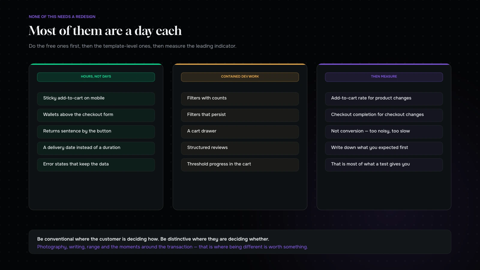
How to introduce interface patterns incrementally: fix the cheap ones first, group by template, and measure the leading indicator rather than conversion
None of these need a redesign. Most of them are a day each.

The good news is that almost none of this requires rebuilding anything.

Do the free ones first. Sticky add-to-cart, wallets moved above the form, returns sentence next to the button, delivery date instead of duration, error states that keep the data. Each is hours, not days.

Then the template-level ones. Filters with counts, persistent filters, cart drawer, review structure. These are development work but they are contained.

Measure the leading indicator, not conversion. Add-to-cart rate for product page changes, checkout completion for checkout changes. They move sooner and with less noise, which matters because most stores cannot detect a conversion change at all.

And write down what you expected before you ship. It is most of what a test gives you, minus the traffic requirement.
Two patterns worth more than the rest

If the list feels long, these two do more than everything else combined on most stores.

The sticky add-to-cart on mobile. A product page on a phone is several screens tall. The customer reads the description, looks at the images, checks the reviews, decides — and the buy button is now four screens above them. Some scroll back. A share do not, and that share is entirely recoverable for about an hour of work. If you implement one thing from this article, implement this one.

Error states that keep the data. A customer at the payment step has done every difficult thing already. Losing their details to a mistyped card number is the most expensive possible moment to make somebody start again, and the platform default frequently does exactly that. Keep the values, mark the field, scroll it into view, say plainly what to change. A day of work, and it recovers people who had their card in their hand.

Both are invisible in a design review, neither appears in a portfolio, and between them they are worth more than any homepage.

What to do on Monday

Twenty minutes on a phone with the thirteen-row list, marking present, partial or missing. An hour to implement the sticky buy button. A day for the error states. Then the template-level work, in whatever order your own numbers suggest.

Do not turn it into a project with a name and a kick-off. Patterns are a maintenance habit, not an initiative — you add them as you notice them missing, and you check the list again in six months when three of them have quietly regressed because somebody installed something.

That is genuinely the whole method.

What it comes down to

Commerce interfaces are not where a brand should be distinctive. They are where a customer should be able to stop thinking.

Use the patterns: filters that behave, a sticky buy button, variants that show what is gone, a delivery date, reviews with names attached, returns stated in a sentence, a cart drawer, wallets at the top, and error states that keep the data. Avoid the ones that photograph well and cost comprehension.

Then put the distinctiveness where it belongs — in the photography, the writing, the product and the offer. That is where customers actually notice it, and it is where being different is worth something.

Want to know which patterns your store is missing? Send us your URL through the contact form and we will go through the list on a real phone and come back with what is missing, what is costing you most, and which three we would add first. Most of them are a day each.

You can also read eight product pages taken apart, or where mobile checkout leaks.

Most of them are a day each

Send us your store and we will go through the pattern list on a real phone.

You will get back which patterns are missing, which of them is costing you most, and the three we would add first, with a note on how long eachtakes.

None of it requires a redesign. Most stores we audit have seven or eight of the thirteen, and the missing ones are almost always the cheap ones.

NDA on request · you will hear back from Sayan or a senior lead, never a bot

More on Design & Brand

Brand, packaging and interface decisions that have to earn their place.

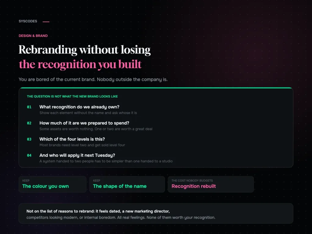
Rebranding without losing the recognition you have built
Design & Brand

Rebranding without losing the recognition you have built

How to audit the recognition you already own, the four levels of rebrand and which one you probably need, what to keep, how to roll it…
21 Aug 202613 min read
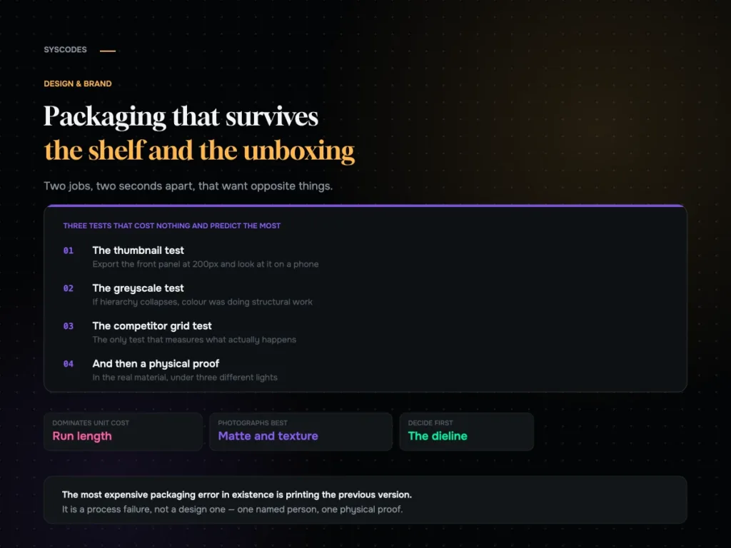
Packaging that survives both the shelf and the unboxing video
Design & Brand

Packaging that survives both the shelf and the unboxing video

How the shelf and the unboxing want opposite things, three free tests every design should pass, what actually drives unit cost, and a pre-press checklist.
21 Aug 202612 min read
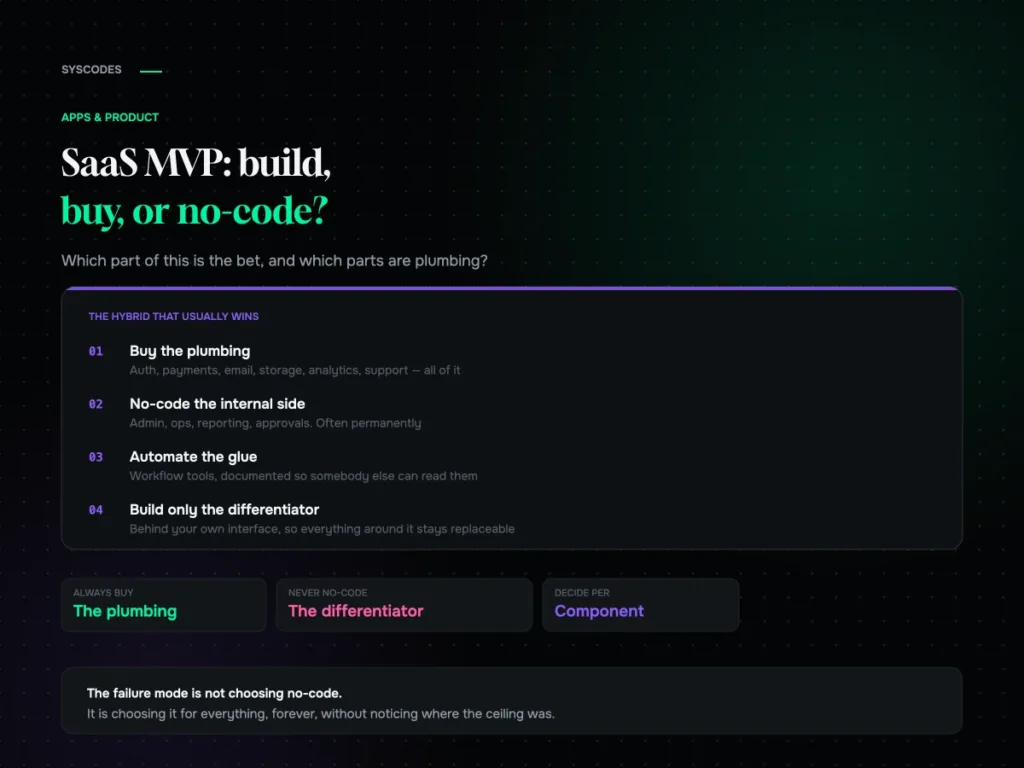
SaaS MVP: build, buy, or no-code?
Apps & Product

SaaS MVP: build, buy, or no-code?

When no-code is the right call, the six ceilings to know in advance, how to keep a migration path open from day one, and the hybrid…
21 Aug 202613 min read
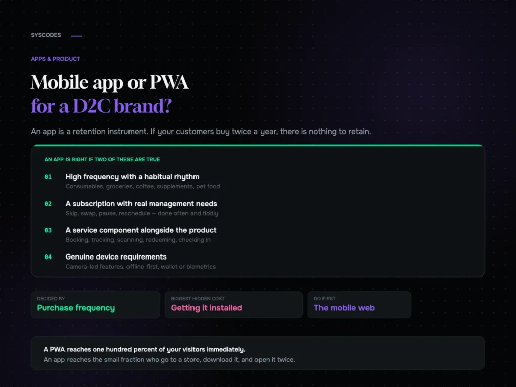
Mobile app or PWA for a D2C brand
Apps & Product

Mobile app or PWA for a D2C brand?

The purchase-frequency threshold that decides app versus web, what an app really costs, what a PWA gets you, the install funnel nobody models, and what to…
21 Aug 202612 min read
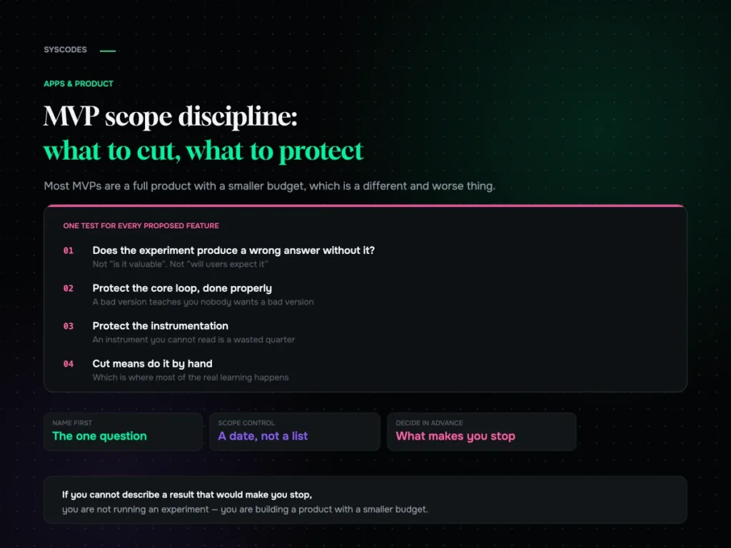
MVP scope discipline: what to cut and what to protect
Apps & Product

MVP scope discipline: what to cut and what to protect

The one question that decides MVP scope, four categories of feature, what to protect against false negatives, five ways to fake it before building, and how…
21 Aug 202614 min read
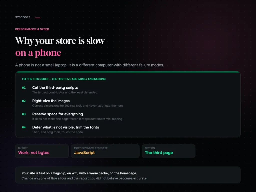
Why your store is slow on a phone and what actually fixes it
Performance & Speed

Why your store is slow on a phone, and what actually fixes it

Why a phone is a different runtime, why JavaScript is the expensive resource, the fix order that is mostly not engineering, and the five conditions for…
21 Aug 202613 min read
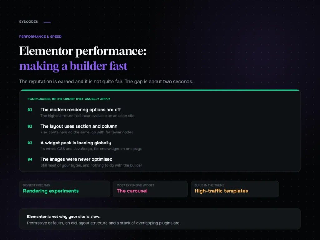
Elementor performance: making a page builder fast
Performance & Speed

Elementor performance: making a page builder fast

Where an Elementor site’s weight actually comes from, the rendering options most sites still have switched off, widget discipline, and a ten-setting checklist.
21 Aug 202613 min read
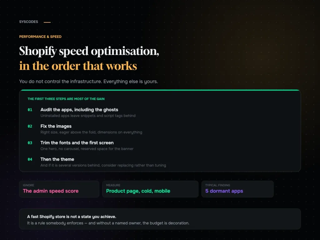
Shopify speed optimisation in the order that works
Performance & Speed

Shopify speed optimisation: what to do, in order

An ordered Shopify speed checklist: the app audit and the ghosts left by uninstalled apps, theme weight, images, fonts, the first screen, collections, cart behaviour and…

21 Aug 202613 min read
Question about your project? Tell us in 30 seconds — a senior lead replies.