Home/Blog/Performance & Speed
Performance & Speed · 11 min read

Why your store is slow on a phone

The site loads in a second on your phone, so the report must be wrong. Both observations are correct. They are just describing twoentirely different computers.

Why your store is slow on a phone and what actually fixes it
S
Sayan SahaUpdated August 2026 · 11 min read

The most common reaction to a mobile performance report is disbelief. Somebody opens the site on their own phone, it loads in about a second, and the report gets filed under “tools being pessimistic”.

Both observations are correct. The site is fast on a recent flagship on office wifi with a warm cache. It is slow on a three-year-old mid-range Android on mobile data on a page that phone has never seen. Those are not the same computer, and most of a store’s traffic is closer to the second one than to the first.

This is what is actually different about a phone, why the usual advice under-delivers, and what fixes it.

A phone is not a small laptop
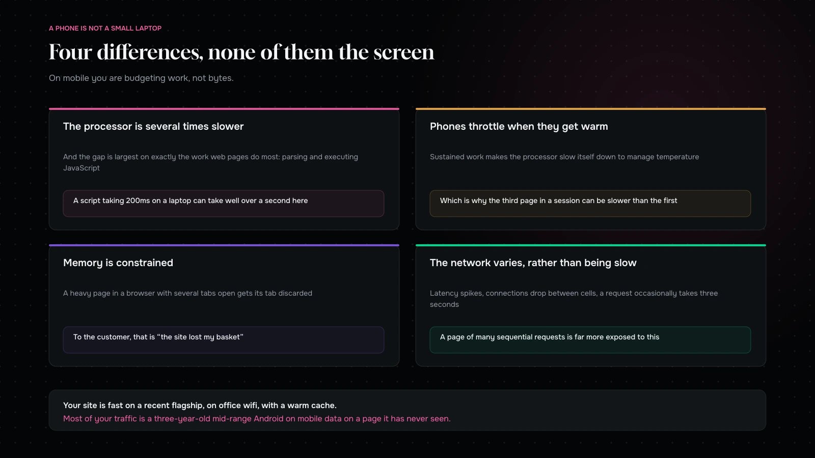
Four hardware realities that make a phone a different runtime: slower CPU, thermal throttling, memory pressure and variable networks
A phone is not a slower version of your laptop. It is a different computer with different failure modes.

Four differences that matter, none of which is screen size.

The processor is several times slower, and the gap is largest on exactly the work web pages do most: parsing and executing JavaScript. A script that takes 200 milliseconds on a laptop can take well over a second on a mid-range phone, and that is before anything else on the page competes for the same core.

Phones throttle when they get warm. Sustained work — a heavy page, a long session, video, a hot pocket — causes the processor to slow itself down to manage temperature. This is why the third page in a session can be slower than the first, which is a failure mode desktops essentially do not have.

Memory is constrained, and the browser is ruthless about it. A heavy page in a browser with several tabs open gets its tab discarded. To the customer that is “the site lost my basket”. To your analytics it is an abandonment.

The network is variable rather than simply slow. Latency spikes, connections drop between cells, and a request that normally takes 80 milliseconds occasionally takes three seconds. A page that depends on many sequential requests is far more exposed to this than one that does not.

Put those together and the practical rule is: on mobile you are budgeting work, not just bytes.

Not all bytes cost the same

This is the single most useful thing to understand, and it is why “reduce page size” is incomplete advice.
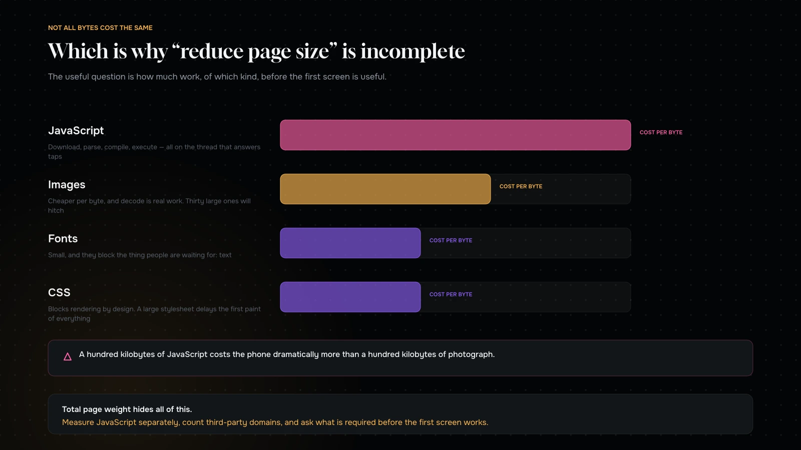
The relative cost of different resource types on a phone: JavaScript, images, fonts and CSS, by download, parse and execution
A hundred kilobytes of JavaScript costs far more than a hundred kilobytes of image. Total page weight hides this entirely.

JavaScript is the most expensive thing you can ship. It has to be downloaded, parsed, compiled and executed, and all of that happens on the main thread — the same thread that responds to taps. A hundred kilobytes of JavaScript costs the phone dramatically more than a hundred kilobytes of photograph.

Images are cheaper per byte, and not free. They still have to be decoded, which is real work, and a page with thirty large images will visibly hitch even on a good connection. Correct sizing matters as much for decode cost as for download.

Fonts are small and block the thing people are waiting for, which is text. Their cost is disproportionate to their size.

CSS blocks rendering by design. A large stylesheet delays the first paint of everything.

So the useful metric is not total page weight. It is: how much JavaScript, how many images and at what dimensions, and how much of it is required before the first screen can be useful.

Why your test said it was fine

Four reasons that all point the same way.

You tested on a good phone. Recent flagships are extremely fast and are not representative of your traffic.

You tested on wifi. Office wifi hides everything that mobile networks reveal.

You tested with a warm cache. Your second visit downloads almost nothing. Your customers’ first visit downloads all of it.

You tested the homepage. Which is usually the lightest important page and the one fewest customers enter on.

The device toolbar in a desktop browser is not a fix for this. It simulates the viewport, which is the one thing that was never the problem, and it runs on your laptop’s processor.

The main thread, which is where the feeling comes from

Loading and responding are different problems, and mobile users notice the second one more.

Everything your page does in JavaScript happens on one thread. While it is busy, taps do nothing. The symptom is familiar: a customer taps a variant swatch, nothing happens, they tap again, and either two things happen or they conclude the site is broken.

That thread is contended by every script on the page — your theme, your apps, your analytics, your chat widget, your personalisation tool. Each one is individually small. The sum is why the site feels sluggish even when the load time looks acceptable.

The fixes are all versions of “do less, later”:

Ship less JavaScript. The only fix that always works.

Defer everything not needed for the first interaction. Chat, reviews, recommendations, anything below the fold.

Break long tasks up so the browser can respond between them.

Move work off the device where you can — server-side rendering, server-side tagging, precomputed data instead of client-side calculation.

Where the JavaScript actually comes from

Since JavaScript is the expensive resource, it is worth knowing what is generating it on a typical store. In our audits it breaks down roughly the same way every time.

Third-party marketing and analytics. Usually the largest block, and usually the least examined. Tag managers in particular accumulate: every campaign adds a tag, nothing is ever removed, and nobody has opened the container in a year.

Apps and plugins. Reviews, upsells, chat, personalisation, back-in-stock, currency switching, loyalty. Each is modest and several load on every page rather than the one that needs them.

The theme. Sometimes substantial on older themes that load everything globally, and much better on modern ones that load per section.

Frameworks and libraries. A carousel library, an animation library, a date picker, occasionally two of each because different people solved different problems.

Your own code. Almost always the smallest slice, which is worth telling your developers when the conversation turns to optimisation.

The order to attack it in follows directly: the tag container first, then the app list, then the theme, and only then anything anyone wrote deliberately. That is the opposite of the order most performance projects take, because the first two are political and the last one is technical, and technical work is easier to schedule than a conversation about whose tool gets removed.

Two questions that settle most arguments

“What does this cost on a mid-range phone?” Ask it about every proposed addition. Not “is it heavy” — a number, measured, on the product page, before and after. Most requests survive this question and a meaningful minority quietly withdraw, which is the point.

“Which page did you test?” Ask it about every optimistic report. If the answer is the homepage, the report is about a page most of your customers never see. Product page and checkout, or the number is decoration.

Neither question requires you to be technical. Both change the conversation more than any tool.

The session, not the page load

One more reframe, because it changes what you optimise.

Almost every performance tool measures a single page load, cold, in isolation. Real customers do something quite different: they land on a product page, browse three or four more, open a filter, add to cart, open the cart, and go to checkout. That is a session, and it is where the phone’s limitations actually bite.

Three things only show up in a session.

Accumulated memory. Each page leaves something behind — event listeners, cached data, images held in memory, third-party scripts that never clean up. By page four the tab is heavier than it was at page one, and on a constrained device that is when things start being discarded.

Thermal throttling, as above. The first page load is the fastest one your customer will get.

Repeated cost. A script that loads on every page pays its parse and execution cost on every page. A cached file avoids the download and not the work, which is why “it is cached, so it is free” is only half true.

The practical implication: measure a journey, not a page. Load a product page, navigate to two more, add to cart, open checkout, and watch what happens to responsiveness along the way. If the fourth interaction is noticeably worse than the first, you have a session problem, and no amount of first-load optimisation will fix it.

This is also the honest reason that a store can score well and still feel bad. The score measured the best moment of the visit.

The order we would fix it

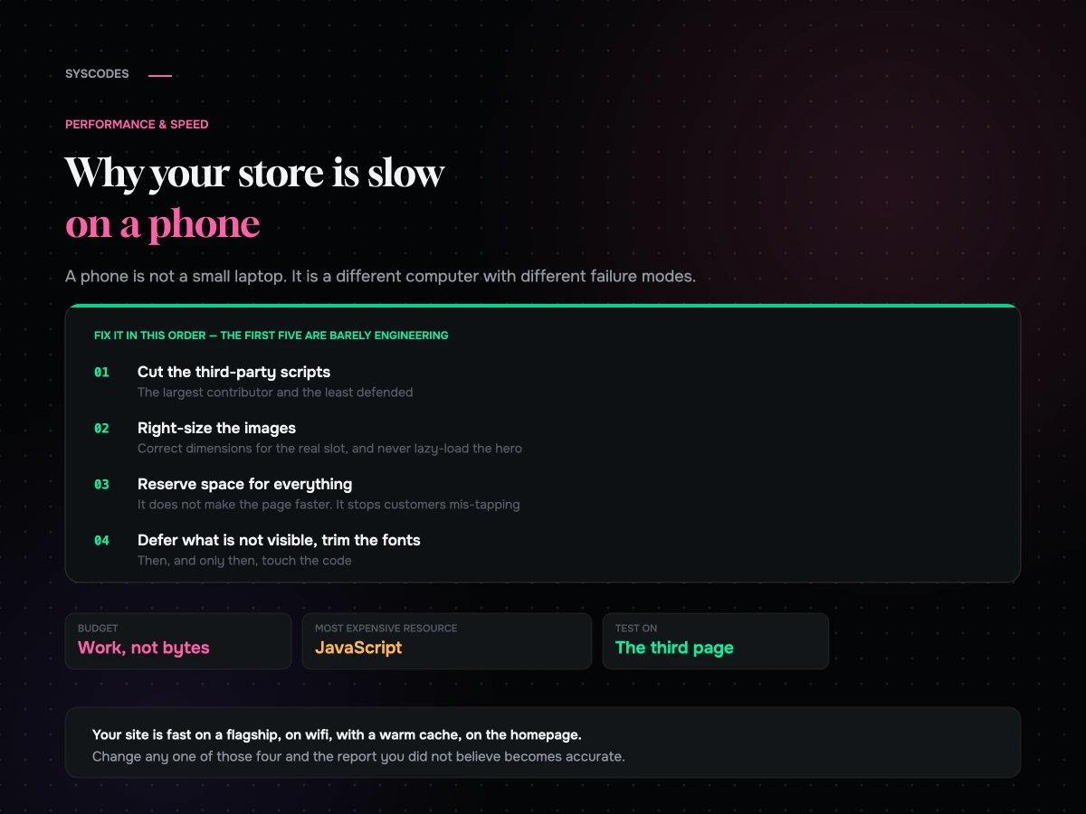
One: cut the third-party scripts. Almost always the largest single contributor and almost always the least defended. Count the distinct third-party domains on a product page; if it is more than a handful, start there.

Two: right-size the images. Correct dimensions for the actual slot at the actual device width, modern format, and never lazy-load the one above the fold. This is mechanical and it is most of your bytes.

Three: reserve space for everything. Dimensions on images, fixed heights for injected banners, overlay rather than push for consent. This does not make the page faster and it stops customers mis-tapping, which is worth more.

Four: defer what is not visible. If it is below the fold, it can load after.

Five: trim the fonts. Two families, the weights you use, one preloaded.

Six: then the code. Splitting bundles, removing dead JavaScript, breaking long tasks. Real gains, real effort, and worth doing after the first five rather than instead of them.

Notice that the first five are mostly not engineering. That is consistent with what we find: most mobile slowness is accumulated decisions rather than bad code.

A budget you can actually enforce

Performance advice fails when it has no number attached, because there is nothing to fail. Here is a set of numbers that works as a starting point for a commerce product page. Adjust them to your category; the point is that they exist and somebody checks them.

WhatA reasonable ceilingWhy this one
JavaScript, compressedThe smallest number you can defendThe most expensive resource per byte, by a distance
Distinct third-party domainsA handful, not a dozenEach is a connection, a script and a risk you do not control
Images above the foldOne, correctly sizedEverything else can wait until the customer scrolls
Font filesTwo families, the weights you useSmall in bytes, disproportionate in perceived speed
Layout shift after first paintNone that a customer can seeThis is the one that causes mis-taps
Response to a tapImmediate, every timeThe difference between “fast” and “feels fast”

Put those on a page, show them at your weekly review, and make anybody adding something to the storefront say what it does to them. That single ritual does more for long-term performance than any individual optimisation, because it converts an occasional project into a standing constraint.

Resilience, which nobody budgets for

Because networks fail rather than merely being slow, a store that handles failure gracefully feels considerably faster than one that does not — even when the numbers are identical.

Do not lose the basket. A dropped connection mid-session should not empty a cart. This is the single most damaging failure mode on mobile and it is entirely preventable.

Retry quietly. A failed request for a price or a stock check should try again rather than showing an error, and it should never leave the interface in a state the customer cannot get out of.

Give feedback on tap immediately, before the response arrives. If a button takes 400 milliseconds to do anything, change its state on the tap. Otherwise people tap again, and a double submission is either an error or a duplicate order.

Fail forward on non-essential things. If the reviews widget cannot load, the page should still be a working product page. A third-party script failure that blocks a purchase is a design decision somebody made without meaning to.

Cache what does not change. Repeat visitors should be downloading very little, and on a variable network that difference is enormous.

None of this appears in a performance score. All of it is what customers mean when they say a site works well on their phone.

The realities outside the flagship market

If a meaningful share of your customers are in India, Southeast Asia, Latin America or Africa — and for many D2C brands they are — the picture shifts further.

Mid-range and older Android devices are the majority, not the tail. Data is metered often enough that a heavy page is a cost to the customer as well as a delay. Connections vary enormously between a city centre and a small town, and the same customer experiences both in a week. And a large share of sessions are on a browser inside another app, which has its own constraints.

The practical consequences: a page that works on a modest device is not a nice-to-have, JavaScript budget matters more than anywhere else, and offline-ish resilience — not losing a basket when a connection drops — is worth real money. It is also why we build the Indian D2C checkout differently in the first place.

What “fast” is worth arguing for internally

The business case for this work is frequently made badly, so here is the version that survives a finance conversation.

Do not lead with a score. Nobody outside the team believes it and it is not connected to revenue in any way anybody can audit.

Lead with the gap. Conversion rate on mobile against desktop, in your own data, on the same channel. That number is uncomfortable, specific, and clearly worth money.

Attach the video. Thirty seconds of a real product page loading on a real mid-range phone on a real connection is the most persuasive artefact in this entire discipline. Play it in silence and let people count.

Scope it honestly. “Two weeks, mostly removing things, here are the four numbers we will move.” Not a quarter, not a rebuild. Performance projects lose credibility when they are sold as transformations and deliver a percentage.

Then report the same four numbers monthly whether or not anyone asked. The point is not the reporting; it is that a visible number makes the next addition to the storefront a decision rather than a default.

We would rather sell two weeks of this than three months of anything else, because it is the engagement most likely to produce a number the client can see and the least likely to require us again next year.

How to test properly

A proper mobile testing setup: a mid-range device, a real network, a cold cache, the pages that matter, and the third page of a session
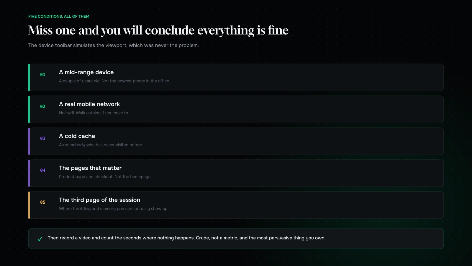
Five conditions. Miss any one of them and you will conclude that everything is fine.

Five conditions, and you need all five.

A mid-range device, a couple of years old. Not the newest phone in the office.

A real mobile network, not wifi. Walk outside if you have to.

A cold cache, as somebody who has never visited.

The pages that matter — product page and checkout, not the homepage.

And the third page of the session, not the first, because that is where throttling and memory pressure show up.

Then, in addition to any tooling: record a video and count the seconds where nothing is happening. It is crude, it is not a metric, and it is the single most persuasive artefact you can bring to a prioritisation meeting.

What it comes down to

Mobile slowness is not a smaller version of desktop slowness. It is a different computer — several times less processing power, a thermal ceiling, memory pressure and a network that varies rather than merely being slow.

That means budgeting work rather than bytes, treating JavaScript as the expensive resource it is, and doing most of the fixing in decisions rather than in code: fewer third-party scripts, correctly-sized images, reserved space, deferred loading and trimmed fonts.

And it means testing on a phone your customers would actually own, on a network they would actually use, on the page they actually land on. Everything else in this article follows from doing that once.

Want to know what your store does on a real phone? Send us your URL through the contact form and we will run it on mid-range hardware on a real network, cold, on the pages that make you money — and send back the video, the numbers, and the three things we would fix first.

You can also read Core Web Vitals for commerce, or where mobile checkout leaks.

We will send you the video

Send us your URL and we will run it on the hardware your customers actually own.

Mid-range device, real mobile network, cold cache, on the pages that make you money. You will get back the recording, the four numbers, and the three things we would fix first.

Most of what we find is not engineering. It is third-party scripts, image sizing and space that was never reserved. Which means most of it is a fortnight, not a quarter.

NDA on request · you will hear back from Sayan or a senior lead, never a bot
Question about your project? Tell us in 30 seconds — a senior lead replies.