Most stores get the majority of their traffic on phones and the majority of their revenue from desktops. Everybody knows this. Almost nobody treats it as a bug.
It gets explained away instead — mobile is for browsing, people research on a phone and buy on a laptop, that is just how it is. Some of that is true. Much less of it is true than people assume, and the part that is not true is worth a great deal of money, because it is a set of specific, fixable defects rather than a behavioural law.
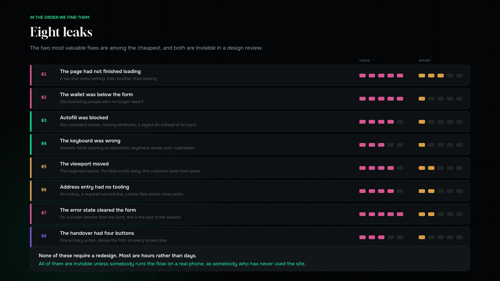
This is where the money actually leaks on a phone, in the order we find it.
The gap, and how much of it is real
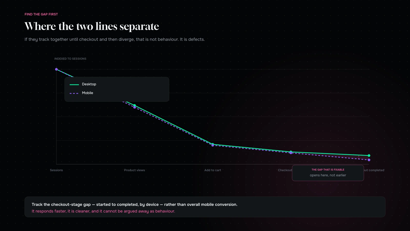
Pull your funnel split by device: sessions, product views, add to cart, checkout started, checkout completed. Then look at where the two lines separate.
If mobile and desktop track together until checkout and then diverge sharply, you do not have a browsing-versus-buying pattern. You have a checkout that is harder to complete on a phone. That is the common case, and it is the fixable one.
If they separate earlier — at product view or add to cart — the problem is upstream, in your product page, and the eight questions a product page has to answer are answered too far down for a phone.
Do this before anything else. Everything below assumes you have found the gap in checkout rather than assumed it.
The three explanations people give, and what is true
“People research on mobile and buy on desktop.” Partly true, and much more true for expensive considered purchases than for anything under about the price of a dinner. It is also self-reinforcing: a store that is hard to buy from on a phone trains its customers to come back on a laptop, and then cites that behaviour as evidence. Check the size of your average order before accepting this explanation. Below a certain value, nobody is deferring anything — they left.
“Mobile traffic is lower intent.” Sometimes true, and it depends entirely on channel mix. Social traffic is lower intent than search traffic, and social skews mobile, so a store with heavy paid social will see a mobile gap that is really a channel gap. The way to separate them is to compare mobile and desktop within the same channel. If mobile still converts materially worse on the same source, intent is not your explanation.
“Small screens are just harder.” True, and it is a reason to build carefully rather than a reason to accept the number. Everything in this article exists because small screens are harder; that is the premise, not the excuse.
The useful discipline is to hold all three explanations in reserve until after the eight leaks are fixed. Whatever gap remains at that point is the honest one, and it is usually a good deal smaller than the one you started with.
A note on speed, specifically
It deserves separating from the general performance conversation because checkout behaves differently from the rest of the store.
Nobody arrives at checkout cold from search. They arrive from your own cart, which means the browser already has your fonts, your CSS and most of your JavaScript. So the usual first-load metrics are less relevant here than two others: how quickly the page becomes interactive, and how long the payment step takes to respond after a tap.
Both are dominated by third-party scripts and by whatever your payment provider loads in an iframe. Neither shows up well in a synthetic score. Measure them the crude way — take a video of yourself completing checkout on a mid-range phone, and count the seconds where nothing is happening. That number is what your customers experience, and it is usually a shock to the team that built it.
Leak one: the page had not finished loading
Checkout is usually the heaviest page in a store because it accumulates scripts: fraud tools, address validators, analytics, chat, upsell apps. On a laptop on office wifi that is invisible. On a mid-range Android on a poor connection it is several seconds of a page that looks nearly ready and does not respond.
The behaviour it produces is not a bounce. It is a tap on a button that does nothing, then another tap, then leaving. In your analytics that looks like abandonment. It is a timing problem.
Measure checkout separately from the rest of the store, on a throttled connection, cold cache. Then count the third-party domains it talks to and ask what each one earns.
Leak two: the wallet was below the form
Express payment methods are the single biggest available win on mobile, because they replace the entire form with a fingerprint.
They only work if people see them. A wallet button placed under a long form is a wallet button that gets discovered by people who have already typed their address, which is exactly the group that no longer needs it.
Put them at the very top of checkout, above everything, with a clear separator between them and the manual path. And check they render — wallet availability depends on device, browser and configuration, and it is common to find that the button silently does not appear for a large share of visitors and nobody noticed because it appears fine on the developer’s phone.
Leak three: autofill was blocked
Every phone can fill a name, an email, an address and a card. That capability is worth more on mobile than any design decision you will make, and it is remarkably easy to break.
It breaks when input names are non-standard, when autocomplete attributes are missing or wrong, when fields are split in ways the browser does not recognise, when a JavaScript component replaces a real input with a styled div, and when a form is rendered inside an iframe that the browser will not fill.
Test it directly: on a phone with saved details, tap into your first field and see whether the whole form fills. If it does not, that is usually two hours of work and one of the highest-return fixes in this article.
Leak four: the keyboard was wrong
A numeric field that opens a full alphabetic keyboard costs a customer two extra taps and a moment of irritation, and it happens constantly. Card number, expiry, CVV, postcode and phone all want the appropriate input mode.
While you are there: check that the email field is not auto-capitalising the first letter, and that nothing is autocorrecting an address into something else. Both are default behaviours that have to be explicitly disabled and almost never are.
Leak five: the viewport moved
The most under-diagnosed mobile checkout defect.
When the keyboard opens, the viewport shrinks. If your layout responds badly, the field being typed into scrolls out of sight, or a sticky element covers it, or the page jumps. The customer loses their place mid-form and a share of them do not find it again.
Related: sticky headers and sticky cart bars that cover the payment button on smaller screens, and modals that cannot be scrolled once the keyboard is up. All of these look fine on a large modern phone and break on a smaller or older one, which is a meaningful share of real traffic in most markets.
Leak six: address entry
The longest, most tedious part of any checkout, and the part most improved by tooling.
Use an address lookup so people type three characters and pick. Pre-select the country sensibly. Do not show a company field to consumers. Do not require a second address line. Do not ask for a state where states do not exist. And if you require a phone number, say why in six words next to the field — an unexplained phone requirement reads as data harvesting and it costs orders.
For Indian stores, check pincode serviceability at entry and say so immediately if you cannot deliver, and offer a landmark field with a good prompt rather than a required one. There is more on this in COD, UPI and returns.
Leak seven: the error state

On desktop, a validation error is an inconvenience. On mobile, where the form is longer than the screen and the customer cannot see the whole thing, a badly handled error is often the end of the session.
Force these and watch: an invalid email, a declined card, an expired card, a mistyped postcode. You are looking for the form clearing, the page scrolling to the top and losing focus, an error message appearing off-screen above the fold you are currently in, and any message that says “an error occurred” without saying what to do.
The correct behaviour is unglamorous: keep every value, mark the specific field, scroll it into view, and say plainly what to change. It is a day of work and it is consistently the highest-return item we find.
Leak eight: the cart to checkout transition
A surprising number of losses happen at the handover.
On a phone, a mini-cart that requires two taps to reach checkout, or a cart page with four competing actions, or a “continue shopping” button given the same weight as “checkout”, all cost orders. So does any layout where the checkout button sits below the fold on a small screen.
One primary action, above the fold, on every screen size. Everything else secondary and visibly so.
Thumbs, not cursors
A short section on the physical part, because it is the one desktop-built checkouts get wrong most consistently.
Targets have to be big enough to hit while walking. A link that is comfortable with a mouse is fiddly with a thumb, and a “remove item” sitting a few pixels from “checkout” produces mis-taps that read as abandonment.
The bottom of the screen is the easy part. On a large phone the top corners are genuinely hard to reach one-handed. Primary actions belong low, secondary actions can live high — which is close to the opposite of desktop layout instinct.
Do not put two destructive actions next to each other. Remove, and change quantity, and apply discount, all in a row, at small sizes, is a design that manufactures accidents.
Give feedback on tap immediately. If the button takes 400 milliseconds to do anything, put the state change on the tap, not on the response. Otherwise people tap again, and a double submission is either an error message or a duplicate order — both bad.
Assume one hand and partial attention. Most mobile purchases happen while somebody is doing something else. A flow that requires concentration to get right will lose the people who are not concentrating, which is most of them.
What to fix first, if you only have a week
In this order, and this is genuinely most of the available gain.
Day one: measure. Funnel by device, checkout page weight on a throttled connection, and third-party domain count. You need the baseline to argue with later.
Day two: wallets to the top, and verify they actually render on both platforms. Then fix autofill — check the attributes, remove anything blocking it, test on a phone with saved details.
Day three: input modes and capitalisation, the whole form. An hour of work, immediately noticeable.
Day four: error states. Keep values, mark the field, scroll it into view, say what to change. This is the day with the largest single return.
Day five: the cart-to-checkout handover and the sticky elements, checked on a small screen with the keyboard open.
Then stop, leave it for a month, and read the checkout-stage gap by device. If it has not moved, the problem is upstream and you have saved yourself from redesigning the wrong thing.
What to actually test on
You cannot find any of this in a desktop browser with the device toolbar on. That simulates the screen and none of the things that matter — the network, the keyboard, the autofill store, the real touch targets, or the actual rendering engine.
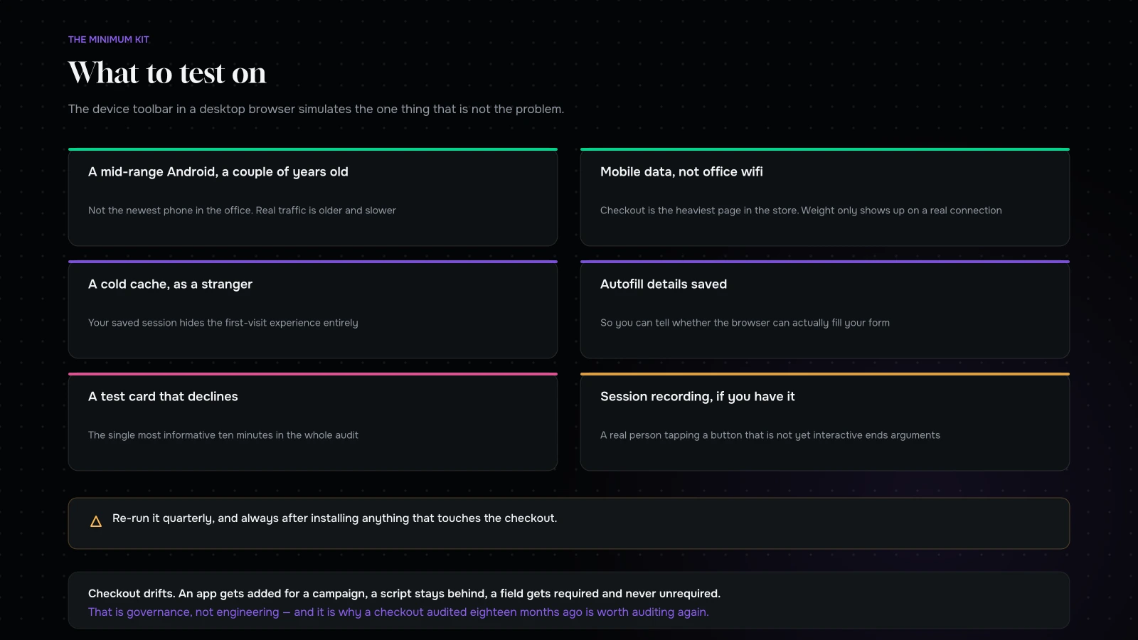
The minimum viable kit: one mid-range Android that is a couple of years old, one iPhone, both on mobile data rather than wifi, with autofill details saved, and a test card that declines. Then run the flow cold, as a stranger, without helping yourself.
Do it once a quarter, and always after installing anything that touches the checkout. Checkout drifts — an app gets added for a campaign, a script stays behind, a field gets required and never unrequired.
If you can, record the sessions. A recording of a real person tapping a button that has not become interactive yet is worth more in a prioritisation meeting than any funnel chart.

The five states worth forcing, on a phone
Ordinary testing walks the happy path. The money is in the other five.
| State | How to force it | What you are watching for |
|---|---|---|
| Declined card | A test card that fails at authorisation | Does the form survive? Does it say what to do? |
| Sold out mid-checkout | Buy the last unit from another device | Is the cart emptied, or the line handled gracefully? |
| Expired session | Leave the tab for an hour, then continue | Are the details still there, or has it all gone? |
| Invalid discount code | Type one that does not exist, then an expired one | Is the message specific, and is it visible on a small screen? |
| Interrupted payment | Start a wallet payment and cancel it | Are you returned to a usable state, or a blank page? |
Each takes ten minutes. Together they find more than a quarter of analytics staring, because these are the paths nobody designed and everybody eventually walks.
How much of the gap you should expect to close
An honest expectation, because “fix mobile” gets sold with numbers that do not survive contact with reality.
Some of the desktop–mobile difference is genuinely behavioural. High-value considered purchases really do get finished on a larger screen more often, people really do research on a phone at lunchtime and buy in the evening, and no amount of engineering changes that.
But in the stores we audit, a substantial share of the gap sits in the eight leaks above, and it is recoverable. What that means practically: do not set a target of matching desktop conversion, because you will not. Set a target of closing the checkout-stage gap — the difference between checkout started and checkout completed, by device — because that portion is almost entirely mechanical and it is the number the fixes actually move.
Track that one number monthly. It is cleaner than overall mobile conversion, it responds faster, and it cannot be argued away as behaviour.
Two things that make it worse over time
Mobile checkout does not degrade because anyone decided to make it worse. It degrades because of two ordinary habits.
Apps and scripts accumulate. Each addition is individually reasonable and each one adds weight to the heaviest page in the store. Nothing is ever removed, because removing something requires someone to be confident it is unused. Set a rule: anything added to checkout gets a review date, and the person who added it owns proving it still earns its place.
Fields get added for a campaign and never removed. A “how did you hear about us” dropdown for a quarterly report. A checkbox for a promotion that ended. A required field to support a process that has since changed. Audit the field list twice a year against the question “would we lose anything real if this were gone?”
Both of these are governance rather than engineering, and both are why a checkout that was audited eighteen months ago is worth auditing again.
What it comes down to
The mobile conversion gap is partly behavioural and mostly mechanical, and the mechanical part is a short list: a page that had not finished loading, a wallet nobody saw, autofill that was blocked, the wrong keyboard, a viewport that jumped, address entry with no tooling, an error state that cleared the form, and a handover with four competing buttons.
None of those require a redesign. Most of them are hours rather than days. All of them are invisible unless somebody runs the flow on a real phone, on real data, as somebody who has never used the site.
That last part is the whole method. Everything else is a list.
Want us to run it on yours? Send us your store URL through the contact form and we will do the mobile pass on real devices — the eight leaks, the five forced states, and the funnel split — and come back with what it is costing you and what we would fix first. Most of the list is usually a week of work.
You can also read the full checkout audit, or eight product pages taken apart.
Send us your store and we will run the mobile pass on actual phones.
The eight leaks, the five forced states, and the funnel split by device. You will get back what it is costing you, what we would fix first, and roughly how long each fix takes.
Most of the list is a week of work. If the gap turns out to be genuinely behavioural rather than mechanical, we will tell you that too — and save you from redesigning the wrong thing.
More on Conversion & Growth
Research, testing and the arithmetic behind a better conversion rate.

Eight product pages taken apart: what converts, what doesn’t
Eight anonymised product page teardowns across eight categories, the eight questions every product page has to answer, the failures that repeat, and a scorecard to run…
How many visitors do you need before an A/B test means anything?
The sample size arithmetic behind A/B testing, a table you can read against your own traffic, the five mistakes that make bad tests worse, and what…

Average order value beats conversion rate: the maths most stores get wrong
Why average order value is usually the easier lever, the arithmetic that compounds it with conversion, five mechanics in order, and how to set a free…

The checkout audit: what we check before touching a single pixel
The eight-station checkout audit we run before any design work, the five run-throughs everyone skips, the findings that recur across every store, and how to prioritise…
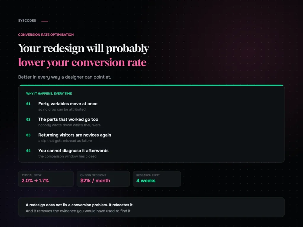
Your redesign will probably lower your conversion rate
Why a full redesign so often drops conversion, the returning-visitor dip that gets misread as failure, and the research to run before anything gets designed.