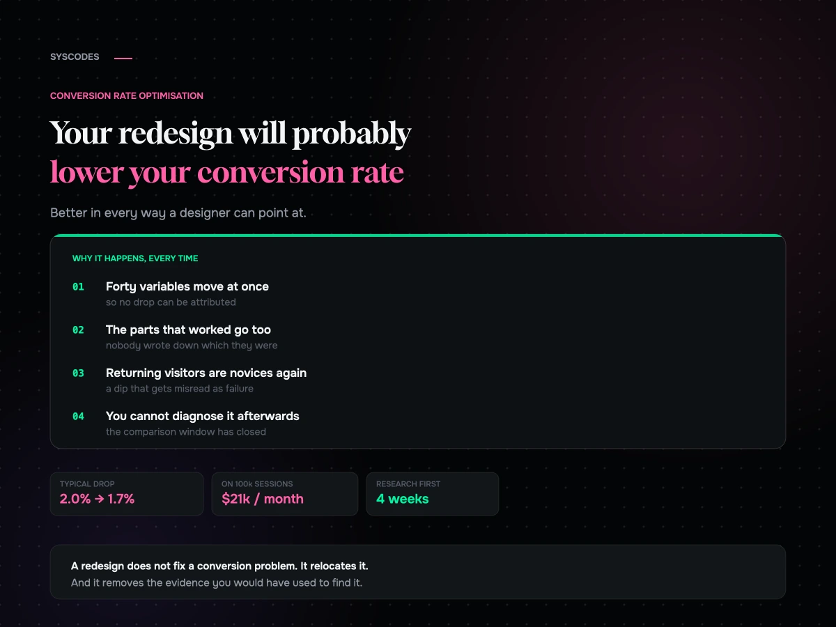
A brand comes to us with a store that converts at 1.9%. The site looks dated, the team is embarrassed by it, and there is a board deck with the word “refresh” in it. Six months and a large invoice later the new site launches, everyone agrees it looks enormously better, and conversion is 1.6%.
This happens often enough that we now treat “we want a redesign” as a symptom rather than a brief.
The uncomfortable part is that the new site usually is better. Better typography, better photography, a coherent system instead of six years of accretion. It is better in every way a designer can point at, and worse at the one thing the business needed it to do. Understanding why is the difference between a rebuild that pays for itself and one that quietly costs you a year.
What a redesign actually changes
A full redesign changes hundreds of variables simultaneously. Layout, copy, navigation, imagery, page speed, form design, the checkout, the information architecture, the URL structure. Every one of those is a lever on conversion, and you have pulled all of them at once, in the dark.
Some of what you changed was load-bearing. You did not know which parts, because nobody measured before ripping it out.
That is the whole mechanism. It is not that new designs are bad. It is that the old site had accumulated, mostly by accident, a set of things that worked — a badly designed but reassuring returns note next to the buy button, a clumsy comparison table that answered the question everyone asks, an ugly urgency line that was doing real work. A redesign sweeps those away along with everything genuinely bad, and there is no record of which was which.
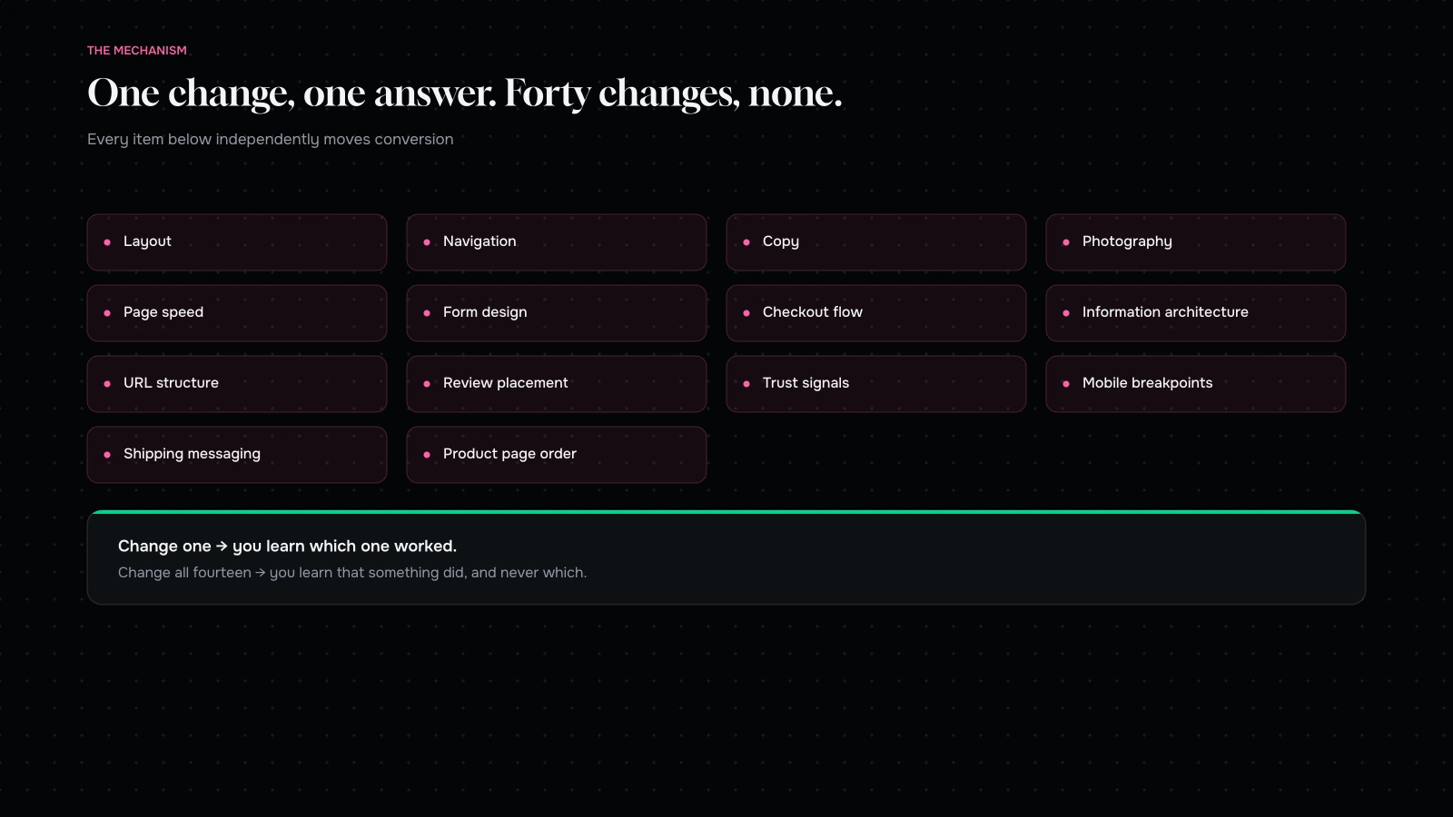
Then, because everything moved at once, you cannot diagnose the drop. You have no idea whether it was the new navigation, the longer product page, the photography that loads more slowly on mobile, or the fact that you moved the reviews below the fold. You are left guessing, and the usual response is to guess expensively.
The three-week window nobody plans for
There is also a second effect people mistake for a design failure.
Returning customers know your old site. They know where the search box was and what the checkout looked like. On the new one they are, briefly, novices. Conversion from returning visitors reliably dips for a couple of weeks after any significant redesign and then recovers as people relearn.
If you judge the redesign in week one you will be reading that dip as a verdict. If you judge it in week eight you will be reading something real. The number of teams who panic in week two and start reverting things is high, and reverting selectively into a new design usually produces something worse than either version.
So: agree in advance what window you will judge on, and agree that nobody touches anything inside it unless something is actually broken.
What to do instead, in the order we would do it
None of this is an argument against redesigning. It is an argument against redesigning first.
Find out what is actually wrong
Most teams cannot answer “where exactly are we losing people?” with a number. Before anything gets designed, that question needs a boring, specific answer.
Funnel data by device and by traffic source, because the aggregate hides everything. A store converting at 1.9% overall might be at 3.1% on desktop and 0.9% on mobile, and those are two completely different projects. Session recordings of people who abandoned, watched until it becomes obvious rather than sampled. Search terms used on your own site, which is the cheapest source of truth about what people cannot find. Support tickets and pre-sale questions, sorted by frequency — every repeated question is a page that failed to answer it. And exit surveys, which are noisy but occasionally hand you something you would never have guessed.
Four weeks of this on a store doing reasonable traffic will usually produce a ranked list of problems that has very little overlap with the list the team started with.
Fix the specific things
Now you have a list. Work it in order of expected value, changing one thing at a time so you learn something from each.
This is unglamorous and it is where the money is. In our experience the wins cluster in a handful of predictable places: the checkout, where every removed field and every added payment method is measurable; the product page’s answers to the four questions every buyer has (will it fit, when does it arrive, what if I am wrong about it, why you); mobile performance, because a two-second improvement on a slow connection is worth more than any layout change; and the returns and shipping policy, which is a conversion feature that most stores hide in the footer.
If your conversion problem is any of those, a redesign does not fix it. It relocates it.
Redesign when the constraint is real
There are genuine reasons to rebuild. The design system cannot express what the brand now is. The codebase makes every change expensive, so you are not shipping improvements at all. The mobile experience is structurally broken rather than cosmetically dated. You are replatforming anyway, which forces a front-end rebuild whether you wanted one or not — and if that is your situation, what actually breaks in a migration is worth reading before you scope it.
Those are all real. “It looks old” is not, on its own, a business case.
If you are going to redesign, do it so you can learn
Sometimes the answer is genuinely a rebuild. Fine. Then build it so a drop is diagnosable.
Carry the winners across deliberately. Before design starts, write down everything on the current site that is known to work — every test you have won, every element you have evidence for. That document is an input to the design brief, not a nice-to-have. Without it, three years of hard-won learning gets redesigned away in an afternoon by someone who never saw the results.
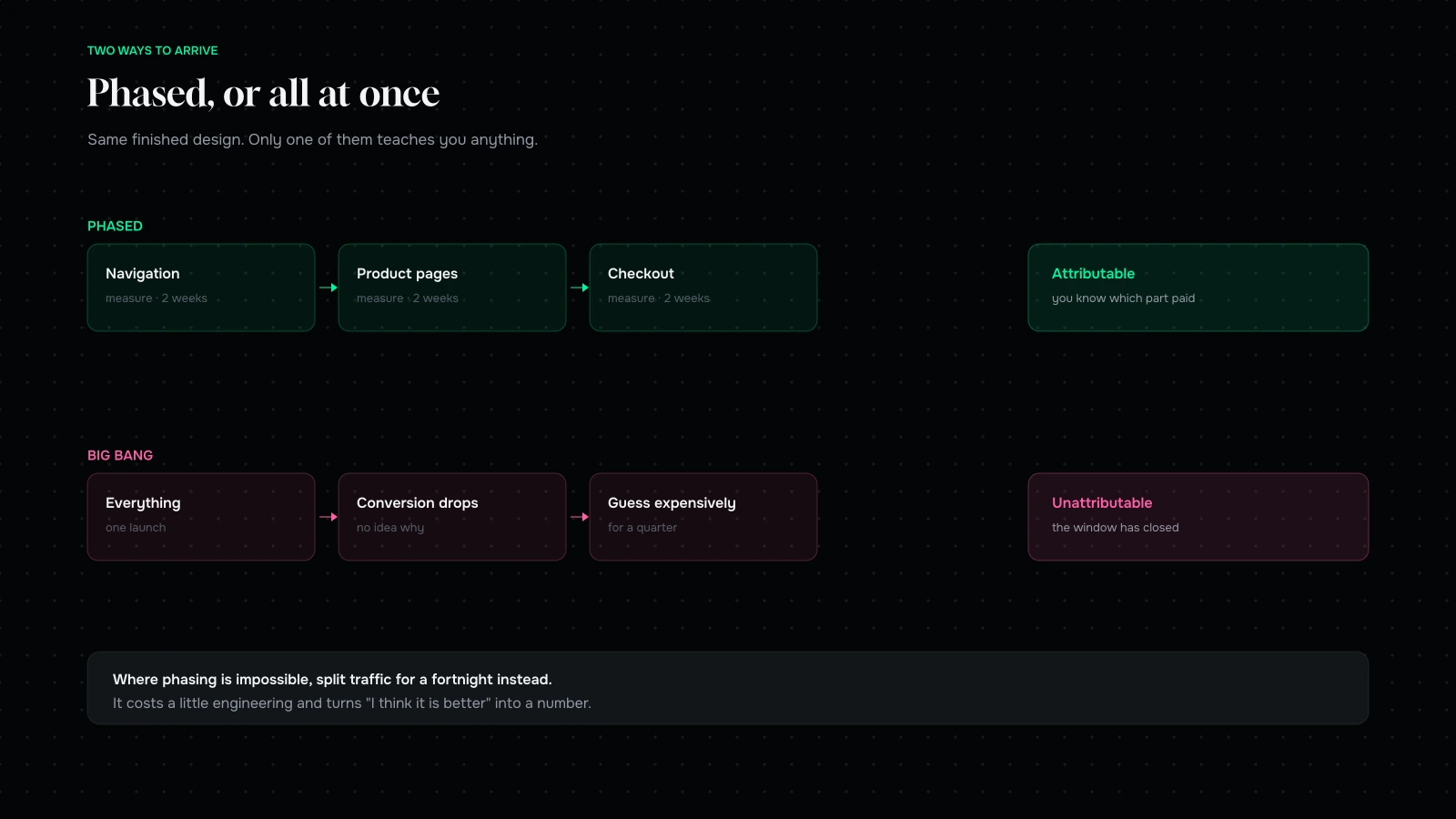
Ship it in phases where you can. Navigation first. Then product pages. Then checkout. Each phase gets its own before-and-after, so when something drops you know what dropped it. This is slower and it is how you keep the learning.
Where phasing is impossible, run it as a real test. Split traffic between old and new for a fortnight. It costs a bit of engineering and it converts “I think it is better” into a number. If you cannot split traffic, at minimum hold a stable comparison window and instrument the funnel identically on both.
Instrument before you launch, not after. Every event you will want in week three has to exist in week zero. Retrofitting analytics onto a live site to explain a drop is a miserable way to spend a fortnight, and the data will not be comparable anyway.
Keep the old site reachable. Not live, but deployable. If the drop is severe and unexplained, being able to go back is worth the small cost of keeping it.
The number that matters more than conversion rate
One more thing, because conversion rate on its own is a bad target.
It is a ratio, and ratios move for reasons that have nothing to do with quality. Run a discount and conversion goes up while margin falls. Cut paid traffic and conversion rises because you removed your least-qualified visitors. Add a top-of-funnel content strategy that works and conversion falls while revenue climbs.
We would rather look at revenue per session, which cannot be gamed the same way, alongside average order value and the returning-customer rate. A redesign that lifts revenue per session while conversion rate stays flat is a success. One that lifts conversion by discounting harder is not, and the aggregate number will not tell you which you have.
What we tell people who ask for a redesign
The conversation usually goes like this. What are the three things you believe the redesign will fix? Of those, how many are design problems rather than merchandising, performance or trust problems? What is your current conversion rate by device, and where in the funnel do you lose the most people? What have you tested in the last twelve months, and what did you learn?
If those questions have good answers, a redesign has something to aim at and we will happily build it. If they mostly do not, we will suggest four weeks of conversion research first, and quite often that research changes what gets built — or shows that the site is fine and the problem is upstream of it.
It is a smaller piece of work than a redesign and it makes the redesign better if you still want one. Telling somebody their expensive project should be a cheaper project first is not a good way to win a big invoice, but it is a good way to have a client in three years.
Where the wins actually are
Having run this exercise on a lot of stores, the ranked list comes out remarkably similar. Not identical, but similar enough that it is worth writing down what tends to be near the top before you spend four weeks confirming it.
Checkout, every time. Every field you remove is measurable. Every payment method you add that your audience actually uses is measurable. Guest checkout, if you do not offer it, is usually the single largest available win in the whole funnel. Address autocomplete removes a genuine failure point on mobile, where typing a postcode with fat thumbs on a moving train is where a share of your carts quietly die.
The four questions on a product page. Will it fit me, or my situation. When will it actually arrive. What happens if I am wrong about it. Why should I buy it from you rather than the other tab. Most product pages answer one and a half of those, beautifully. A page that answers all four badly outperforms a page that answers two of them beautifully, which is an uncomfortable thing for designers to hear and is nevertheless true.
Mobile performance, specifically on a bad connection. Not your Lighthouse score on office wifi. The experience on a mid-range Android phone on 4G in a lift. A second and a half off that is worth more than any amount of layout refinement, and it is invisible in every design review because design reviews happen on fast laptops.
Returns and shipping, stated early. These are conversion features, not legal small print. A store that says “free returns for 30 days, no questions” next to the buy button converts better than one that hides the same policy in the footer, and it is the same policy.
The reassurance nobody designs. Reviews near the decision rather than at the bottom. A real photograph of the product in a real setting. A phone number, even one nobody rings. Stock levels. These accumulate on old sites by accident and get swept away by redesigns because individually each looks like clutter.
None of that list requires a new design system. All of it is cheaper than a rebuild.
Considered purchases behave differently
Everything above assumes a fairly ordinary ecommerce funnel. If your product is expensive, technical, or sold to a business, the arithmetic changes and the advice changes with it.
A B2B or high-consideration buyer does not convert in a session. They visit four times over three weeks, forward a page to a colleague, and eventually fill in a form or ring you. Session-based conversion rate barely describes that, and optimising for it can actively make things worse — a shortened form gets you more leads of lower quality, which looks like a win in analytics and feels like a loss to whoever has to call them.
For those funnels we look at different things. Assisted conversions rather than last-click. The share of enquiries that turn into a real conversation. Time from first visit to enquiry, which tells you whether the site is doing the work of persuading or just collecting people who were already convinced. And the questions your sales team gets asked repeatedly, which are the actual content brief.
The redesign trap is the same, though. A B2B site that gets rebuilt to look modern and loses the four case studies that were doing the persuading will produce more traffic and fewer conversations, and the dashboard will look fine.
A worked example of the trap
Here is the shape of it, using round numbers.
A store does 100,000 sessions a month at 2% conversion and an average order value of $70. That is 2,000 orders and $140,000.
The redesign lands. Conversion drops to 1.7% — not catastrophic, and easy to attribute to the “settling in” period everyone was warned about. Sessions are unchanged. That is 1,700 orders and $119,000. The shortfall is $21,000 a month.
Nobody panics, because the drop is small and the explanation is plausible. Three months later it has not recovered, and by then the change is old news and nobody is looking at it as a regression. That is $63,000 gone, on top of the cost of the redesign, and it is now extremely difficult to diagnose because the comparison window has closed and half a dozen other things have changed since.
The alternative version: the same store spends four weeks on research, ships eight specific changes over the following quarter, and measures each. Five do nothing. Two produce small gains. One — guest checkout, or a shipping promise moved above the fold — produces most of the improvement. Conversion goes to 2.3%. That is $161,000 a month, and more importantly the team now knows which change did it, which is knowledge that compounds into every decision after.
The second version is less satisfying to look at. It is also the one that pays for itself.
We would rather sell you four weeks of research than six months of the wrong thing.
Send us your store and your current numbers. We will come back with where you are actually losing people, and whether that is a design problem at all.
If the honest answer is that the site is fine and the problem is upstream of it, we will tell you that. It is a smaller invoice and a better outcome.
More on CRO
Research, testing and the arithmetic behind a better conversion rate.

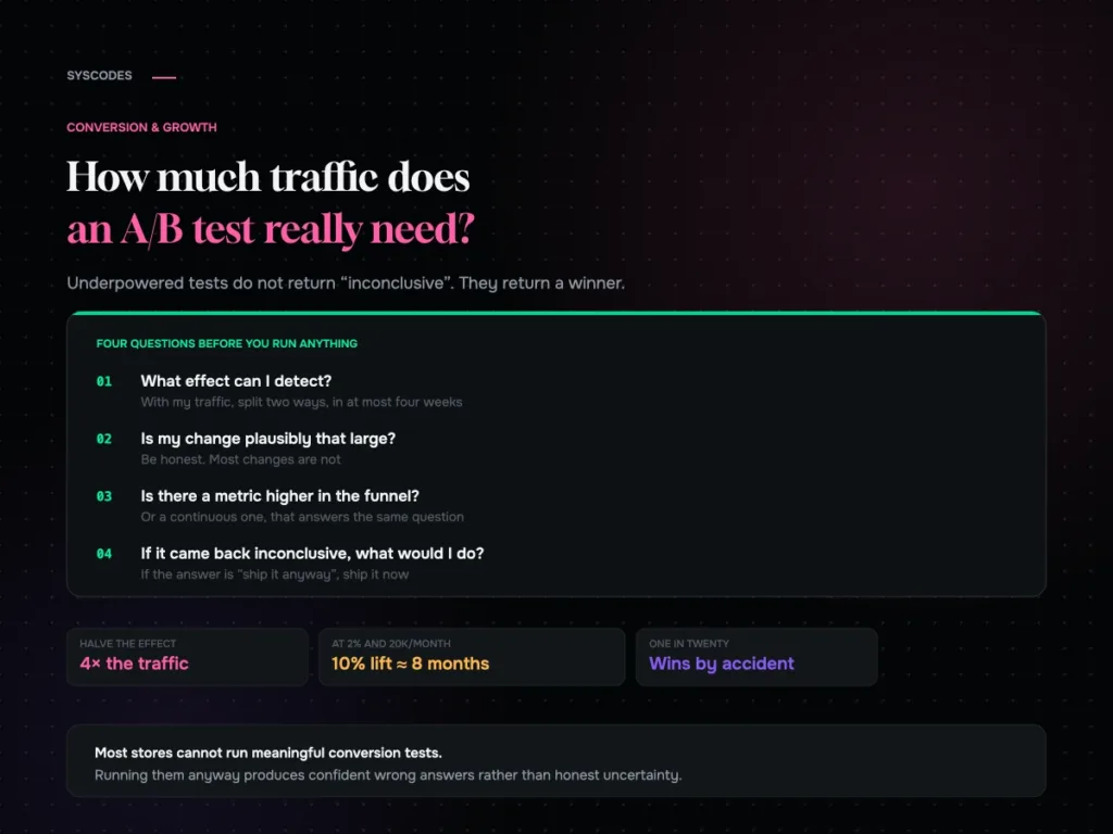
How many visitors do you need before an A/B test means anything?
The sample size arithmetic behind A/B testing, a table you can read against your own traffic, the five mistakes that make bad tests worse, and what…
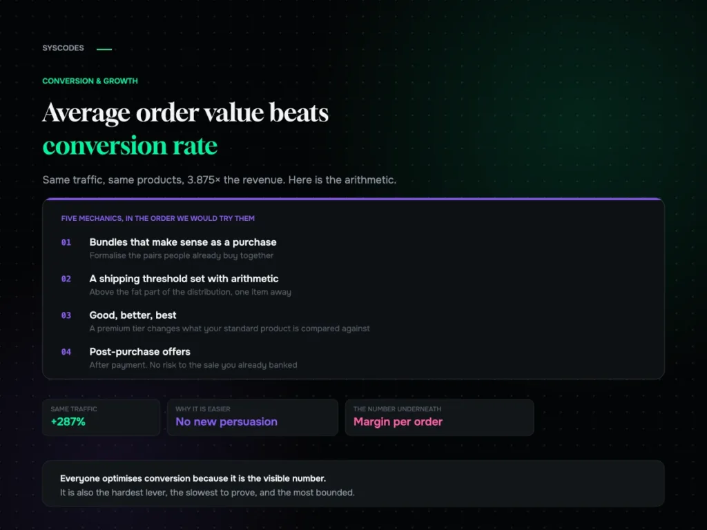
Average order value beats conversion rate: the maths most stores get wrong
Why average order value is usually the easier lever, the arithmetic that compounds it with conversion, five mechanics in order, and how to set a free…
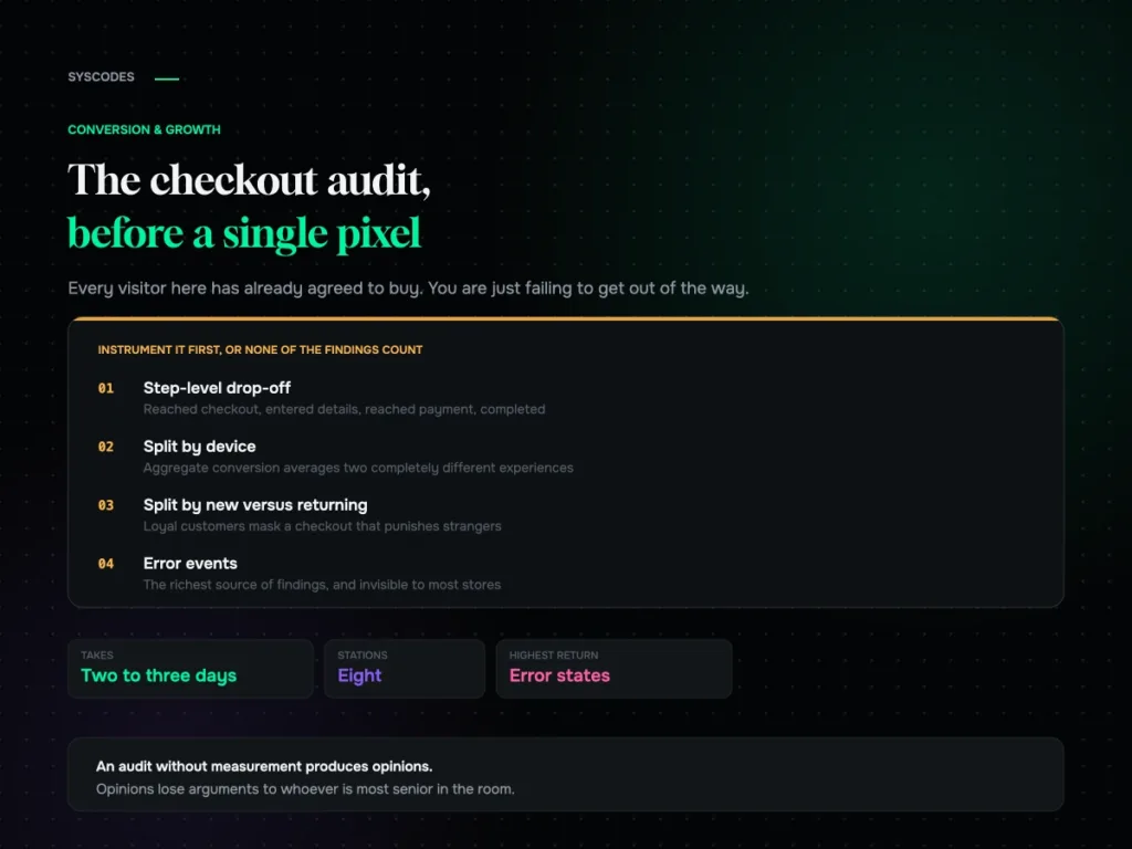
The checkout audit: what we check before touching a single pixel
The eight-station checkout audit we run before any design work, the five run-throughs everyone skips, the findings that recur across every store, and how to prioritise…
