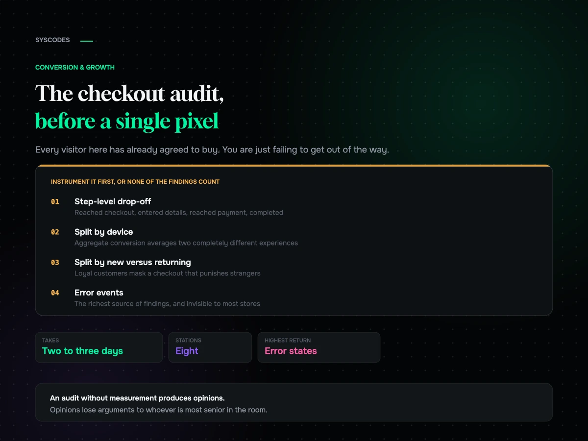
Checkout is the only part of a store where every visitor has already agreed to buy something. Everywhere else you are persuading. Here you are just failing to get out of the way.
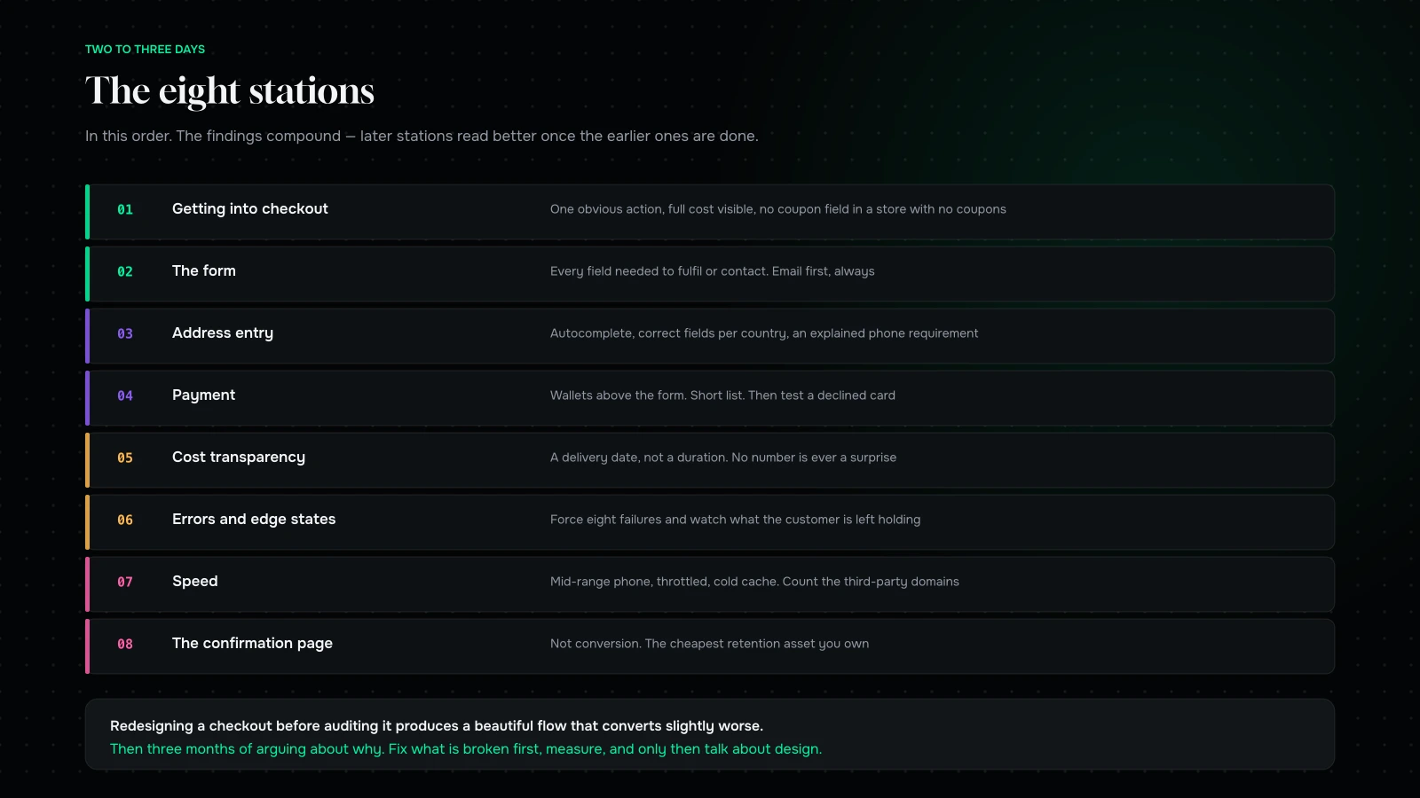
Which is why it is where we start, and why we do not touch anything for the first week. Redesigning a checkout before auditing it is how agencies produce a beautiful flow that converts slightly worse than the one it replaced, and then argue about why for three months.
This is the audit itself. It is deliberately mechanical, it takes two to three days, and you can run it yourself. We are giving away the method because the method is not the hard part — the fixing is.
First: instrument it, or none of this counts
Before the audit, make sure you can read the funnel. You need four things.
Step-level drop-off. How many sessions reach checkout, enter details, reach payment, and complete. If your analytics only tells you “sessions” and “orders”, you are guessing about everything in between.
Split by device. Aggregate conversion is an average of two completely different experiences, and the mobile one is usually much worse and much more of your traffic. Any number not split by device is a number that hides the problem.
Split by new versus returning. Returning customers convert far better and can mask a checkout that is punishing to strangers.
Error events. Every validation failure, every declined payment, every “something went wrong”. Most stores do not track these at all, which means the single richest source of checkout findings is invisible to them.
If you have none of this, spend two days on it first. An audit without measurement produces opinions, and opinions lose arguments to whoever is most senior.
The eight stations

One: getting into checkout
Start before checkout, because a meaningful share of the loss happens at the cart.
Is the path to checkout obvious and singular, or is the customer offered four competing things to do? Is there a mini-cart that lets people proceed without a page load? Does the cart show the full cost, or does the number change later — because a cost that appears at step three is worse than the same cost shown at step one. Are there discount fields inviting people to leave and search for a code they will not find?
That last one is worth measuring rather than debating. If your coupon field is prominent and your store rarely issues codes, it is a leak with a UI.
Two: the form
Count the fields. Then count the ones you actually need to fulfil the order and contact the customer. The gap between those numbers is your first list.
Then look at the order of them. Email first, always — it is the field that lets you recover an abandoned checkout, and getting it early is worth more than any other single sequencing decision. Then shipping, then payment. Anything optional goes last or goes away.
Check the labels are outside the field rather than only inside it, that autofill is not being blocked by unusual field names, that the keyboard type is right on mobile for numeric fields, and that nothing is auto-capitalising an email address.
Three: address entry
The most under-examined part of most checkouts, and disproportionately where mobile users leave.
Is there address lookup or autocomplete? Is the country pre-selected sensibly? Are state and postcode fields appropriate to the country, or is an international customer being asked for a state they do not have? Is a company field being shown to consumers? Is the phone number required, and if so, is the reason explained — because an unexplained phone requirement is one of the most reliable drop-off causes we find.
For Indian stores add serviceability: check the pincode at entry and say so immediately if you cannot deliver. Discovering that at the payment step is a wasted checkout and an annoyed customer. There is more on this in COD, UPI and returns.
Four: payment
Are the express wallets present, and are they above the form rather than below it? A wallet button underneath a long form is a wallet button nobody sees.
Are the payment methods your customers actually use present and prominent? Is the list short — a long list of options reduces conversion rather than increasing it. Do the logos look right, because unfamiliar payment branding reads as risk.
Then test a declined card. Most teams have never done this. What the customer sees when a payment fails is one of the highest-leverage screens in the entire store, and it is almost always the platform’s default: a red message, a cleared form, and no idea what to do next.
Five: shipping and cost transparency
The single largest cause of abandonment in almost every study ever run is unexpected cost.
Show shipping cost as early as possible — on the product page if you can, in the cart at the latest. Show a delivery date, not a duration; “arrives Thursday” outperforms “3–5 business days” reliably. If you have a free shipping threshold, show progress toward it. If you charge tax or duties, say so before the last step.
The rule: no number should be a surprise. Every time a total goes up, you lose people, and the amount matters much less than the surprise.
Six: errors and edge states
This is where the real findings are, because nobody looks here.
Force each of these and record what happens: an invalid email, an expired card, a declined card, an out-of-stock item added before checkout and sold out during it, an invalid discount code, a session timeout, a back-button press mid-flow, and a browser refresh at the payment step.
You are looking for cleared forms, lost cart contents, unhelpful error text, and any state from which the only recovery is starting again. Every one of those is a customer who had their card out.
Seven: speed
Measure checkout page load separately from the rest of the store, on a mid-range phone on a throttled connection, cold cache.
Checkout tends to be the heaviest part of a store because it accumulates scripts — fraud tools, analytics, chat, upsell apps, address validators. Count the third-party domains on your checkout page. Then ask, for each one, whether it is worth the fraction of a percent it costs. Some are. Not all of them are.
Eight: the confirmation page
Not part of conversion, and part of the next one.
Does it confirm clearly what will happen and when? Does it give a way to fix a mistake? Does it capture a guest customer into an account without demanding it? Does it set expectations about delivery and returns that reduce the support email you are about to receive?
The five run-throughs everyone skips
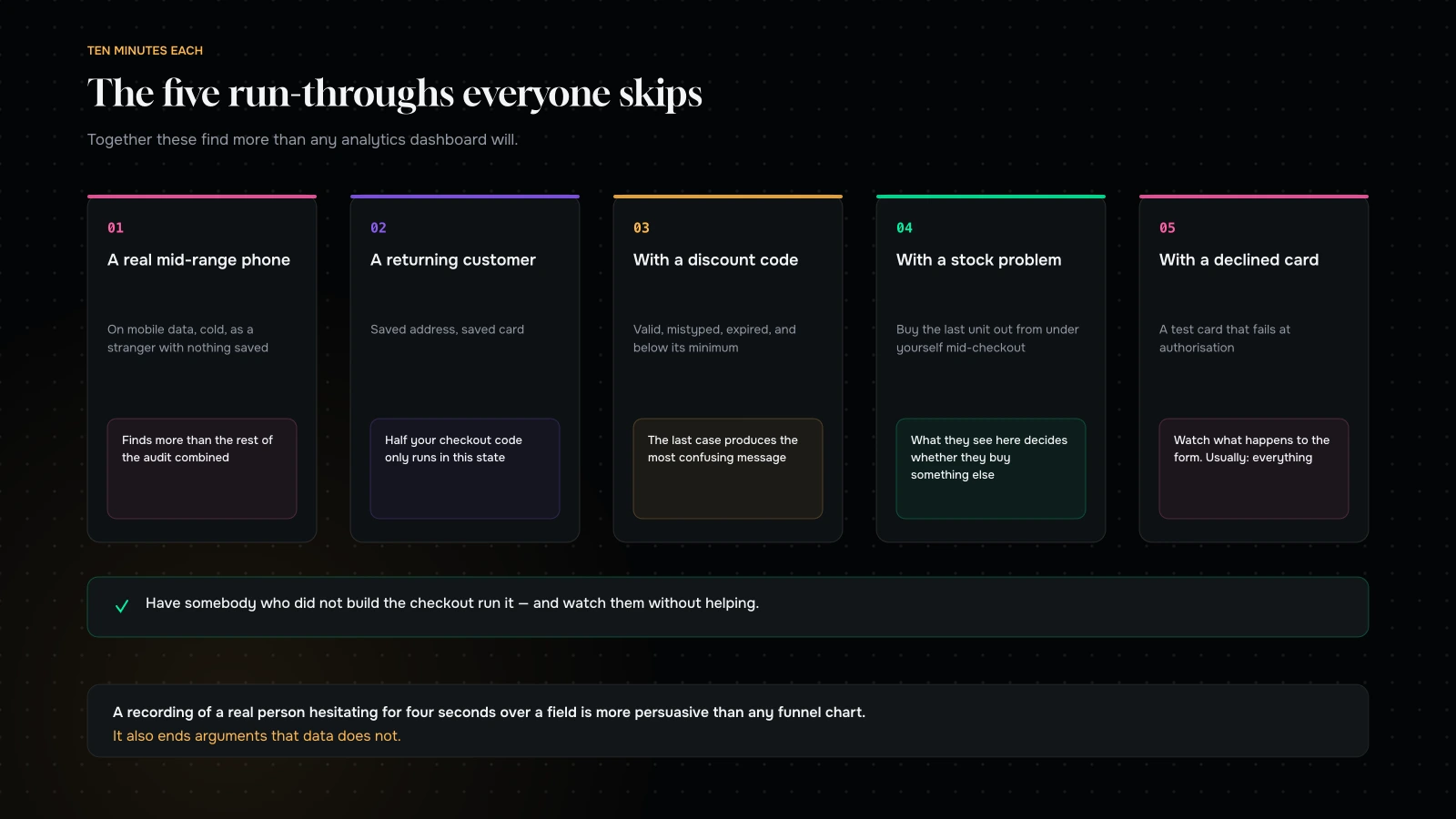
On a real, mid-range phone, on mobile data, as a new customer. Not a simulator, not on office wifi, not with your details already saved. This single run-through finds more than the rest of the audit combined.
As a returning customer with a saved address. Half your checkout code paths only run in this state and most testing never reaches them.
With a discount code. Applying, mistyping, applying an expired one, and applying one that does not meet its minimum. The last case is where most stores produce a genuinely confusing message.
With a stock problem. Add the last unit of a variant, then have somebody else buy it, then try to complete. What the customer sees at that moment decides whether they buy something else or leave.
With a declined payment. Use a test card that declines. Watch what happens to the form.
What we usually find
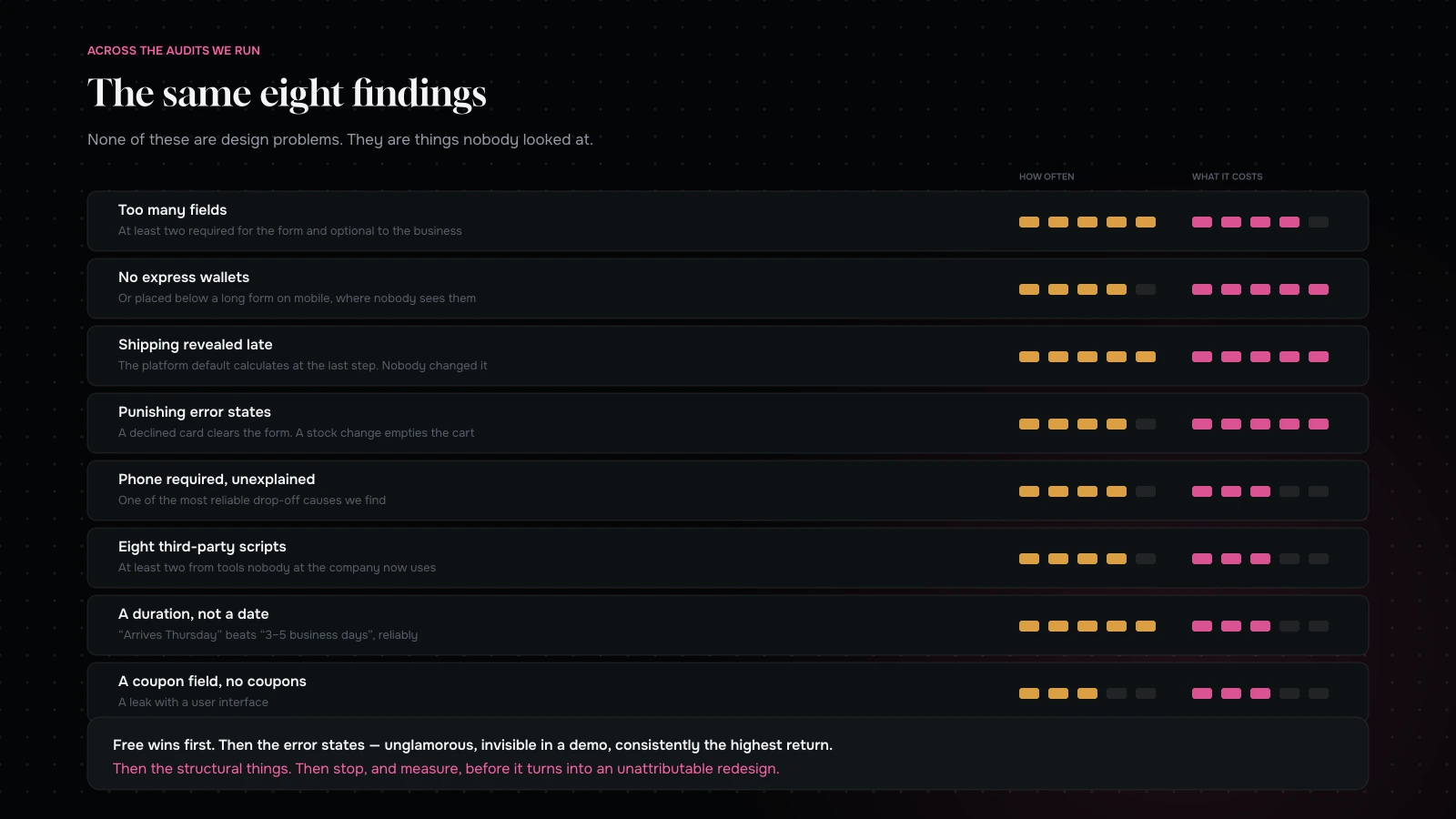
Across the audits we have run, the same handful come up again and again.
Too many fields, and at least two of them optional to the business but required in the form.
No express wallets, or wallets placed below the fold on mobile.
Shipping cost revealed late, usually because the platform’s default flow calculates it at the last step and nobody changed it.
Punishing error states. Declined payment clears the form. Validation error scrolls to the top and loses focus. A stock change during checkout empties the cart.
Phone number required without explanation.
A checkout page carrying eight or more third-party scripts, at least two of which are from tools nobody at the company currently uses.
No delivery date, only a duration.
A coupon field in a store with no coupons.
None of these are design problems. They are things nobody looked at — which is exactly why an audit outperforms a redesign, and why a full redesign so often lowers conversion.
Turning findings into a plan
Score each finding on two axes: how many people it affects, and how much work it is. Then do them in this order.
Free wins first. Removing a field, removing a script, changing a label, moving the wallet buttons above the form. These are hours of work and they ship this week.
Then the error states. Unglamorous, invisible in a demo, and consistently the highest-return category we find.
Then the structural things. Address lookup, a rebuilt payment step, shipping calculated earlier. Days rather than hours, but with a measurable number attached.
And then stop, and measure. You have just changed several things. Let them run for long enough to read, because the temptation to keep going is how a clean audit turns into an unattributable redesign.
Two rules we hold to. Change one meaningful thing at a time where traffic allows. And if traffic does not allow proper testing — which it does not for most stores — prefer changes that are obviously correct on first principles over clever ones that need proof. Removing a required field nobody uses does not need an A/B test. Reordering your value propositions does, and you probably cannot reach significance anyway.
The one-page scorecard
If you want a single artefact to hand round after the audit, this is the one we produce.
| Station | Pass condition | Common failure |
|---|---|---|
| Cart to checkout | One obvious action, full cost visible | Four competing calls to action |
| The form | Every field is needed to fulfil or contact | Two required fields nobody uses |
| Address | Autocomplete, correct fields per country | An unexplained required phone number |
| Payment | Wallets above the form, short list | Wallets below a long form |
| Cost transparency | No number is ever a surprise | Shipping revealed at the last step |
| Errors | Every failure keeps the data and says what to do | Declined card clears the form |
| Speed | Measured on a mid-range phone, cold | Eight third-party scripts on the heaviest page |
| Confirmation | Clear next steps, easy account capture | The platform default, untouched |
Mark each pass or fail with one sentence of evidence. Eight rows, one page. Anybody in the business can read it, which is the point — checkout work competes for budget against things with prettier decks, and a one-page list of specific defects wins that argument better than a report.
Who should run it, and how long it takes
Two to three days, and it does not need to be a developer.
Day one is instrumentation and the eight stations, done desk-side. Day two is the run-throughs on real devices, plus the error states, which is the part that needs patience rather than skill. Half a day to score and write up.
The one thing that genuinely helps is having somebody who did not build the checkout run it. Familiarity is the enemy here — the person who built the flow knows which field is required and why, and has stopped seeing the ones that are not. If you cannot get an outsider, get somebody from a different team and watch them without helping. That last part is difficult and it is where the best findings come from.
Record the sessions if you can. A recording of a real person hesitating for four seconds over a field is more persuasive than any funnel chart, and it ends arguments that data does not.
What happens after the quick wins
The free wins take a week and typically move the number by a visible amount. Then the question becomes what to do next, and there are three honest answers depending on what the audit found.
If the findings were mostly mechanical, keep going down the list, ship, measure, and revisit in a quarter. Checkout drifts — apps get installed, fields get added for a campaign and never removed — so an annual re-audit is worth scheduling.
If the findings pointed upstream, the checkout was not your problem. A high add-to-cart rate with a poor checkout completion is a checkout problem; a low add-to-cart rate with a fine checkout is a product page, price or traffic-quality problem, and no amount of checkout work will fix it.
If the findings pointed at the platform, you now have the specific, evidenced constraint that makes a platform conversation worth having — which is exactly the input a pre-replatform audit needs, and much better than a general feeling that the store is limiting you.
What not to do
Do not redesign it. Not yet. Fix what is broken, measure, then decide whether the design was ever the problem.
Do not add a progress bar to a bad flow. It makes a long checkout feel longer.
Do not add trust badges instead of trust. A clear returns policy, a real delivery date and a visible way to contact a human do more than any row of logos.
Do not copy a big retailer’s checkout. Theirs is optimised for their catalogue, their customers and their volume, and much of what looks clever is compensating for a problem you do not have.
Do not skip the confirmation page. It is the cheapest retention asset you own.
What it comes down to
The checkout is the shortest, most measurable, highest-leverage part of a store, and it is the part most likely to have been left exactly as the platform shipped it.
Instrument it. Run the eight stations. Do the five run-throughs, especially the one on a real phone. Fix the free things this week, the error states next week, and the structural things after that. Then measure, and only then talk about design.
We have done this for stores that then decided not to redesign at all, which was the correct outcome and a smaller invoice — Cocoon Care and TotalSnacc both started here.
Want us to run it on yours? Send us your store URL through the contact form and we will do the eight stations and the five run-throughs, and come back with a prioritised list — free wins, error states, structural changes — with a note on what we would expect each to be worth. If your checkout is already good, we will tell you where the money is actually leaking instead.
You can also read why average order value beats conversion rate, or where mobile checkout leaks.
Send us your store and we will run the eight stations and the five run-throughs.
You will get a prioritised list back — free wins, error states, structural changes — with a note on what we would expect each to be worth and roughly what each costs to do.
If your checkout is already good, we will tell you where the money is actually leaking instead. That is a more useful answer than a redesign proposal.
More on Conversion & Growth
Research, testing and the arithmetic behind a better conversion rate.

Mobile checkout: where the money actually leaks
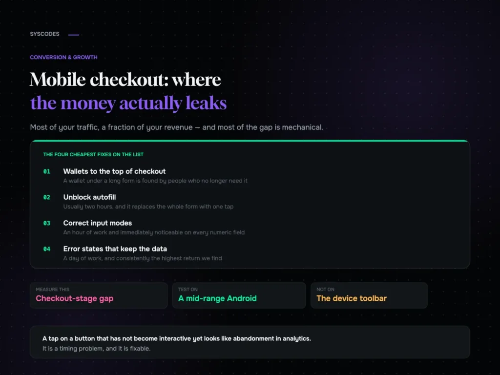
The eight mechanical leaks in a mobile checkout, how to tell a behavioural gap from a fixable one, the five states worth forcing on a phone,…
Eight product pages taken apart: what converts, what doesn’t
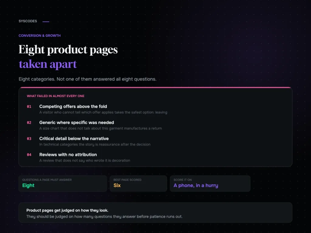
Eight anonymised product page teardowns across eight categories, the eight questions every product page has to answer, the failures that repeat, and a scorecard to run…
How many visitors do you need before an A/B test means anything?
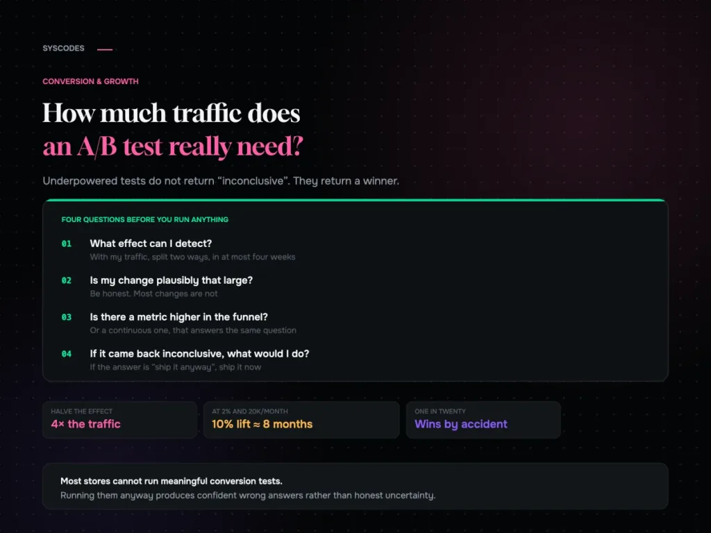
The sample size arithmetic behind A/B testing, a table you can read against your own traffic, the five mistakes that make bad tests worse, and what…
Average order value beats conversion rate: the maths most stores get wrong
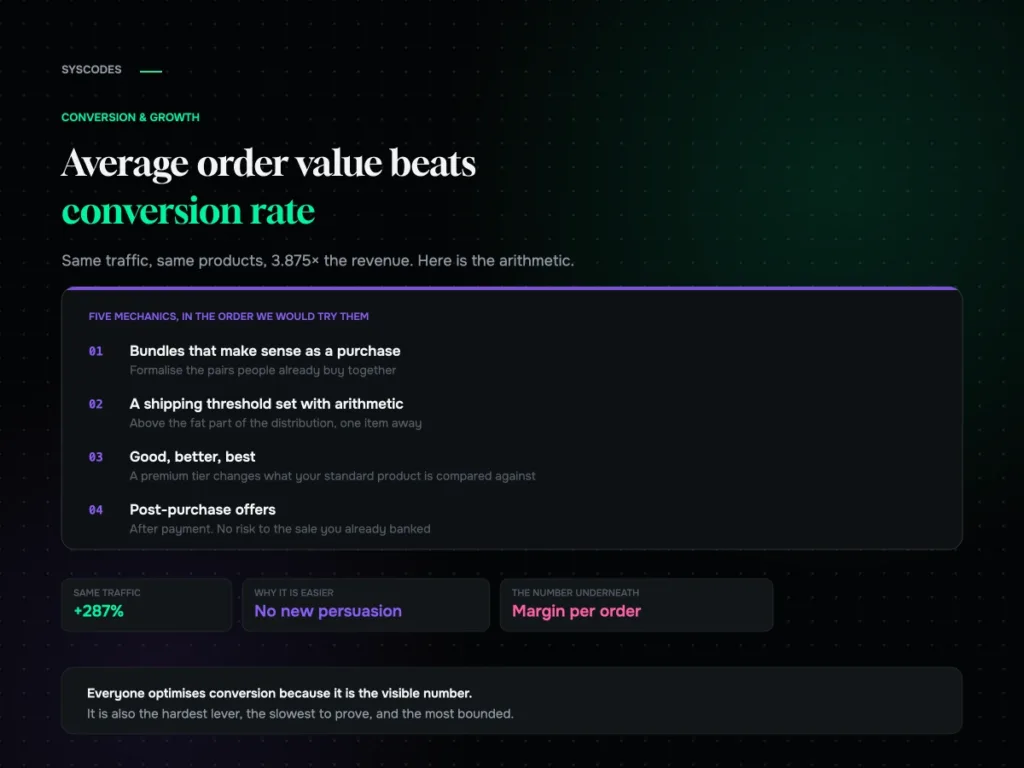
Why average order value is usually the easier lever, the arithmetic that compounds it with conversion, five mechanics in order, and how to set a free…
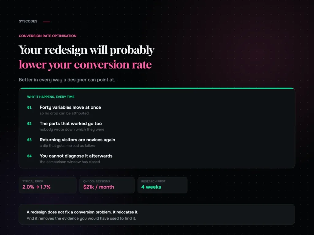
Your redesign will probably lower your conversion rate
Why a full redesign so often drops conversion, the returning-visitor dip that gets misread as failure, and the research to run before anything gets designed.
