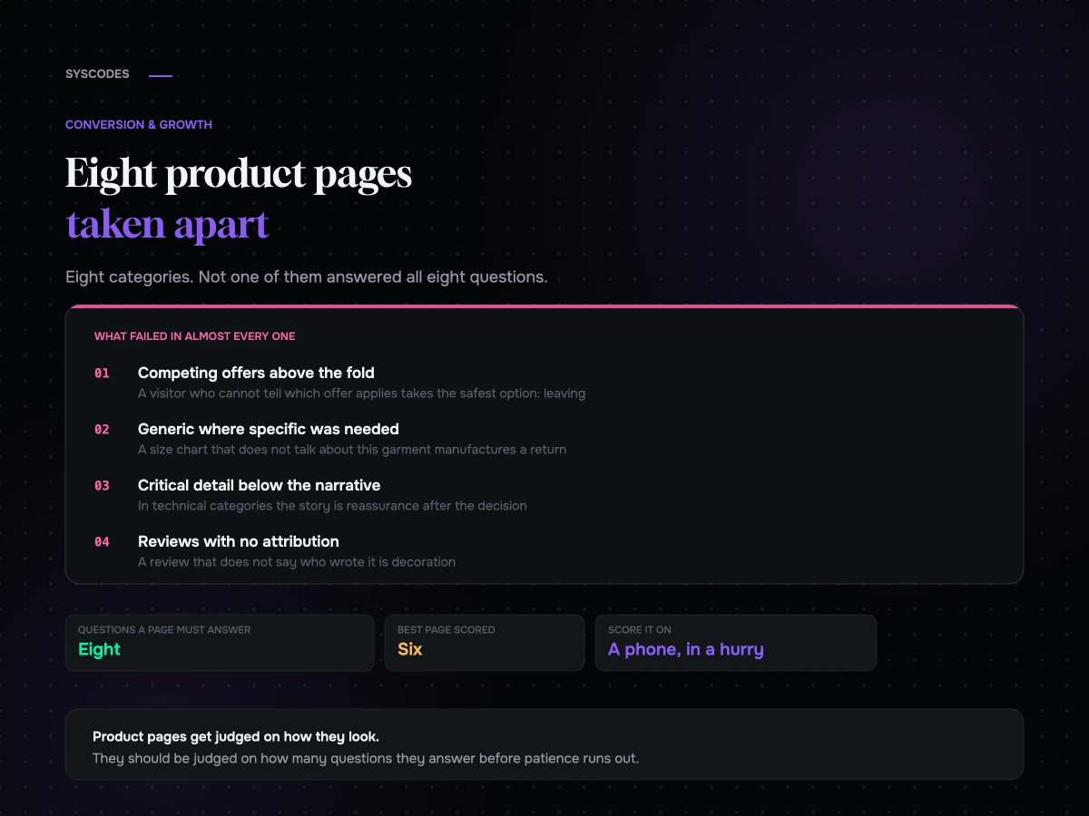
A product page has one job and it is not the one most of them are designed for. It is not to look like the brand. It is to answer, in order, every question standing between a curious person and a purchase — and to do it before they get bored and leave.
We have taken apart a lot of these. What follows is eight of them, anonymised, across eight different categories, with what worked, what did not, and what we would change first. Then the patterns that showed up in all eight, because those are worth more than any individual finding.
The anatomy we score against
Before the teardowns, the frame. Every product page is answering eight questions, whether or not it knows it.
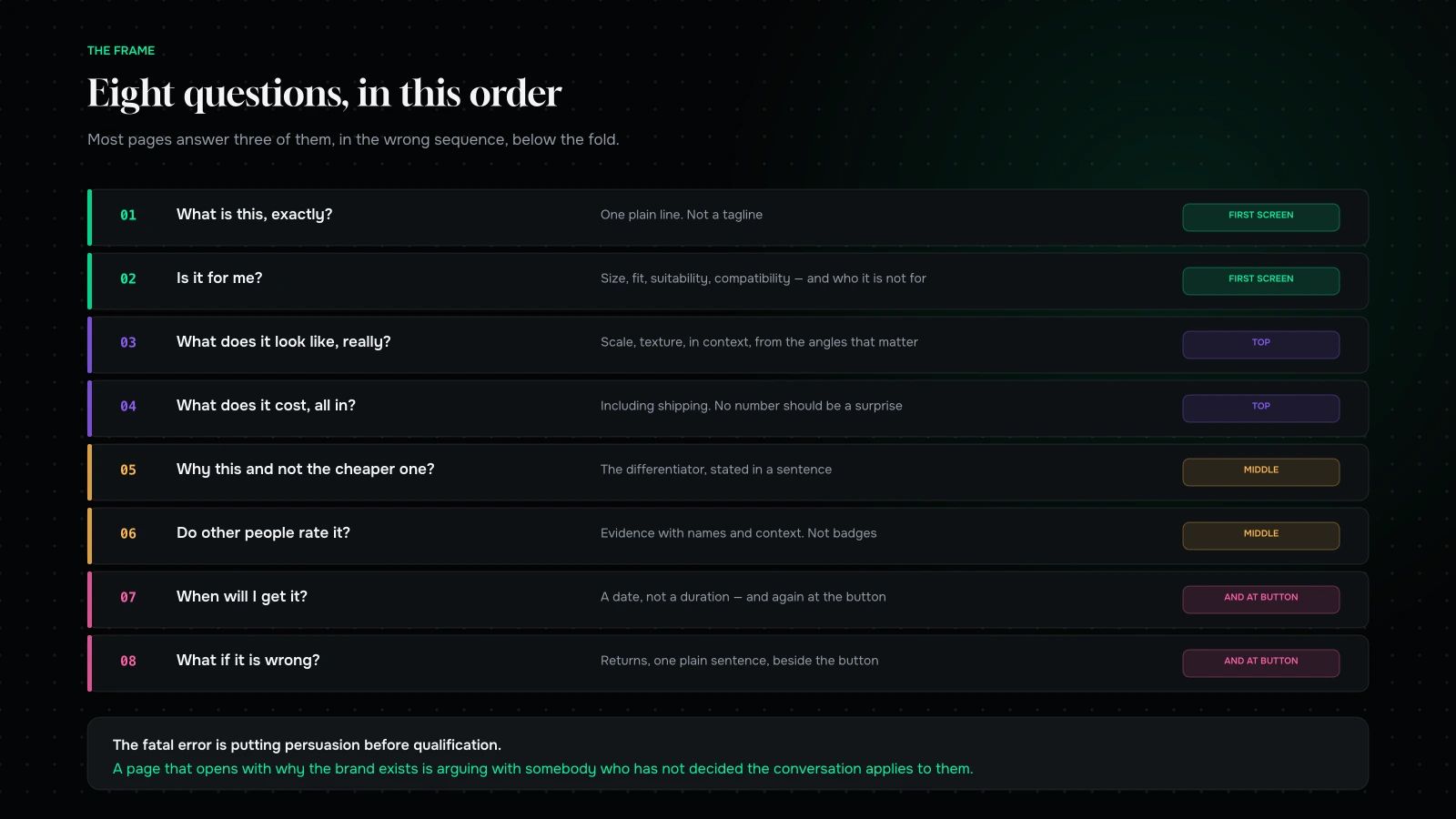
- What is this, exactly? In one line, without brand poetry.
- Is it for me? Size, fit, suitability, compatibility, skin type, use case.
- What does it look like, really? Scale, texture, in context, from the angles that matter.
- What does it cost, all in? Including shipping and any surprise.
- Why this one and not the cheaper one? The differentiator, stated.
- Do other people think it is good? Evidence, not badges.
- When will I get it? A date.
- What if it is wrong? Returns, in plain language, before the button.
A page that answers all eight, in roughly that order, converts. A page that answers three of them beautifully does not.
One — a supplement, direct-to-consumer
What worked. The ingredient panel was open by default rather than hidden behind a tab. In a category built on suspicion, showing the full formulation without making people ask for it did more than any amount of reassurance copy.
What did not. Four different reasons to buy, competing above the fold: a subscription offer, a bundle, a first-order discount and a free-shipping threshold. A visitor who cannot tell which offer applies to them takes the safest option, which is to leave.
What we would change. One offer above the fold. Move the rest below, or into the cart. Then answer question two — who this is for and who it is not for — which the page never did.
Two — apparel, mid-price
What worked. Photography on three different body types with heights and sizes worn listed underneath. This is the single highest-return change available to most apparel stores and it is still rare.
What did not. A generic size chart in centimetres, disconnected from the product. In a category where returns are the defining economic constraint, a size chart that does not talk about this garment is a return being manufactured on purpose.
What we would change. Product-specific fit notes — runs small, cut for a longer torso, the model is 5’9" and wearing M. Then put the returns policy next to the button, because in apparel it is part of the purchase decision, not the aftermath.
Three — technical equipment, considered purchase
What worked. A specification table that was genuinely complete, and a comparison against the two adjacent models in the range. Buyers in this category are comparing whether you help them or not, and helping them means they compare on your site instead of somewhere else.
What did not. The specification lived at the bottom, under three sections of brand narrative. The people who buy this scroll straight past the story, and a proportion of them concluded the specification did not exist.
What we would change. Invert it. Specification and comparison first, narrative after. In considered technical categories, the story is the reassurance after the decision, not the argument for it — something we ran into head-on while rebuilding Cocoatown’s technical catalogue.
Four — furniture, high value
What worked. Room-context photography with a scale reference, and a delivery estimate given as a date range on the page itself rather than at checkout. For a purchase people plan around, that date is part of the product.
What did not. No dimensions above the fold, and no indication of what happens on delivery day — whether it is assembled, whether it comes upstairs, what happens if it does not fit through the door. Those are the actual anxieties, and the page addressed none of them.
What we would change. Dimensions in the first screen, always. A short, honest delivery-and-assembly section. And photography that includes the box, because for large items the logistics are part of the decision.
Five — subscription coffee
What worked. A clear, unpatronising explanation of how the subscription works, including how to pause and cancel, stated positively. Removing the fear of being trapped converts better than any discount.
What did not. No way to buy once. A visitor who is not ready to commit had no path at all, and a meaningful share of subscribers in this category start with a single bag.
What we would change. Offer both, with the subscription framed as the better deal rather than the only door. You lose a little on the first order and gain the customers who would otherwise have left.
Six — skincare
What worked. Before-and-after imagery with honest timeframes and a stated number of weeks, plus a routine diagram showing where this product sits relative to the others.
What did not. Reviews were a wall of five-star sentences with no names, no skin types and no dates. In a category where suitability is everything, a review that does not say who wrote it is decoration.
What we would change. Structured reviews — skin type, concern, how long they used it. Fewer, richer reviews beat a large number of anonymous ones, and they answer question two while they are at it.
Seven — B2B industrial
What worked. Bulk pricing tiers displayed on the page rather than hidden behind an enquiry form. Buyers in this category are building a quote and comparing suppliers, and making them ask for a price removes you from the comparison.
What did not. No stock or lead-time information, and no downloadable specification sheet. B2B purchasing runs on documents that get forwarded internally, and a page with nothing to download does not travel through an organisation.
What we would change. Lead time on the page. A PDF specification with your part numbers in it. And a way to request a quote that pre-fills what they were looking at, rather than a blank contact form.
Eight — a digital product
What worked. A genuinely useful preview — actual content, not a trailer for the content. In digital categories, proof of quality is the entire sale.
What did not. No answer at all to “what happens after I pay”. No indication of format, access duration, device support or whether there was any support attached.
What we would change. A short, plain fulfilment section: what arrives, how, for how long, and what to do if it does not work. Digital products have a delivery experience too; it is just invisible, which is exactly why it needs stating.
The order of the eight questions, and why it matters
The sequence is not arbitrary, and getting it wrong is more damaging than missing a question entirely.
A visitor arriving from an ad or a search result is running a fast disqualification loop. They are not looking for reasons to buy; they are looking for reasons to stop. Every question they cannot answer quickly is a reason to stop, and the earlier questions carry more weight because they are cheaper to answer with “no”.
Which means the fatal error is putting persuasion before qualification. A page that opens with why the brand exists, before establishing what the product is and who it is for, is arguing with somebody who has not yet decided whether the conversation applies to them.
Practically: questions one and two belong in the first screen on a phone, always. Question three should be answerable by scrolling the images without leaving the top. Four and five sit immediately below. Six, seven and eight can live lower, but seven and eight must appear again next to the buy button, because that is the moment the anxiety returns.
The best single diagnostic we know: hand somebody the page on a phone for fifteen seconds, take it away, and ask them what the product is and whether it is for them. If they cannot answer both, nothing further down the page matters.
Six things worth adding to almost any product page
Across these eight and the many others we have looked at, the same small additions keep earning their place.
A one-line plain description under the product name. Not a tagline. What the thing is, for somebody who arrived from a search result and has no context.
A “who this is for / who this is not for” block. Uncomfortable, and it works. Disqualifying the wrong buyer improves conversion among the right ones and reduces returns at the same time.
A delivery date, not a duration. “Arrives Thursday” is a fact. “3–5 business days” is homework.
The returns policy in one sentence, next to the button. Not a link to a policy page. One honest sentence, with the link underneath for the detail.
One photograph with a scale reference. A hand, a room, a familiar object. This single image reduces returns in more categories than people expect.
Structured reviews. Whatever the buying anxiety is in your category — fit, skin type, compatibility, size of room — collect it as a field and show it on the review. It converts the review from decoration into an answer.
What we would not bother with
Equally, the things that get added because everybody adds them and which earn very little.
Trust badge rows. A row of security logos does less than one clear sentence about returns.
Countdown timers on evergreen products. Customers have learned what these are. In categories built on trust, they cost more than they earn.
“X people are viewing this”. Same problem, plus it looks worse the smaller your store is.
Long brand narrative above the specification in a considered category. Below it, gladly.
A five-star average with no reviews behind it. Four honest reviews beat a rounded number every time.
An enquiry form where a price should be, in B2B. It removes you from the comparison the buyer is already running.
The patterns across all eight

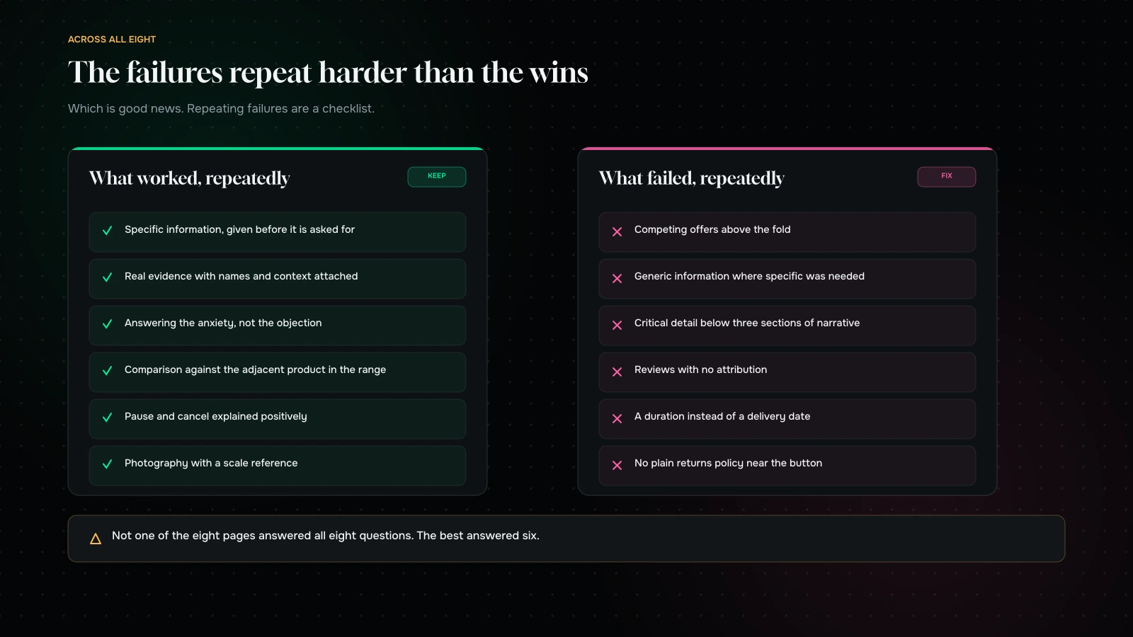
The wins repeat. Specific, honest information delivered before it is asked for. Real evidence with names and context attached. Answering the anxiety rather than the objection. Every single page that did something well was doing a version of that.
The failures repeat harder. Competing offers above the fold. Generic information where specific information was needed. Critical detail below three sections of narrative. Reviews with no attribution. No delivery date. No plain-language returns policy near the button.
Nobody had all eight questions answered. Not one of the eight pages. The best had six.
Every page over-invested in the top and under-invested in the middle. Enormous care in the hero, then a fall-off in exactly the region where the actual decision gets made.
The mobile experience was worse in every case, usually because desktop-first design pushed the answer to question two — is this for me — three screens down.
The scorecard, if you want to run this yourself
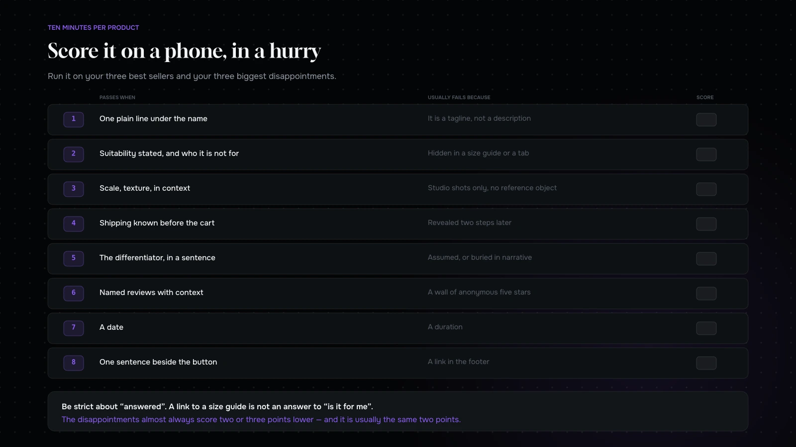
Take your best-selling product page and score it out of eight — one point for each question above, answered clearly, in the first two screens on a phone.
Then do the same for a product that sells less well than it should. In our experience the difference is rarely the product. It is that the second page answers fewer of the questions, and answers them further down.
Two rules for reading your own score. Be strict about “answered” — a link to a size guide is not an answer to “is it for me”. And do it on a phone, in a hurry, as somebody who has never seen the brand.
Where the copy actually comes from
The most common reason a product page fails question two is not laziness. It is that nobody in the building knows the answer, because nobody has asked.
Three sources, all cheap.
Your support inbox. Every pre-purchase question somebody sent you is a question your page failed to answer. Read a month of them, group them, and you have your content brief. If four people asked whether it fits a certain size, that goes on the page, in the first screen.
Your reviews, especially the middling ones. Five-star reviews tell you what to keep. Three-star reviews tell you what people expected and did not get, which is precisely the gap between what your page promised and what the product is.
Your returns reasons. A return is a page that made a promise the product could not keep. Categorise them for a quarter and the pattern is usually two or three specific mismatches — colour, size, strength, compatibility — each of which is one sentence and one photograph away from being prevented.
Between those three you will have written a better product page than any copywriter working from a brand deck, because it is answering questions people have actually asked rather than the ones you imagined.
Scoring your own, station by station
| # | The question | Passes when | Usually fails because |
|---|---|---|---|
| 1 | What is this? | One plain line under the name | It is a tagline, not a description |
| 2 | Is it for me? | Suitability stated, and who it is not for | Hidden in a size guide or a tab |
| 3 | What does it look like? | Scale, texture, in context | Studio shots only, no reference object |
| 4 | What does it cost, all in? | Shipping known before the cart | Revealed two steps later |
| 5 | Why this and not the cheaper one? | The differentiator, in a sentence | Assumed, or buried in narrative |
| 6 | Do others rate it? | Named reviews with context | A wall of anonymous five stars |
| 7 | When do I get it? | A date | A duration |
| 8 | What if it is wrong? | One sentence beside the button | A link in the footer |
Eight rows, one page, scored on a phone. It takes ten minutes per product and it will produce a shorter and far more useful list than any redesign brief.
Run it on your three best sellers and your three biggest disappointments. The comparison is where the insight is — the disappointments almost always score two or three points lower, and the missing points are usually the same two.
What it comes down to
Product pages are usually judged on how they look, and they should be judged on how many questions they answer before the visitor runs out of patience.
Eight pages, eight categories, and the same handful of failures in almost all of them: competing offers, generic information, critical detail buried, evidence without attribution, and no plain answer to what happens if it is wrong.
None of those are design problems, and none of them require a redesign to fix. They require somebody to sit down with the page and a list of eight questions and be honest about which ones it actually answers.
Want us to take yours apart? Send us a product page URL through the contact form and we will score it against the eight questions and come back with the three changes we would make first, in order, with the reasoning. If the page is already good, we will tell you where else the money is going.
You can also read the checkout audit, or why average order value beats conversion rate.
Send us a product page and we will score it, then tell you the three changes we would make first.
You will get the score, the reasoning, and the three changes in order — not a redesign proposal. Most of what we find is copy, sequence and one missing photograph.
If the page is already good, we will tell you where else the money is going instead. That is usually more useful than another opinion about the hero image.
More on Conversion & Growth
Research, testing and the arithmetic behind a better conversion rate.

Mobile checkout: where the money actually leaks
The eight mechanical leaks in a mobile checkout, how to tell a behavioural gap from a fixable one, the five states worth forcing on a phone,…
How many visitors do you need before an A/B test means anything?
The sample size arithmetic behind A/B testing, a table you can read against your own traffic, the five mistakes that make bad tests worse, and what…
Average order value beats conversion rate: the maths most stores get wrong
Why average order value is usually the easier lever, the arithmetic that compounds it with conversion, five mechanics in order, and how to set a free…
The checkout audit: what we check before touching a single pixel
The eight-station checkout audit we run before any design work, the five run-throughs everyone skips, the findings that recur across every store, and how to prioritise…
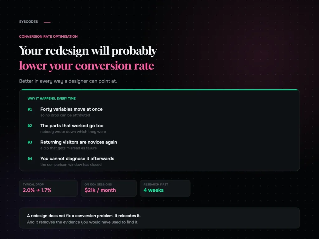
Your redesign will probably lower your conversion rate
Why a full redesign so often drops conversion, the returning-visitor dip that gets misread as failure, and the research to run before anything gets designed.