Home/Blog/Design & Brand
Design & Brand · 11 min read

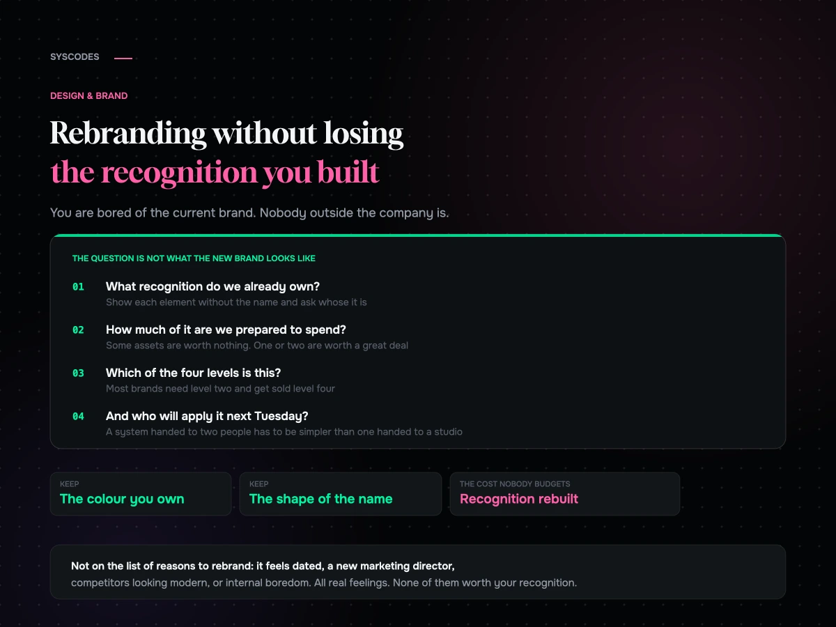
Rebranding without losing the recognition you built

The riskiest thing about a rebrand is that everybody involved is bored of the current brand and nobody outside the company is.

Rebranding without losing the recognition you have built
S
Sayan SahaUpdated August 2026 · 11 min read

The riskiest thing about a rebrand is that everybody involved is bored of the current brand and nobody outside the company is.

That asymmetry causes most of the damage. Internally you have looked at the logo for four years, you have noticed every flaw, and you are ready for something new. Your customer has seen it briefly, occasionally, in passing, and has built a fragile association between a shape or a colour and the idea of you. Replacing that association costs money and takes time, and it is entirely invisible on the day you launch.

So the useful frame is not “what should the new brand look like”. It is: what recognition do we already own, and how much of it are we prepared to spend?

Recognition is a specific asset, not a feeling

The things that make a brand recognisable are usually a small number of concrete elements that have been repeated for long enough to become shorthand.
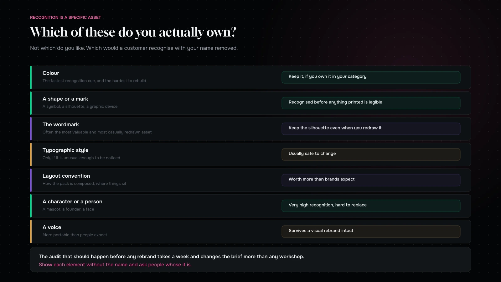
The distinctive assets a brand can own — colour, shape, wordmark, typography, layout, character, sound and voice — with what makes each one worth keeping
Recognition lives in a handful of specific things. Most brands cannot say which ones, which is why rebrands throw them away.

A colour, if it is genuinely distinctive in your category and used consistently.

A shape or a mark — a symbol, a container silhouette, a graphic device.

The wordmark itself, which is often the most valuable and most casually redrawn asset a brand owns.

A typographic style, if it is unusual enough to be noticed.

A layout convention — how the pack is composed, how the site is structured, where things sit.

A character, a mascot, or a person.

A voice, which is more portable than people expect and more distinctive than most brands realise.

The audit that should happen before any rebrand is simply: which of these do we actually own? Not which do we like. Which would a customer recognise if they saw it without our name attached?

One question to ask in the first meeting

Before any moodboards, before any workshop, ask the room this: if we changed nothing but the system — same colour, same mark, same name, applied properly and consistently for two years — how much better would this brand look?

The answers divide people usefully.

If the honest answer is “a great deal”, you have a consistency problem rather than an identity problem, and a rebrand will not fix it. It will produce a beautiful new set of assets that get applied just as inconsistently as the old ones, and in three years you will be having this conversation again with a different agency.

If the answer is “somewhat, but the mark is genuinely weak”, you are at level one or two.

If the answer is “not much, because what we are is no longer what this says”, you have a real case for level three, and now the conversation can be about the business rather than about taste.

We ask it partly because it is diagnostic and partly because it is the question that most often talks us out of a larger piece of work. That is a strange thing for an agency to volunteer, and it is the reason the clients who do go ahead go ahead for the right reason.

Run the recognition audit first

It takes a week and it changes the brief more than any workshop.

Show the elements without the name. Colour swatch, symbol, pack silhouette, typography sample, layout. Ask customers what brand it is. Anything with real recognition is an asset with a price.

Ask your sales and support teams what customers describe. “The one in the green box” is a distinctive asset speaking. So is “the one with the little bird on it”.

Look at what your competitors have taken. If somebody has moved toward your colour or your layout, that is evidence it is worth owning — and an argument for defending it rather than vacating it.

Check what you use inconsistently. Frequently there is a strong asset that has never been used properly, and the answer is to commit to it rather than to replace it.

Then price the change. For each asset, ask what it would cost in recognition to abandon it. Some will be worth nothing. One or two are usually worth a great deal.

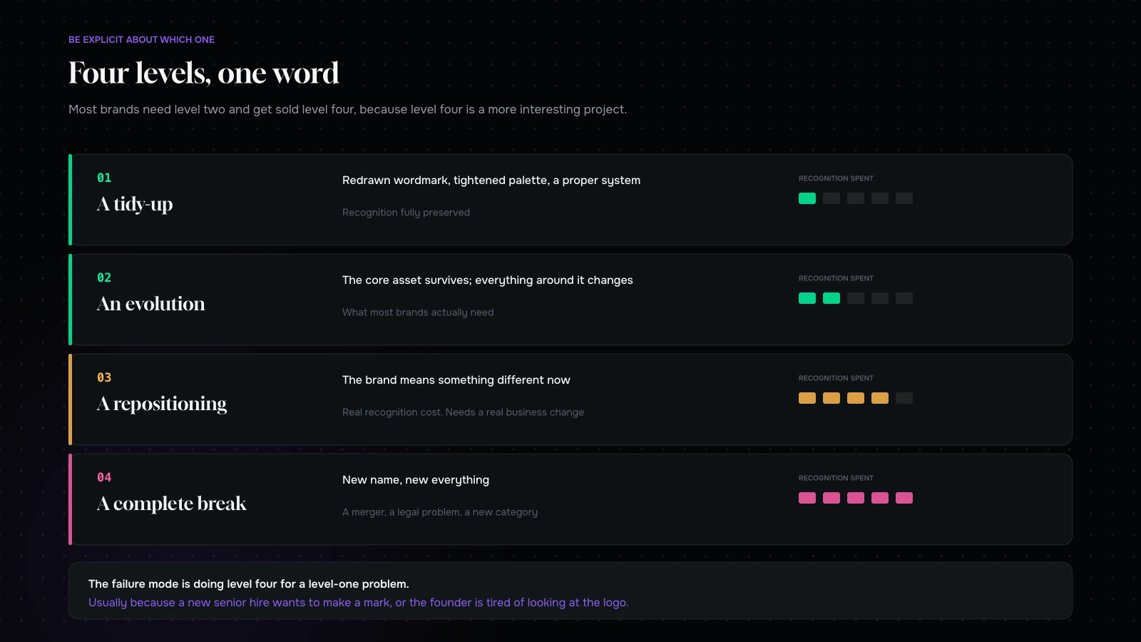
Four levels of change

Four levels of rebrand from a refresh to a complete break, with what each preserves and what each costs
Most brands need level two and get sold level four, because level four is a more interesting project.

Be explicit about which one you are doing, because the same word covers all four and they have very different risks.

Level one: a tidy-up. Redrawn wordmark, tightened palette, better typography, a proper system. Recognition fully preserved. Low risk, and often all that is needed.

Level two: an evolution. The core asset survives — usually the colour or the mark — while everything around it changes. This is the level most brands actually need, and the one that gets talked out of the room because it is less exciting to present.

Level three: a repositioning. The brand means something different now, and the identity follows. Real recognition cost, justified only when the business itself has genuinely changed.

Level four: a complete break. New name, new everything. Correct after a merger, a legal problem, a reputational event, or a fundamental change of category. Expensive, slow, and occasionally necessary.

The failure mode is doing level four for a level-one problem, which usually happens because a new senior hire wants to make a mark or because the founder has grown tired of looking at the logo.
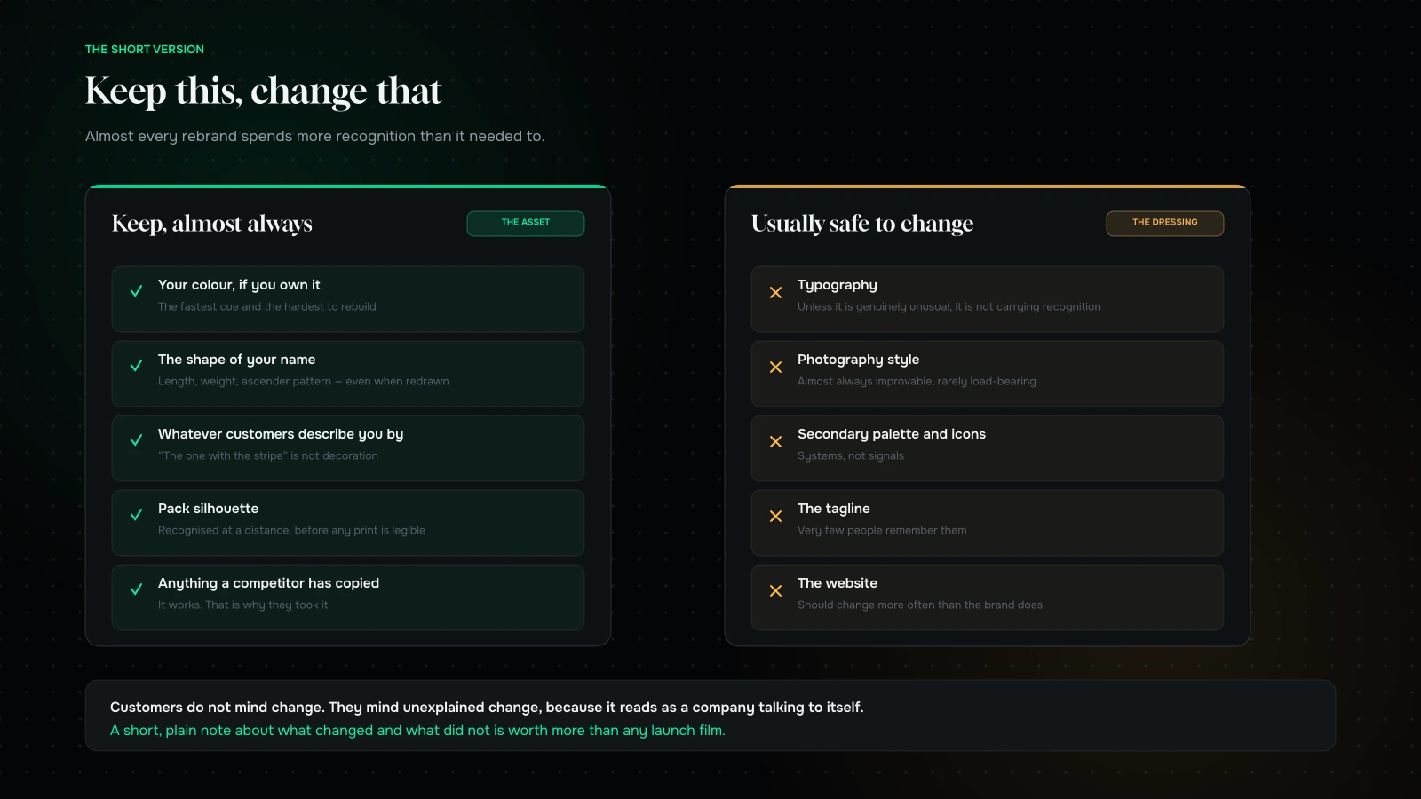
What to keep in a rebrand and what is usually safe to change, in two columns
The left column is the asset. The right column is the dressing. Most rebrands change both.

What to keep, almost always

Your colour, if you own it. Colour is the fastest recognition cue and the hardest to rebuild. If you genuinely own a colour in your category, changing it is the single most expensive decision available.

The shape of your name. Even a substantially redrawn wordmark can keep the silhouette people recognise — length, weight, ascender pattern. This is where a good designer earns their fee.

Whatever your customers describe you by. If people call you “the one with the stripe”, the stripe is not decoration, it is your brand.

Pack silhouette, in physical categories. It is recognised at a distance before anything printed on it is legible.

Anything a competitor has copied. It works.

What is usually safe to change

Typography, unless it is genuinely unusual. Most brands’ type choices are not distinctive enough to be assets.

Photography style. Almost always improvable, rarely load-bearing.

Secondary palette, layout systems, iconography, illustration style.

The tagline. Very few people remember them.

The website, which should probably change more often than the brand does. Although not for the reasons people usually give — see why a redesign so often lowers conversion.

When a full break genuinely is right

Four situations, and outside them the case is usually weaker than it feels.

The name is a constraint. Geographically limiting, unpronounceable in a new market, legally contested, or describing something you no longer do.

The business has genuinely changed. Not “we have a new strategy” — a different product, a different customer, a different category.

There is a reputational problem severe enough that recognition has become a liability rather than an asset.

A merger or an acquisition where two brands must become one.

Notice what is not on that list: the brand feeling dated, a new marketing director, competitors looking more modern, or internal boredom. All four are real feelings and none of them justifies spending your recognition.

The brief that produces a good rebrand

Most rebrand briefs describe a mood. The ones that produce good work describe a constraint.

State what must survive. Name the two or three assets that are not on the table, and say why. A designer given “everything is open” will explore everything, and you will fall in love with something that costs you your colour.

State the business change, if there is one. A new brand should be answering a change in what the company does or who it serves. If nothing has changed, say so — that is a signal for a refresh rather than a repositioning, and it is a legitimate brief.

Name the channels it has to work in. A brand that lives mainly as a 200-pixel thumbnail in an app grid has different requirements from one that lives on a shopfront. Most brands now live in the first place and are designed for the second.

Name the people who will apply it. A brand handed to a two-person marketing team needs to be simpler than one handed to a studio. Systems that require judgement to apply get applied badly.

Say what happens to the old brand. Retired at once, run in parallel, kept for a sub-line? Answer it in the brief rather than in month four.

What a good system actually contains

The deliverable that matters is not the logo. It is whether somebody who was not in the room can use this next Tuesday.

Decisions, not options. One typographic scale, one spacing system, one set of colour roles. Guidelines that offer three approaches will produce four.

Real examples, not abstract rules. A page built, a pack laid out, a post composed, an email formatted. People copy examples; they do not read principles.

The awkward cases. What happens with a very long product name, a portrait photograph in a landscape slot, a headline with no image, a partner logo next to yours. These are what break brands in practice and they are almost never in the guidelines.

Files people can actually use. In the formats the team works in, named sensibly, in one place.

A named owner. Someone who answers questions and says no. Without them, drift starts in week three and by year two nothing matches.

A brand that comes with those five stays coherent. One that comes as a beautiful PDF and a folder of logos does not, regardless of how good the design is.

The rollout is where it usually goes wrong

Two mistakes account for most failed rebrands, and neither is a design mistake.

Changing everything on one day. It is dramatic, and it maximises the moment of confusion: every touchpoint unfamiliar at once, with no bridge for a customer who knew you. A phased rollout — new alongside old, then new with a reference to old, then new alone — costs almost nothing and dramatically reduces the disorientation.

Not telling anybody why. Customers do not mind change; they mind unexplained change, because it reads as a company talking to itself. A short, plain explanation of what changed and what did not is worth more than any launch film.

Two more that are worth naming: launching without updating everything (a rebrand visible on the site and not on the packaging reads as a mistake rather than as a phase), and failing to prepare the people who answer the phone, who will be asked about it more than anyone.

The cost nobody puts in the budget

The design fee is the visible part and rarely the largest one.

LineUsually forgotten?Notes
Design and systemNoThe visible part, and the smallest of the big three
Packaging artwork and reprintsSometimesEvery SKU, every size, every variant. Plus stock write-off
The websiteNoBut the content rewrite that comes with it usually is
PhotographyYesNew identity, new art direction, whole library
Templates and collateralYesDecks, documents, email, ads, signage, uniforms, vehicles
Marketplace and channel assetsYesEvery listing, every store page, every partner
Internal rolloutYesTraining, briefing, and the time it takes everyone
Recognition rebuiltAlwaysThe real cost, and the only one that is not an invoice

That last row is the point of this entire article. It does not appear on any quote, it is paid in reduced branded search and slower recognition, and it is the reason a level-two evolution frequently beats a level-four break on pure economics — never mind on taste.

The practical move: before approving anything, add up the middle six rows honestly. A brand change that looks like a design project on the quote is usually a much larger programme once every SKU, listing and template is counted, and knowing that number changes which level you choose.

Two rebrands, same category, different outcomes

A useful contrast, generalised from projects we have seen rather than any single client.

One brand kept its colour and its pack silhouette and changed everything else: wordmark redrawn, typography replaced, photography reshot, layout system rebuilt. To an internal audience it felt like a complete transformation. To customers it looked like the same brand, better. Branded search did not move. Repeat purchase did not move. The commercial benefit came from the system being usable, which meant everything shipped afterwards looked coherent.

The other changed its colour and its name, for reasons that were about internal ambition rather than about the market. It was better work, honestly — sharper, more distinctive, more contemporary. Branded search took a long time to recover, a proportion of returning customers did not recognise the pack, and the marketing budget for the next year was spent re-establishing something that had already existed.

Neither project was badly designed. The difference was entirely in what they chose to spend.

What to measure

Rebrands are usually evaluated on how everybody feels, which is not a measure.

Branded search volume. If people stop searching your name, something has gone wrong. Watch it weekly for a quarter.

Direct traffic. Same signal, different channel.

Repeat purchase rate among existing customers. The population with the most recognition to lose, and the first to show damage.

Support contacts asking whether you are the same company. A real, countable signal and a very good early warning.

Prompted and unprompted recognition, if you can afford to measure it before and after. Rare, and the only true measure.

Agree these before launch and a normal settling period stops being an argument. Which it will otherwise become, roughly three weeks in, when the numbers wobble and somebody senior asks whether the rebrand was a mistake.

How long recognition takes to rebuild

Worth having a rough expectation, because the absence of one is what turns a normal settling period into a crisis meeting.

Recognition is built by repetition across touchpoints, so the time it takes to rebuild is a function of how often your customers see you. A brand with high purchase frequency and heavy advertising re-establishes a new asset relatively quickly. A brand bought twice a year, with modest media spend, does not — and for that brand, abandoning a distinctive asset can take years to recover.

Two implications.

Low-frequency categories should be far more conservative. If your customer sees you three times a year, every one of those impressions matters more, and starting the association from zero is a genuinely expensive decision.

Media spend is the exchange rate. You can buy back recognition faster with money. If you are going to make a large change, budget the media to support it, and treat that as part of the cost of the rebrand rather than as a separate marketing decision. A large identity change with no supporting spend is the worst of both — you have paid to abandon the old asset and not paid to establish the new one.

There is no universal number here, and anybody offering one is guessing. What we would say is: plan for longer than the launch enthusiasm suggests, and watch the branded-search line rather than the internal mood.

What it comes down to

A rebrand spends an asset you built slowly, and most rebrands spend more of it than they needed to — because the people commissioning them are bored of the current brand and their customers are not.

Audit what you actually own before you change anything. Be explicit about which of the four levels you are doing. Keep the colour, the silhouette and whatever customers describe you by. Change the things that were never carrying recognition. Roll it out in phases and explain it plainly.

And if the honest answer is that you need a better system rather than a different brand — which it usually is — that is a much smaller project and a much better outcome. It is what we ended up doing for TotalSnacc, where the identity mostly needed committing to rather than replacing.

Considering a rebrand? Send us what you have today and a sentence on why now, through the contact form. We will tell you which of your assets carry recognition, which of the four levels we think you need, and what a full break would cost you that a refresh would not.

You can also read packaging that survives the shelf and the unboxing, or commerce UI patterns that convert.

Usually a smaller project than the brief says

Send us what you have today and a sentence on why now.

We will tell you which of your assets actually carry recognition, which of the four levels we think you need, and what a full break would cost you that a refresh would not.

If the honest answer is that you need a better system rather than a different brand — which it usually is — we will say that, and it is a considerably smaller invoice.

NDA on request · you will hear back from Sayan or a senior lead, never a bot

More on Design & Brand

Brand, packaging and interface decisions that have to earn their place.

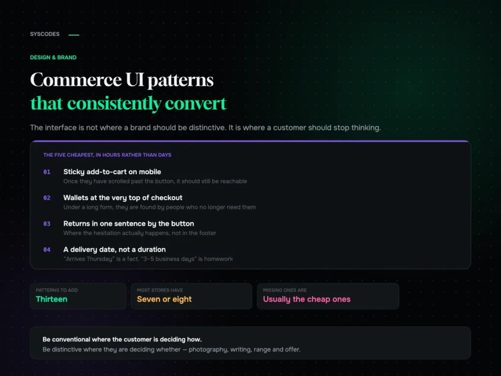
Commerce UI patterns that consistently convert
Design & Brand

Commerce UI patterns that consistently convert

Thirteen commerce interface patterns grouped by funnel stage, the ones that present beautifully and cost orders, the states nobody designs, and how to add them without…
21 Aug 202613 min read
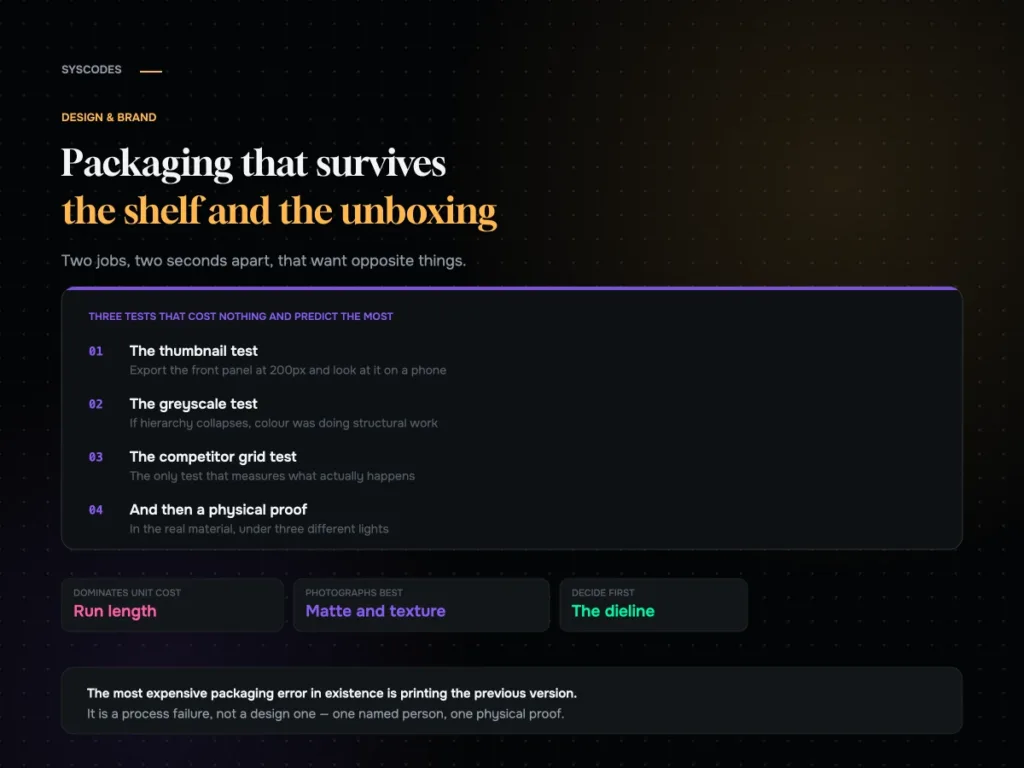
Packaging that survives both the shelf and the unboxing video
Design & Brand

Packaging that survives both the shelf and the unboxing video

How the shelf and the unboxing want opposite things, three free tests every design should pass, what actually drives unit cost, and a pre-press checklist.
21 Aug 202612 min read
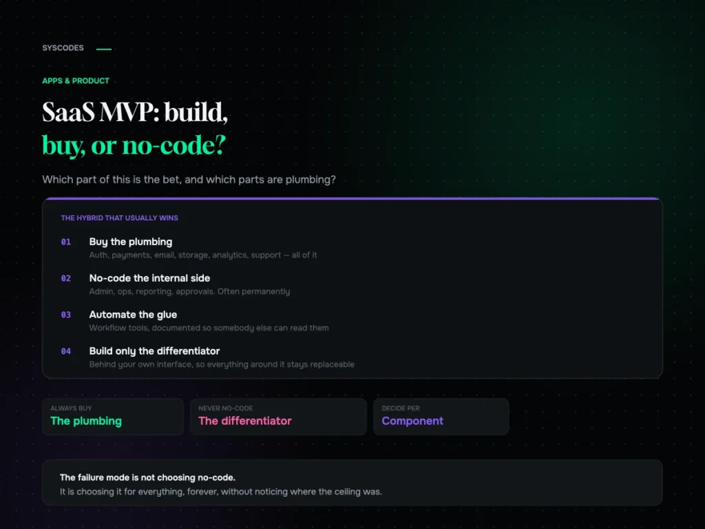
SaaS MVP: build, buy, or no-code?
Apps & Product

SaaS MVP: build, buy, or no-code?

When no-code is the right call, the six ceilings to know in advance, how to keep a migration path open from day one, and the hybrid…
21 Aug 202613 min read
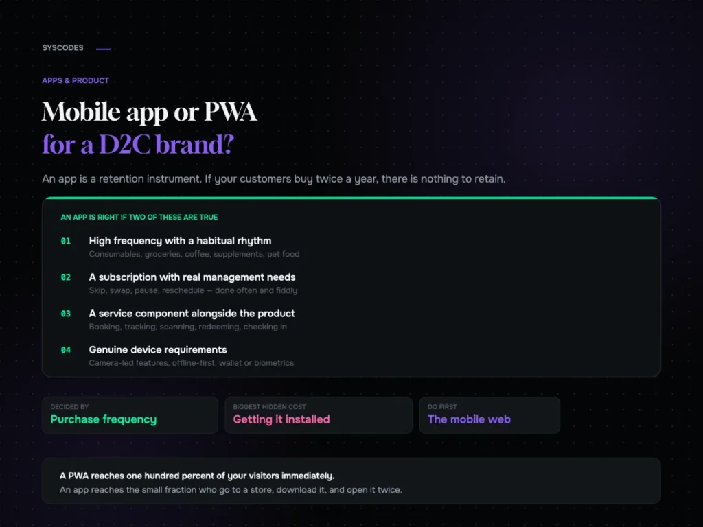
Mobile app or PWA for a D2C brand
Apps & Product

Mobile app or PWA for a D2C brand?

The purchase-frequency threshold that decides app versus web, what an app really costs, what a PWA gets you, the install funnel nobody models, and what to…
21 Aug 202612 min read
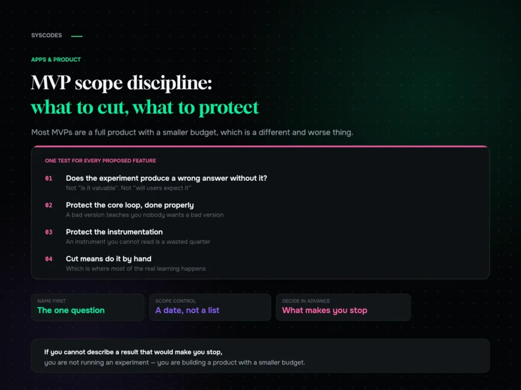
MVP scope discipline: what to cut and what to protect
Apps & Product

MVP scope discipline: what to cut and what to protect

The one question that decides MVP scope, four categories of feature, what to protect against false negatives, five ways to fake it before building, and how…
21 Aug 202614 min read
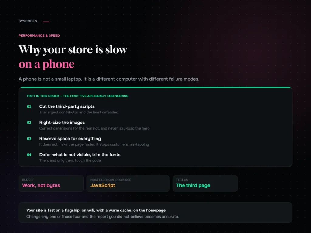
Why your store is slow on a phone and what actually fixes it
Performance & Speed

Why your store is slow on a phone, and what actually fixes it

Why a phone is a different runtime, why JavaScript is the expensive resource, the fix order that is mostly not engineering, and the five conditions for…
21 Aug 202613 min read
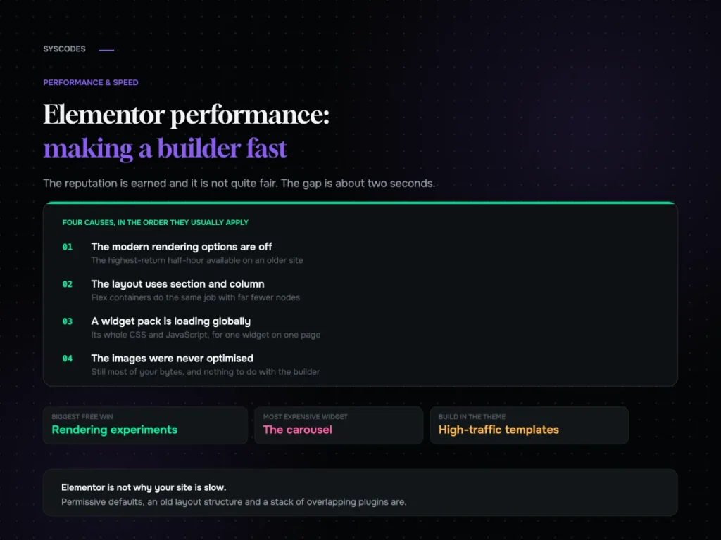
Elementor performance: making a page builder fast
Performance & Speed

Elementor performance: making a page builder fast

Where an Elementor site’s weight actually comes from, the rendering options most sites still have switched off, widget discipline, and a ten-setting checklist.
21 Aug 202613 min read
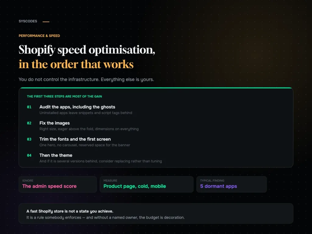
Shopify speed optimisation in the order that works
Performance & Speed

Shopify speed optimisation: what to do, in order

An ordered Shopify speed checklist: the app audit and the ghosts left by uninstalled apps, theme weight, images, fonts, the first screen, collections, cart behaviour and…

21 Aug 202613 min read
Question about your project? Tell us in 30 seconds — a senior lead replies.