Packaging used to have one job: be picked up. Now it has two, and the second one arrives after the sale, in someone’s hand, filmed on a phone, in a room you did not light.
Those two jobs want different things. The shelf wants contrast, hierarchy and legibility from three metres and from a 200-pixel thumbnail. The unboxing wants texture, sequence and a moment of something better than expected. A design optimised entirely for one of them tends to fail at the other, and most brands only discover which one they optimised for after the print run.
This is how we think about the trade, and the practical constraints that decide it.
Two jobs, and where they conflict
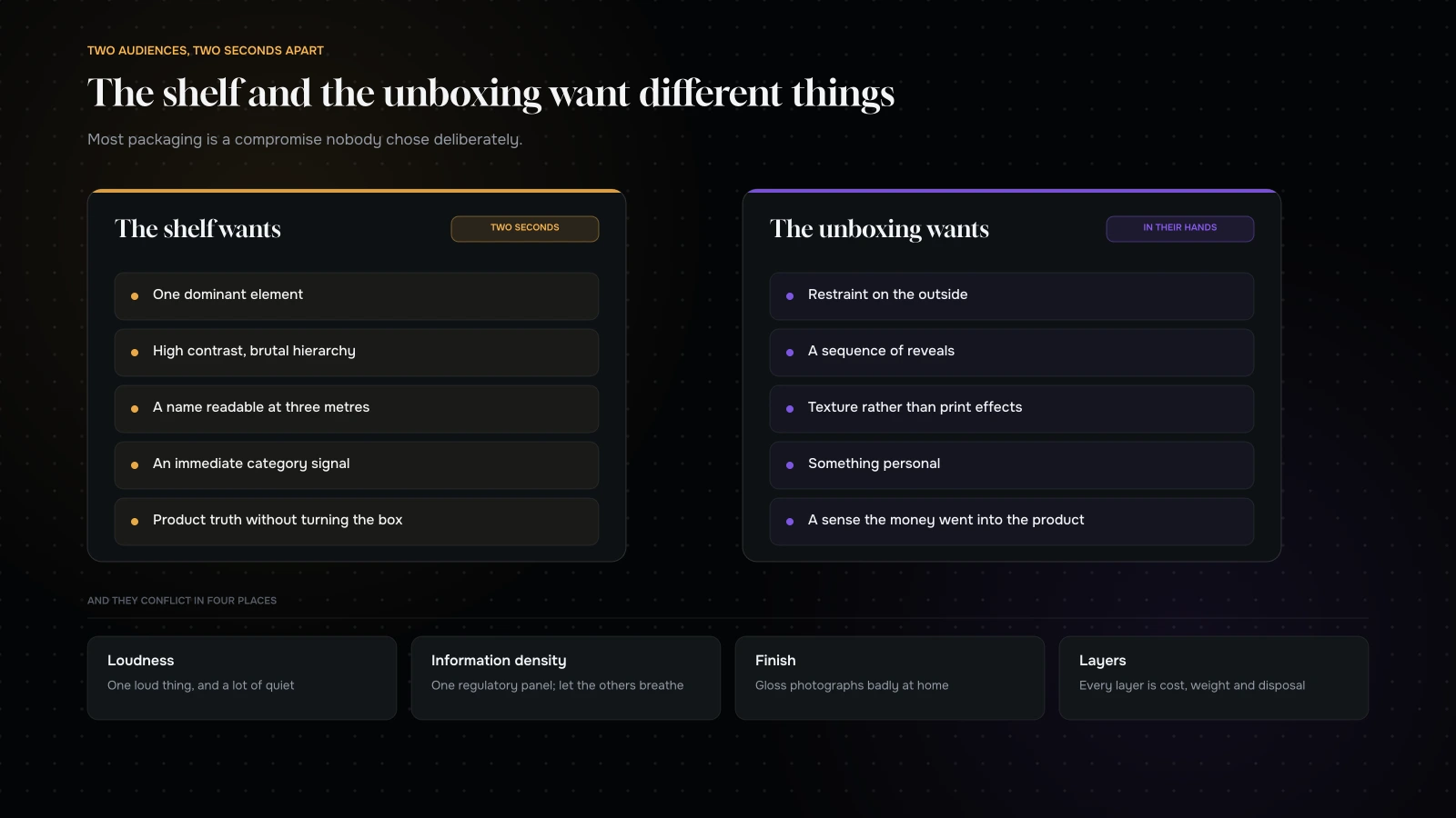
The shelf wants a single dominant element, high contrast, a name readable at a glance, an immediate category signal, and a product truth visible without turning the box. It is a two-second decision made among competitors.
The unboxing wants restraint on the outside, a sequence of reveals, tactile quality, something personal, and a sense that the money went into the product rather than the print.
They conflict in four specific places.
Loudness. What reads well at three metres frequently reads as shouty in someone’s hands. The mitigation is hierarchy rather than volume — one loud thing and a lot of quiet.
Information density. Retail demands claims, certifications, weights and legal text. Unboxing wants those to be discoverable rather than shouted. The answer is usually to put the regulatory face on one panel and let the others breathe.
Finish. Gloss photographs badly in a bedroom with an overhead light and looks vivid in a bright store. Matte photographs beautifully and can look flat under retail lighting.
Layers. Unboxing likes an outer, a wrap, a card, a reveal. Retail and freight would prefer one box. Every layer is cost, weight and, increasingly, a thing the customer has to dispose of.
The shelf is now a thumbnail
Worth saying plainly, because it changes design decisions more than anything else in the last few years.
For a lot of brands, the first “shelf” a customer sees is a small image in a grid — on a marketplace, in a quick-commerce app, in a search result, in a social feed. That image is often smaller than a matchbox on the screen, surrounded by competitors, and viewed for about a second.
Design tests to run before signing off:
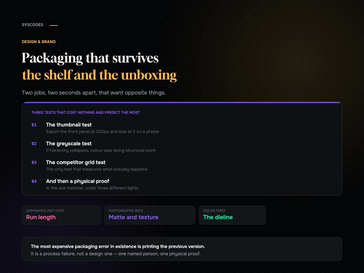
The thumbnail test. Export the front panel at 200 pixels wide and look at it on a phone. If the brand name is not legible and the product is not identifiable, it will lose to something simpler.
The greyscale test. Remove the colour. If the hierarchy collapses, you were relying on colour to do structural work, and colour is the first thing lost to bad lighting and cheap screens.
The competitor grid test. Put your thumbnail in a grid with eight competitors. This is the only test that measures the thing that actually happens.
Almost every packaging design that fails commercially fails one of those three, and all three cost nothing to run.
What photographs well, which is not what looks good in a studio
The unboxing photograph is being taken by a customer, in a room, with one overhead light and a phone.
Matte and soft-touch finishes photograph well and hide fingerprints. Gloss shows every mark and every reflection of a ceiling light.
Deep, saturated colours read better on a phone camera than pale pastels, which get washed out.
Texture is the cheapest premium signal. An embossed logo, a ridged board, an uncoated stock — all of these read as expensive on camera in a way that a print effect does not.
Metallic foils photograph unpredictably. They look extraordinary in person and frequently render as a grey smear under a phone camera, especially in low light.
High contrast between the box and the product matters, because the customer will photograph both together.
And one practical thing that is worth more than any finish: make the product visible in the first three seconds of opening. Unboxing content lives or dies on the reveal.
Choosing which job wins
Since the two jobs conflict, somebody has to decide which one leads. Do it deliberately, using your channel mix rather than your taste.
If most of your volume goes through marketplaces, quick commerce or physical retail, the shelf wins. Design for the thumbnail and the two-second glance, keep the hierarchy brutal, and treat the unboxing as a small, cheap upgrade — a printed inside, a card, a decent tape.
If most of your volume is direct, and repeat purchase matters, the unboxing wins. The customer already decided before the box arrived; its job now is to make the decision feel correct and to earn the second order. Restraint, texture and a good reveal beat contrast.
If you are genuinely split, do not average the two into something mediocre. Consider two structures: a retail-facing pack designed for the shelf, and a direct shipper designed for the moment it opens. It costs more in tooling and it produces two things that each do their job, which is usually cheaper than one that does neither.
If you are pre-launch and do not know your mix, design for the thumbnail. It is the more unforgiving constraint, and a design that survives it can always be enriched later with finish and inserts. The reverse is much harder.
What the insert is actually for
The card, leaflet or booklet inside is the most under-used part of most packaging, and the cheapest thing on the whole spec.
Three things it should probably do.
Answer the first-use question. Whatever your support inbox is asked most often in the first week after delivery — how to use it, how often, what to expect, what is normal — goes here. Every one of those you answer is a support message you do not receive and a customer who does not feel lost.
Set up the second purchase without asking for it. Not a discount code. A reason: when to reorder, what pairs with it, what the next size up is for. Useful information sells better than a percentage.
Give the unboxing something to read. Video and photographs need a moment of content, and a well-written card is the cheapest possible one.
What it should not do: apologise for the packaging, ask for a review before the product has been used, or contain three separate discount offers with different codes.
Print reality: what actually costs money
Design decisions turn into unit costs in ways designers often do not see, so it is worth knowing which decisions are expensive.
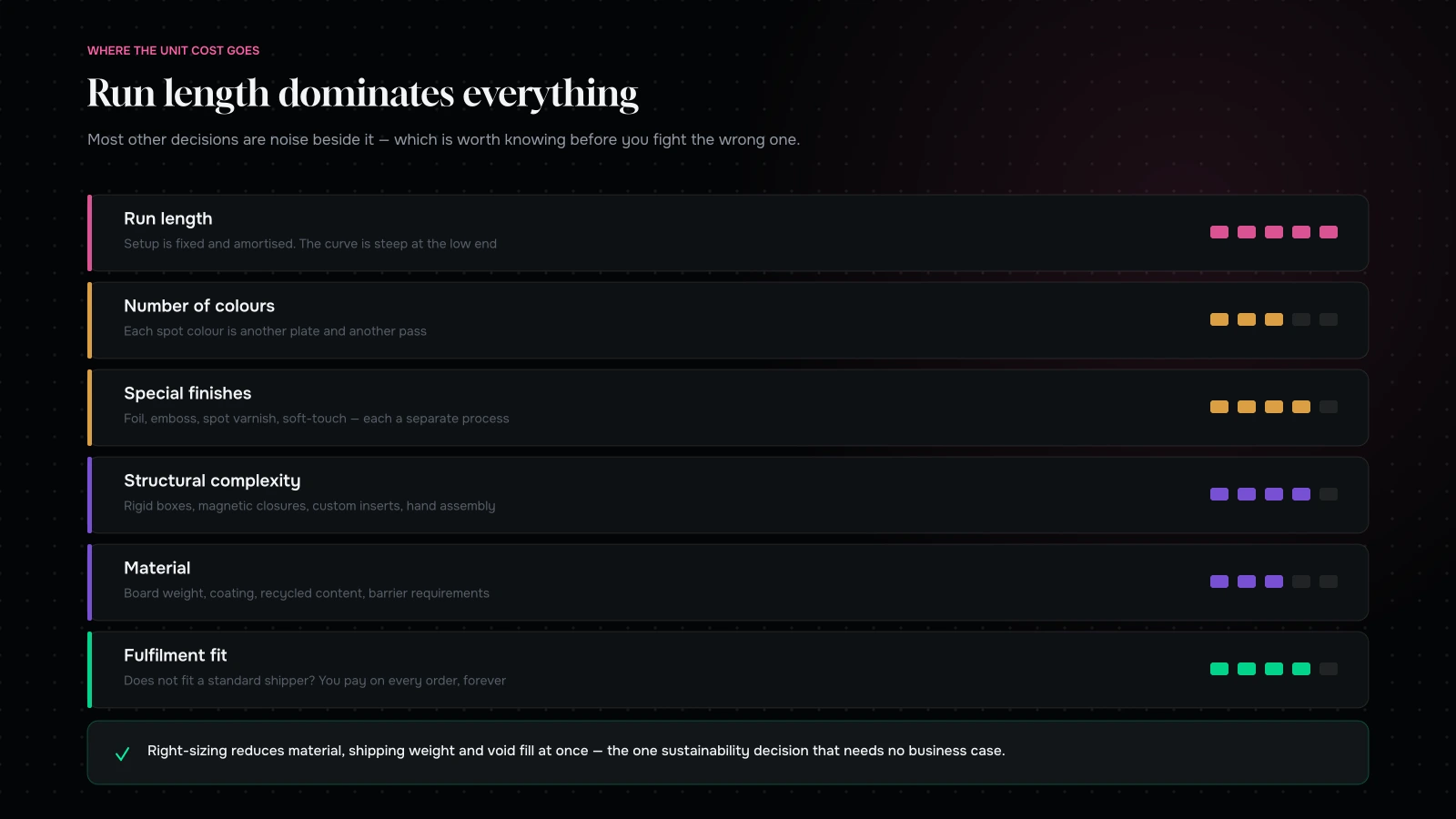
Run length dominates everything. Setup costs are fixed and amortised, so short runs are expensive per unit and the curve is steep at the low end. A brand doing small quantities should design for a process that suits small quantities rather than fighting the economics of one that does not.
Number of colours. Each additional spot colour is another plate and another pass. A design using three carefully chosen colours will always be cheaper than one requiring five, and it usually looks more considered.
Special finishes. Foil, emboss, deboss, spot varnish, soft-touch lamination — each is a separate process with its own setup. Choose one and do it well; three finishes on one box is where budgets disappear and the result rarely looks better.
Structural complexity. A straightforward folding carton is inexpensive and well understood. A rigid box, a magnetic closure, a custom insert or an unusual die each add tooling and hand assembly.
Material. Board weight, coated versus uncoated, recycled content, barrier requirements for food or cosmetics. Barrier requirements in particular can decide the whole structure before aesthetics get a say.
Fulfilment fit. Packaging that does not fit a standard shipper, or that needs void fill, adds cost to every single order forever. This is the line most often missed at design stage and it compounds harder than any print decision.
Sustainability, without the greenwash
Customers ask, regulators increasingly require, and a great deal of what gets claimed is thin.
Three things that are genuinely useful.
Use less. The most defensible environmental decision is material you did not use. Right-sizing packaging reduces material, shipping weight and void fill simultaneously, and it saves money — which is why it is the one sustainability decision that never needs a business case.
Make it recyclable in practice, not in theory. Mono-material is recyclable. A laminated board with a plastic window and a foil stamp is technically several materials fused together, and in most municipal systems it is landfill. If you want a recyclability claim, design for it structurally rather than adding a symbol at artwork stage.
Say what is true and nothing more. Specific, verifiable statements about what the pack is made of and what to do with it. Vague claims are increasingly regulated and always corrosive when a customer looks into them.
What we would avoid: a sustainability story that does not survive a curious customer, and an expensive material switch that changes little while raising unit cost enough to be felt.
The dieline is the design
Structure decides more than graphics do, and it is usually decided last, by whoever is quoting the print.
Get the dieline early and design into it. Know which panel faces the customer on a shelf, which one they see first when the shipper is opened, where the regulatory text lives, and what is visible when the box is half-open — because that is the frame in every unboxing video ever made.
Two questions that catch most problems: what does this look like from the back, and what does the customer see at the exact moment the lid lifts? Both get answered late, and both are cheap to get right early.
The mistakes that cost the most
Six, roughly in order of how expensive they are when they happen.
Printing the wrong version. The most expensive mistake in packaging, and it is a process failure rather than a design one. One person owns the final file, the file name contains the date, and nothing goes to print without a named sign-off against a physical proof.
Designing before the dieline is fixed. Artwork laid out on an assumed structure, then squeezed onto the real one, produces the cramped panels and misaligned folds that are visible in every photograph forever.
Signing off colour on a screen. Screens are backlit and packaging is not. Every substrate shifts colour, uncoated stocks dramatically so. A physical proof in the actual material is not optional.
Ignoring the shipper. Beautiful pack, wrong dimensions for a standard box, void fill on every order, higher shipping weight, and a customer opening a large carton containing a small thing. That combination undoes the premium impression the pack was designed to create.
Type too small for the category rules. Regulatory minimums exist and vary by market. Discovering one after the run is a reprint.
Barcodes on the wrong background. Dark stock, low contrast, or a finish over the top, and the scanner fails at the till or in the warehouse. Test on the actual substrate.
None of these are design talent problems. All of them are checklist problems, which is why the checklist is the last section of this article rather than an afterthought.
The pre-press checklist

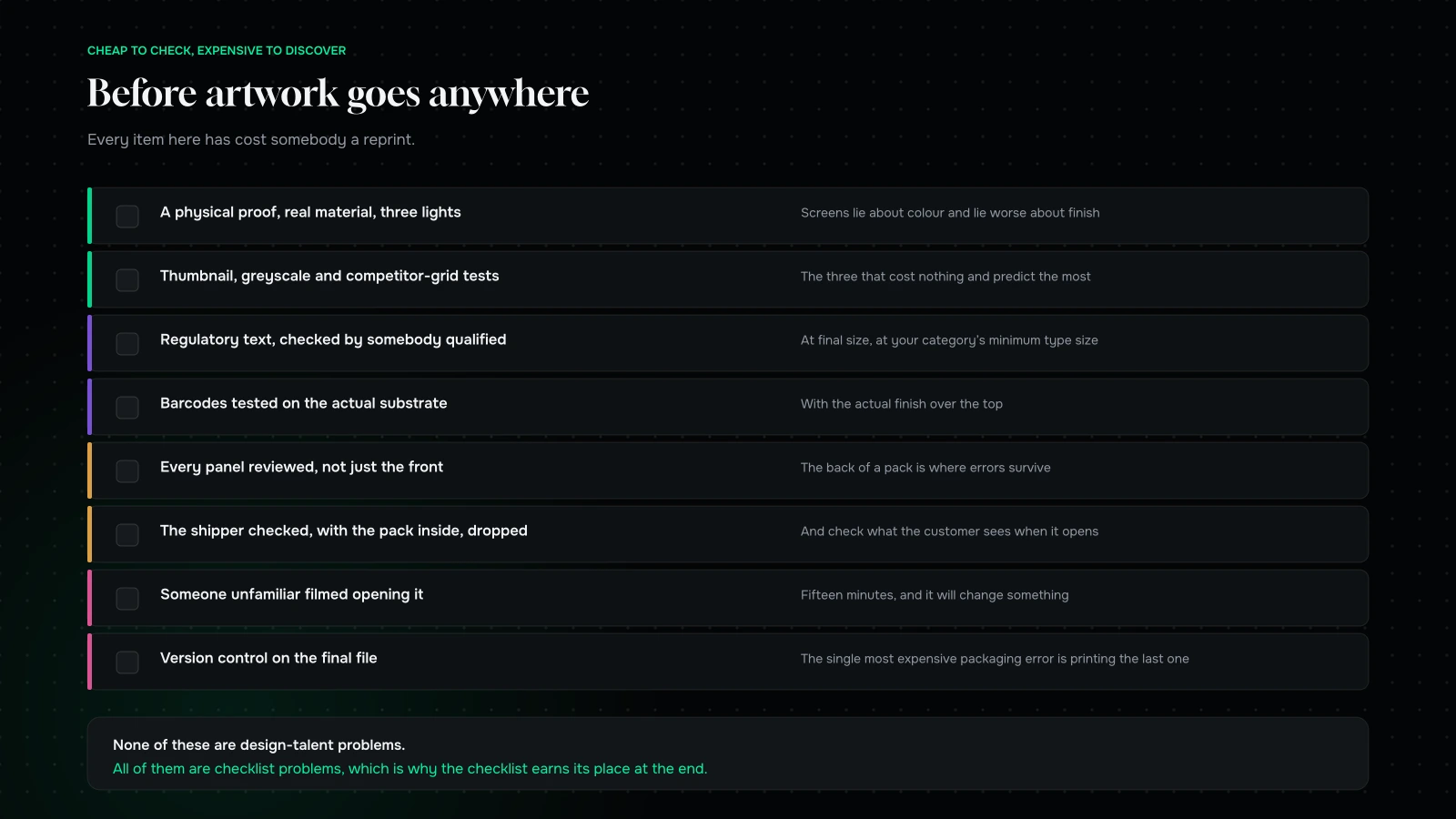
Before artwork goes anywhere, work through this.
A physical proof, in the real material, under three lighting conditions — daylight, retail-style overhead, and a warm indoor lamp. Screens lie about colour and lie worse about finish.
The thumbnail test, the greyscale test, the competitor grid test.
Regulatory and legal text checked by somebody qualified, at final size, with the actual minimum type sizes your category requires.
Barcodes tested, on the actual substrate, with the actual finish over them.
Every panel reviewed, not just the front. The back of a pack is where errors survive.
The shipper checked, with the pack inside it, dropped a few times.
Someone unfamiliar asked to open it, filmed, without help. Fifteen minutes, and it will change something.
Version control on the final files, because the single most expensive packaging error in existence is printing the previous version.
Working with a printer, usefully
The relationship changes the result more than the software does, and most brands treat it as a transaction.
Involve them before the design is finished. A printer will tell you which finish is cheap on their press, which board they run well, and which structural idea will double your cost. That conversation is free and it is worth more than any amount of research.
Ask what they run most. Every printer has stocks, sizes and processes they are set up for. Designing into those is dramatically cheaper than asking them to do something unusual, and the quality is better because it is what the press is dialled in for.
Get quotes at three quantities, not one. The curve tells you where your economics change, and it frequently reveals that ordering somewhat more costs barely anything extra per unit — which is useful information for a growing brand.
Ask what they would change. They see hundreds of jobs and they know which ones come back with problems. Most will tell you if asked directly, and almost nobody asks.
Attend the first press check if you can. Colour on press is a conversation, not a setting, and being in the room once teaches you more about print than a year of reading.
The pattern here is the same as everywhere else in this article: the expensive mistakes are made early, quietly, by people who did not know they were making a decision.
| Decision | Made by | When it should be made |
|---|---|---|
| Structure and dieline | Printer and designer together | Before any graphics |
| Number of colours | Designer, with a quote in hand | Concept stage |
| Finish | Designer and printer | Concept stage, on a physical sample |
| Shipper fit | Operations | Before the dieline is signed off |
| Regulatory text | Someone qualified | Before final artwork |
| Final file sign-off | One named person | Against a physical proof |
What it comes down to
Packaging has two audiences now: someone deciding in two seconds among competitors, and someone opening a parcel at home with a phone in their hand. Those jobs want different things, and pretending otherwise produces packaging that does neither well.
Decide which job matters more for your channel mix, design for that one, and make the other work as a deliberate compromise. Run the thumbnail test. Choose one finish and do it properly. Get the dieline before the graphics. Right-size it, because that decision is good for the customer, the shipping bill and the environmental story at the same time.
And prove it physically, in the real material, under the light your customer will actually be standing in.
Working on a pack? Send us your dieline and your channel mix through the contact form and we will tell you which of the two jobs your current design is optimised for, what it will cost you in the other, and the three changes we would make before it goes to print.
You can also read rebranding without losing the recognition you have built, or commerce UI patterns that convert.
Send us your dieline and your channel mix and we will tell you which job it is designed for.
You will get back which of the two audiences the current design serves, what it is costing you in the other, and the three changes we would make before it goes anywhere near a press.
If the honest answer is that the design is good and the structure is wrong for your shipper, we will say that. It is the cheapest possible finding and the one people discover last.
More on Design & Brand
Brand, packaging and interface decisions that have to earn their place.

Commerce UI patterns that consistently convert
Thirteen commerce interface patterns grouped by funnel stage, the ones that present beautifully and cost orders, the states nobody designs, and how to add them without…
Rebranding without losing the recognition you have built
How to audit the recognition you already own, the four levels of rebrand and which one you probably need, what to keep, how to roll it…
SaaS MVP: build, buy, or no-code?
When no-code is the right call, the six ceilings to know in advance, how to keep a migration path open from day one, and the hybrid…
Mobile app or PWA for a D2C brand?
The purchase-frequency threshold that decides app versus web, what an app really costs, what a PWA gets you, the install funnel nobody models, and what to…
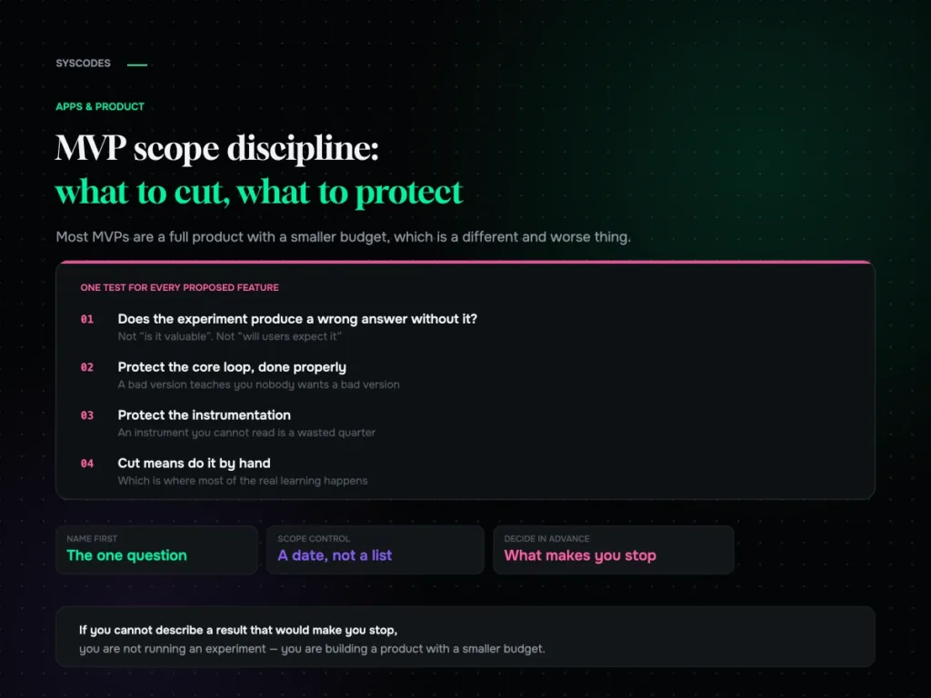
MVP scope discipline: what to cut and what to protect
The one question that decides MVP scope, four categories of feature, what to protect against false negatives, five ways to fake it before building, and how…
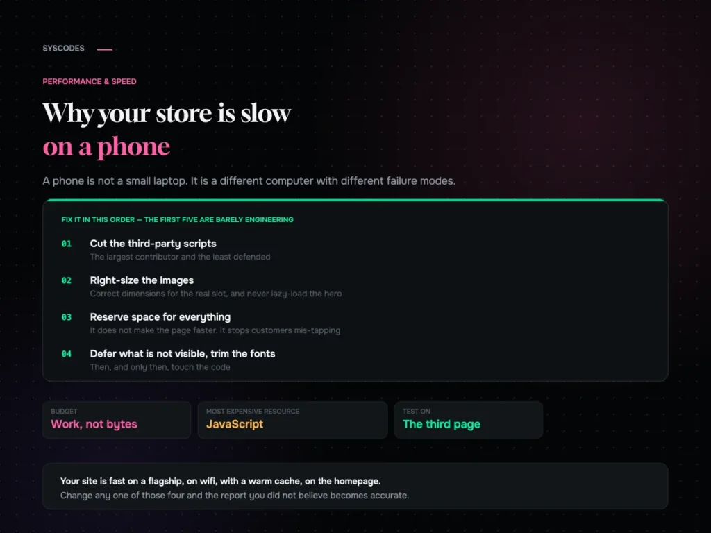
Why your store is slow on a phone, and what actually fixes it
Why a phone is a different runtime, why JavaScript is the expensive resource, the fix order that is mostly not engineering, and the five conditions for…
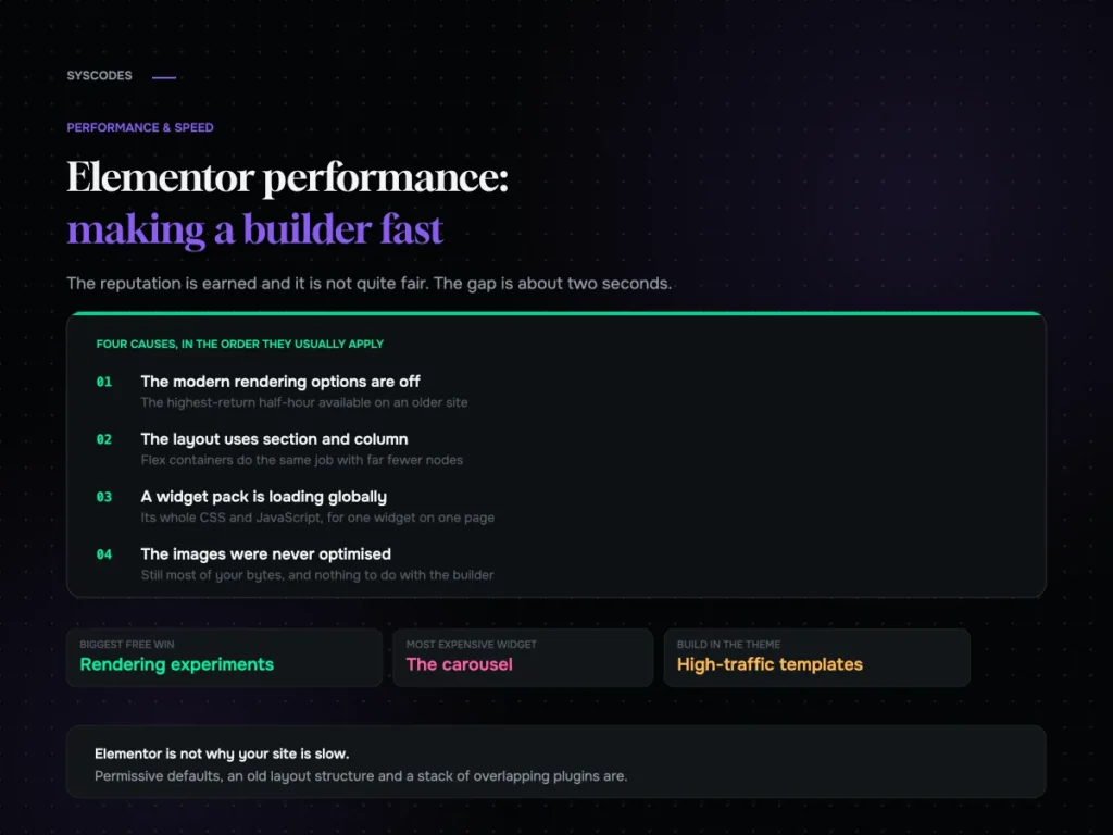
Elementor performance: making a page builder fast
Where an Elementor site’s weight actually comes from, the rendering options most sites still have switched off, widget discipline, and a ten-setting checklist.
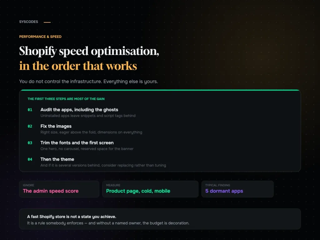
Shopify speed optimisation: what to do, in order
An ordered Shopify speed checklist: the app audit and the ghosts left by uninstalled apps, theme weight, images, fonts, the first screen, collections, cart behaviour and…