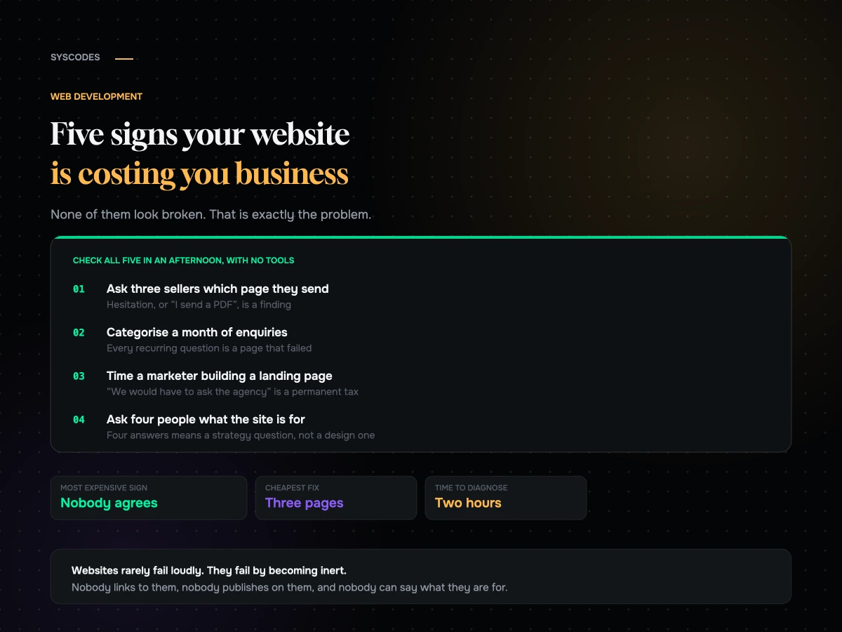
Most websites that are costing a business money do not look broken. They load, they have pages, the contact form works, and nobody in the company thinks about them very much. That is precisely the condition in which a site quietly stops earning.
The obviously bad website gets fixed. The merely inert one survives for years, because there is never a specific moment where somebody notices it has become the reason a deal went elsewhere.
These are the five signs we look for, what each one actually costs, and how to check every one of them in an afternoon.
Sign one: your best salespeople never send anyone to it
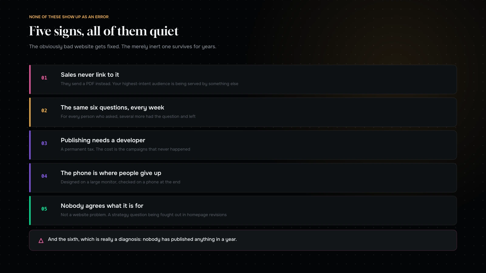
This is the strongest single signal, and it costs nothing to check. Ask three people who sell for you when they last sent a prospect a link to your site, and which page.
If the answer is a hesitation, or “I usually send a PDF”, or “I send them the LinkedIn page”, your website is not doing the one job it is unambiguously good at — being the thing you send to somebody who is deciding.
What it means: the site describes the company rather than answering a buyer. Salespeople know exactly which three objections lose them deals, and if none of those objections is addressed on a page they can send, they will build their own materials and the site becomes decoration.
The fix is not a redesign. It is three pages, written from the objections your sales team actually hears, that a person can send in a message. We have seen this alone change a site’s contribution to pipeline more than any amount of visual work.
Sign two: the same six questions arrive every week
Open your inbox — or your support queue, or your DMs — and categorise a month of pre-purchase questions.
You will find a small number of questions that recur constantly. Delivery times. Whether it works with something. Sizing. Whether you serve a particular market. What is included. Pricing structure.
Every one of those is a page that failed. Not because the information is missing — usually it is on the site somewhere — but because it is not where the question is asked, in the words the customer used.
What it costs: it is not primarily the staff time, though that is real. It is that for every person who asks, several more had the same question and did not ask. They left. You never saw them, which is why this sign is so persistently underrated.
The fix: take the six questions and answer each one, in the customer’s words, on the page where it arises — not in an FAQ nobody visits. Then keep doing it: the recurring-question list is the best content brief a business ever gets, and it updates itself for free.
Sign three: publishing anything requires a developer
Ask your marketing person to add a new landing page for a campaign and time it. Not to design it — to build a page using the components that already exist.
If the answer is “we would have to ask the agency”, your site has a permanent tax on it. Every campaign now has a development dependency, every idea has a queue, and over a year the number of things that simply do not happen because they were too much hassle is large and completely invisible.
What it costs: the campaigns you did not run. This never appears anywhere, which is why it persists for years.
The fix: a page-building capability with guardrails — a set of tested components a non-technical person can assemble without producing something ugly or broken. This is a build decision, not a platform decision, and it is one of the highest-return things you can retrofit to an existing site.
Sign four: your phone is where people give up
Pull your analytics and compare conversion rate by device. Then look at where the two lines separate.
Most sites get the majority of their traffic on phones. A meaningful share of them were designed on a large monitor by somebody who checked the mobile version at the end, and it shows in the places that matter — forms that fight autofill, buttons under a sticky bar, critical information three screens down, and pages that take six seconds on a real connection.
How to check it properly: on a mid-range phone, on mobile data, cold, as somebody who has never seen the site. Not the device toolbar in a desktop browser, which simulates the one thing that is not the problem. For stores specifically, we go through the whole method in where mobile checkout leaks.
What it costs: proportional to your mobile traffic share, which is probably higher than you think.
Sign five: nobody can say what the site is for
Ask four people in your business — a founder, a salesperson, a marketer, somebody in operations — what the website is for. Write down the answers.
If you get four different answers, you do not have a website problem. You have an unresolved strategy question that is being fought out in homepage revisions.
This is the sign that looks least like a website problem and causes the most expensive ones. Every subsequent decision — what goes in the navigation, what the homepage says, which audience the case studies are written for — becomes an argument with no criteria, and the result is a site that gestures at everything and persuades nobody.
The fix: one sentence, agreed, with a number in it. “This site exists to generate qualified enquiries from procurement teams at mid-size manufacturers; we want forty a month.” Everything else follows from that, and disagreements get resolved by asking whether a change serves the sentence.
The sixth sign, which is really the first
Nobody has published anything in a year.
We left it off the list of five because it is less a sign than a diagnosis. A site that has not changed since launch is not being used as an asset. It is being treated as a brochure that was printed once, and it is decaying quietly — the content is stale, the platform is unpatched, the case studies are from three years ago, and the phone number in the footer may not even be right any more.
If this is you, the useful question is not “what should we build”. It is “who is going to own this”, and until that has a name, everything else is premature.
The three pages that fix sign one
Because “write three pages” is easy to say and people ask what goes in them, here is the shape we use.
Page one: the objection page. Pick the objection that loses you the most deals — price, lead time, size of firm, geography, integration, whatever it is — and write the honest answer. Not a defence. An explanation of why it is true, who it makes you wrong for, and what you do about it for the people it does not disqualify. Counter-intuitively, disqualifying people on this page improves conversion, because the ones who remain arrive convinced.
Page two: the proof page. One customer, in detail, in the buyer’s own situation. What their problem was, what you did, what changed, and what you would do differently. Specific enough that a stranger in the same position recognises themselves. One of these beats twelve logos.
Page three: the how-it-works page. What actually happens after somebody gets in touch. The steps, the timeline, who they will speak to, what you need from them, what it costs to start. Buyers hesitate because the next step is unclear far more often than because the offer is wrong.
Those three, sendable in a message, written from things your salespeople already say out loud every week. It is a fortnight of work, it needs no design project, and it is the single highest-return thing most business websites are missing.
What “fine” actually looks like
The opposite of the five signs, stated positively, because it is useful to know what you are aiming at.
A site that is working is one your sales team links to weekly and can point at a specific page for a specific objection. One where the recurring questions have been answered where they get asked, so the inbox is about deals rather than logistics. One where a marketer shipped a campaign page last month without asking anyone. One that is as usable on a mid-range phone on mobile data as it is on a laptop. And one where four people in the business give the same answer about what it is for.
None of those require a large site, a big budget or a redesign. All of them are properties of how the site is used and maintained rather than how it looks, which is why a modest site that is genuinely owned beats an expensive one that nobody touches.
That is also the honest reason we push back on so many redesign enquiries. The brief usually describes a visual problem, and the diagnosis is almost always one of these five.
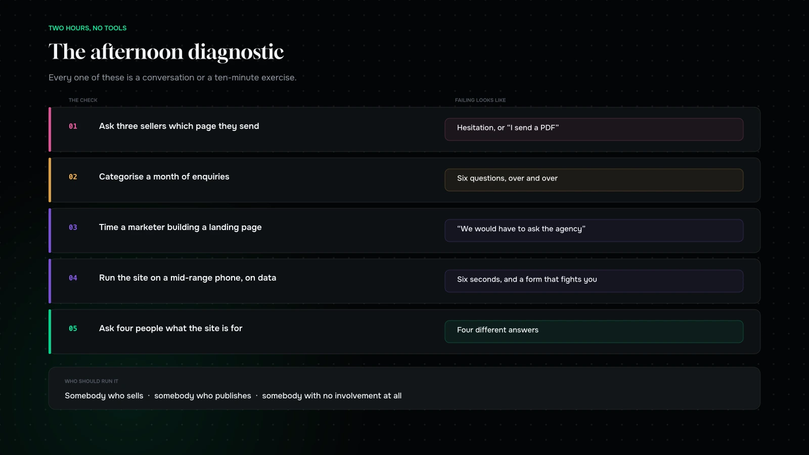
Checking all five in an afternoon

| Sign | The check | Failing looks like |
|---|---|---|
| Sales never link to it | Ask three sellers which page they send | Hesitation, or “I send a PDF” |
| Repeated questions | Categorise a month of enquiries | Six questions, over and over |
| Publishing needs a developer | Time a marketer building a landing page | “We would have to ask the agency” |
| Mobile gives up | Run the site on a mid-range phone, on data | Six seconds, and a form that fights you |
| Nobody agrees what it is for | Ask four people, write it down | Four different answers |
Two hours, no tools, no consultant. The output is not a redesign brief — it is a short list of specific, mostly cheap problems, which is a far more useful thing to hold.
Two signs that look bad and usually are not
Equally worth saying, because businesses spend money on both and neither is usually the problem.
“Our bounce rate is high.” On its own this means very little. A page that answers a question completely and sends somebody away satisfied looks identical, in that metric, to a page nobody could stand. Look at what the page is for before treating this as a defect — for a lot of informational pages a high bounce rate with a long time on page is the correct outcome.
“It looks dated.” Sometimes true and worth fixing, and much less often the reason a business is losing deals than the people inside that business believe. Nobody inside a company sees their own site the way a first-time visitor does; you see the version you have been staring at for four years, and its familiarity reads as staleness. A visitor who arrives with a problem is judging whether you can solve it, and a slightly old-fashioned site that answers them clearly beats a fashionable one that does not.
The test we apply: would fixing this change what somebody does? If the honest answer is “it would make us feel better about it”, that is a legitimate thing to want and it should be sequenced after the five signs, not before them.
There is a version of this where appearance genuinely is the problem — where the site actively undermines credibility in a category where credibility is the product, or where it is so out of step with a rebrand that it confuses people. That is real. It is just rarer than the number of redesigns commissioned for it.
What each one is actually worth

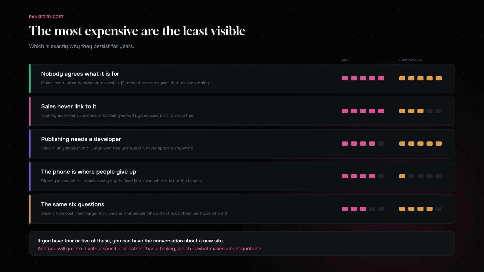
Worth ranking, because they are not equal and the most expensive are the least visible.
Nobody agrees what it is for — the most expensive, because it makes every other decision unresolvable and produces months of expensive revision cycles that resolve nothing.
Sales never link to it — next, because it means your highest-intent audience is not being served by the asset that exists to serve them.
Publishing needs a developer — a compounding cost. Not a big number in any single month, and over two years it is a large number of things that did not happen.
Mobile gives up — directly measurable, and the easiest to build a business case for, which is why it tends to get fixed first even when it is not the biggest problem.
Repeated questions — the smallest visible cost and a much larger invisible one, because the people who did not ask outnumber the people who did.
Who should run the afternoon
Not the person who commissioned the current site. That is not a judgement about them; it is that they will unconsciously defend decisions they made, and the whole exercise depends on being able to say “this does not work” without it being a criticism.
The best combination we have seen is three people: somebody who sells, somebody who publishes, and somebody with no involvement in the website at all. The seller supplies the objections. The publisher supplies the friction. The outsider supplies the questions everyone else has stopped asking.
Give it two hours, work through the five checks in order, and write the findings as sentences rather than as a document. Then rank them by what each is plausibly costing, and stop. The temptation at the end of an exercise like this is to leap to a solution, and the value is in having the list.
One practical note: record what people say, verbatim, especially the sellers. “I never send them the services page because it does not say what we actually do” is a finding. “The services page needs work” is a task that will be interpreted as a design request and come back as a new services page with the same problem.
What to do, in order
If you have sign five — stop. Do not commission anything until the sentence exists. A week of internal conversation now saves a quarter of revisions later.
If you have sign one — write three pages. Not a project. Three pages, from real objections, that a salesperson can send. This is usually a fortnight and the return is immediate.
If you have sign two — answer the six questions where they get asked. Also a fortnight.
If you have sign three — this is a build change and it is worth doing properly. Components with guardrails, a page builder your team can use, and a short session teaching them.
If you have sign four — audit it on real devices and fix what you find. Mostly hours, not days.
If you have four or five of them — now you can have the conversation about a new site, and you will go into it with a specific list rather than a feeling, which is exactly what makes a brief quotable.
What it comes down to
Websites rarely fail loudly. They fail by becoming inert: nobody sends anybody to them, nobody publishes on them, the same questions get answered by hand every week, and nobody can quite say what the thing is for.
Check the five signs. Most of what you find will be cheap to fix and will not require rebuilding anything. And if it turns out you do need a new site, you will now be able to say precisely why — which is worth more to the quality of the outcome than any amount of budget.
Not sure which of the five you have? Send us your URL through the contact form and we will run the checks we can run from outside and tell you what we see, in order of what it is probably costing you. If the answer is that your site is fine and the problem is upstream of it, we will tell you that — it is a cheaper thing to hear now.
You can also read what a custom website actually costs, or how to brief a web development agency.
Send us your URL and we will tell you which of the five we can see from outside.
You will get back what we found, in order of what it is probably costing you, and what we would do about each one. Most of it will be cheap and will not involve rebuilding anything.
If the answer is that your site is fine and the problem is upstream of it, we will tell you that instead. It saves you a redesign you did not need.
More on Web Development
Building, briefing and maintaining a website that still works in year three.

B2B commerce is not B2C with a login: what actually changes
What genuinely changes in a B2B commerce build: account structure, resolved pricing, the order workflow, punchout and ERP integration — and what to build first to…
How to brief a web development agency (with a template)
A nine-section website brief template, why a budget range helps you, the five details that make quotes comparable, what not to include, and how to read…
WordPress vs Webflow vs Wix for a growing business
A neutral comparison of WordPress, Webflow and Wix: what each genuinely wins on, where each hurts, the content-model test that settles it, lock-in, and three-year cost.
What a custom website actually costs in 2026
The three tiers of website project, the nine lines on every quote, what genuinely moves the number, what a cheap quote quietly removes, and the three-year…